We use cookies and other tracking technologies to improve your browsing experience on our website, to show you personalized content and targeted ads, to analyze our website traffic, and to understand where our visitors are coming from.
In recent years, behavioral finance - the field of study that combines psychology and economics to better understand financial decision making - has grown in popularity. There have been many studies that prove the irrationality of human decision-making processes due to psychological and emotional factors. With this in mind, we will investigate if weather conditions in New York have any noticeable impact on daily stock market returns.
The maximum distance at which an object can clearly be discerned.
Dew Point
The minimum threshold temperature that results in a relative humidity level of 100%.
Feels Like
A measure of how hot/cold it feels like outside when accounting for other variables like wind chill, humidity, etc.
Temp Min
The minimum temperature during the associated time stamp.
Temp Max
The maximum temperature during the associated time stamp.
Pressure
The weight of the air. High air pressure (heavy air) is associated with calm weather conditions whereas low air pressure (light air) is associated with active weather conditions.
Humidity
The amount of water vapor in the air.
Wind Speed
The speed of the wind in miles per hour.
Wind Deg
The direction of the wind in circular degrees.
Clouds All
Cloudiness of the sky in percent.
Weather Id
The ID code associated with the weather.
Weather Main
The Primary Weather Category.
Weather Description
The Secondary Weather Category.
Weather Icon
The ID code of the icon being displayed on weather apps.
Exploring the Data
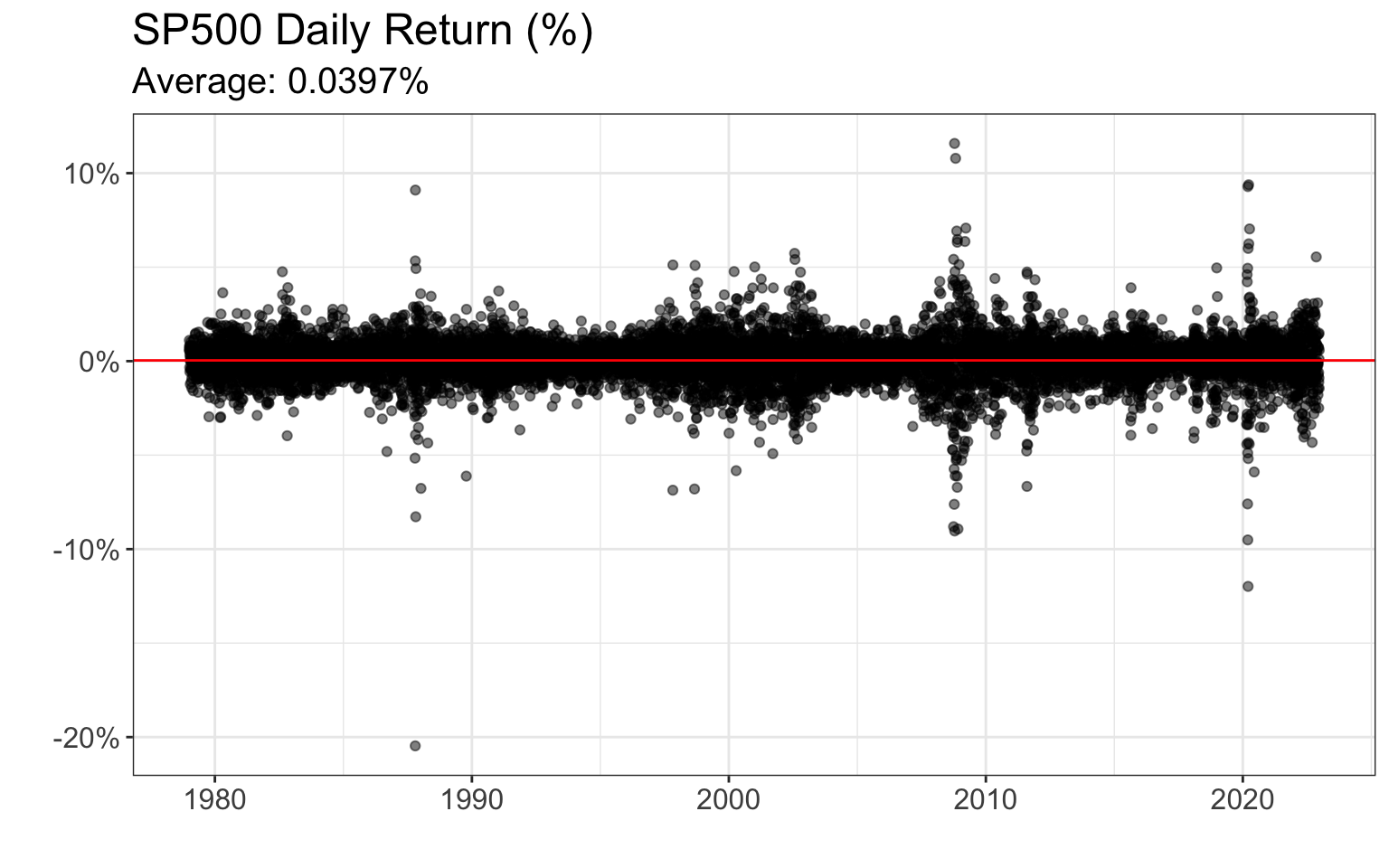
Let’s start by taking a look at the daily SP500 returns below:
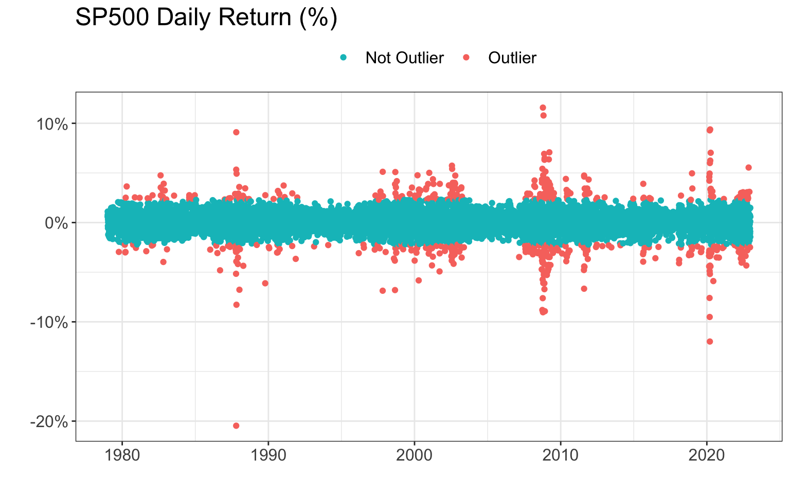
As we can see from the data, there are several days with extreme returns; on October 19, 1987 (‘Black Monday’) the market declined by approximately 22%, and in March of 2020, the stock market dipped when news of the Covid-19 pandemic arose. While these events are extremely important from a historical perspective, it is unlikely that the weather contributed significantly to these extreme returns. Therefore, we will consider days like these to be outliers, and we will remove them from our data. Here is a cleaned version of the data:
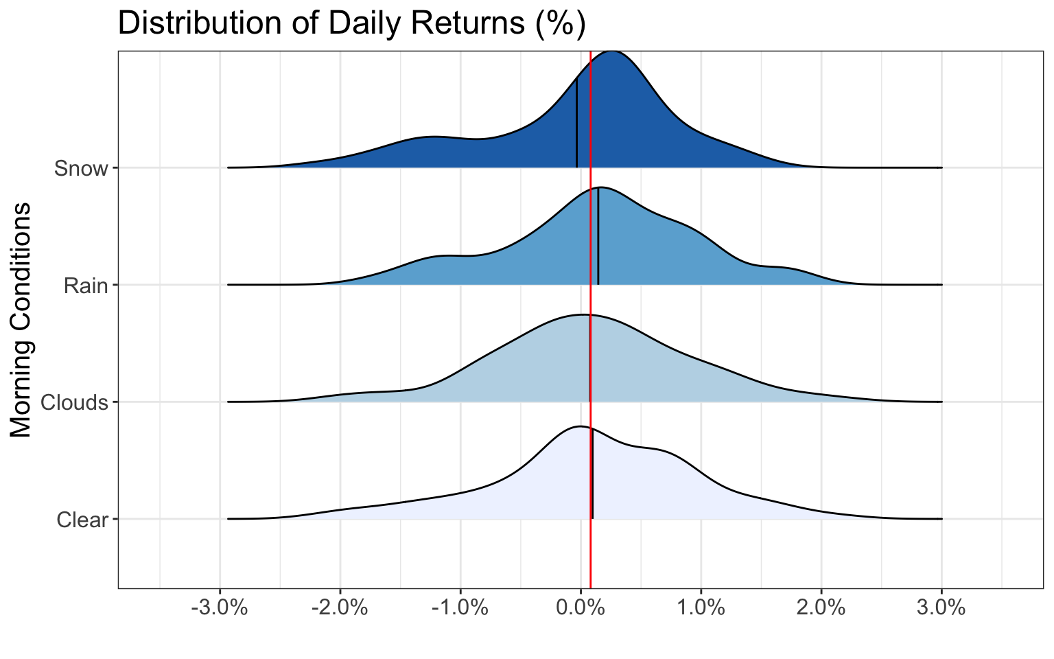
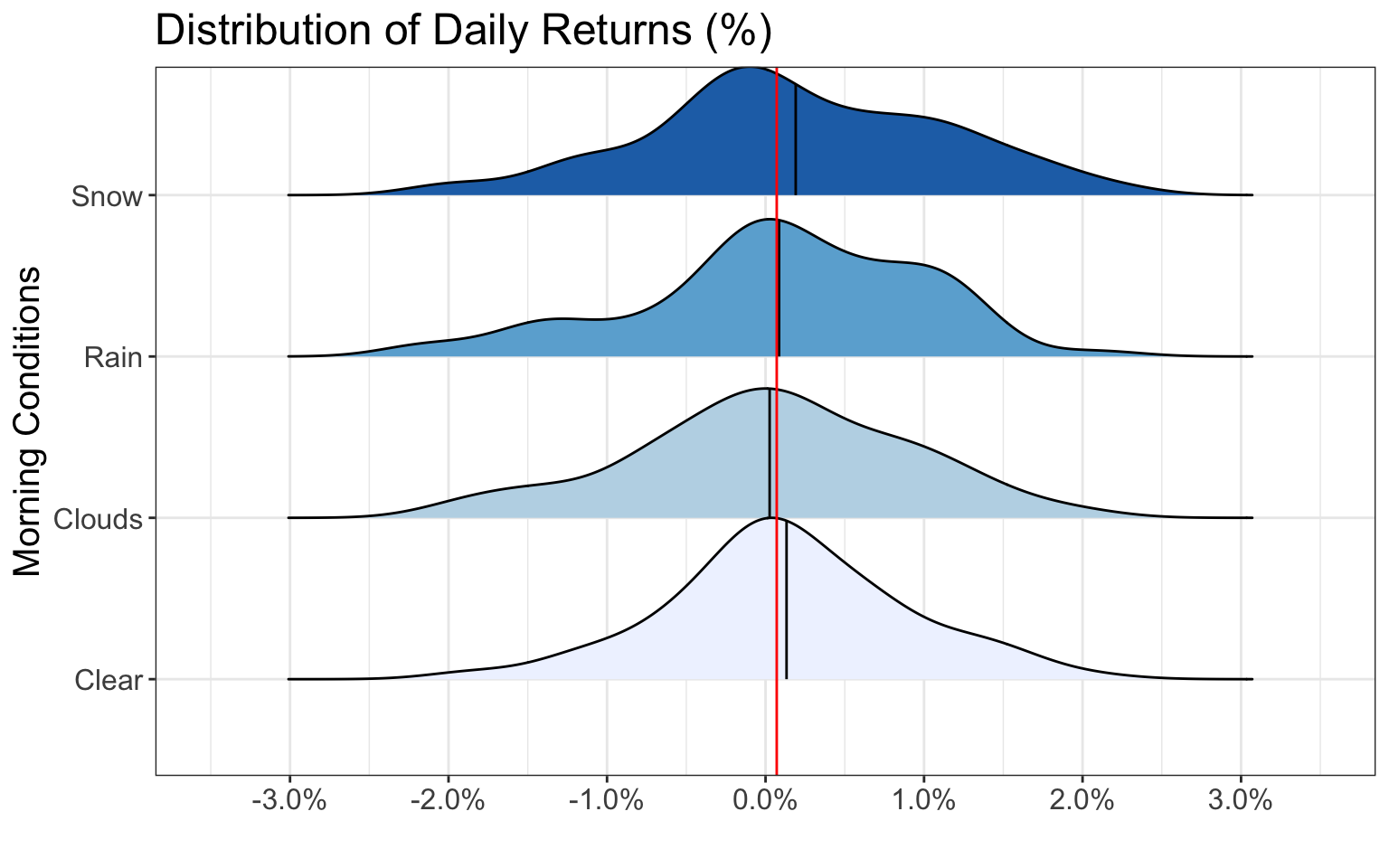
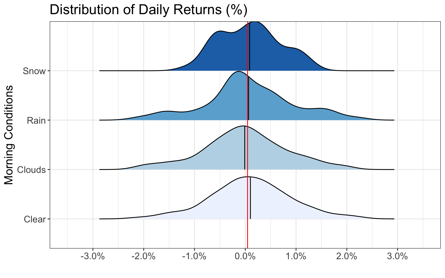
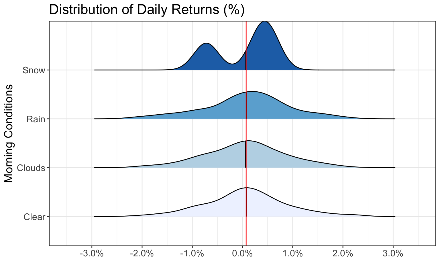
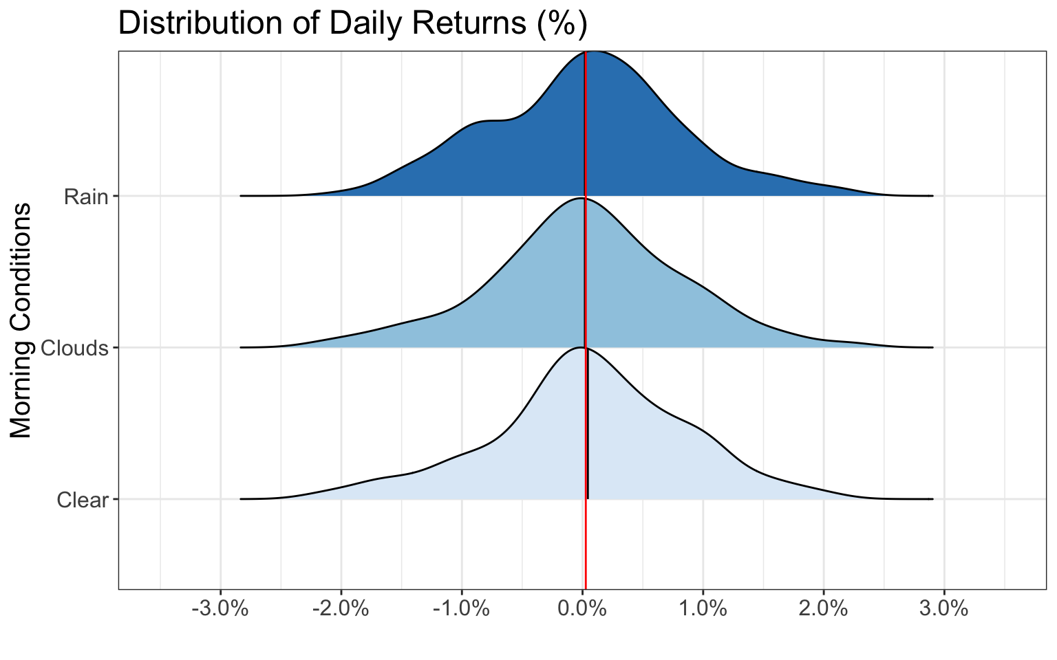
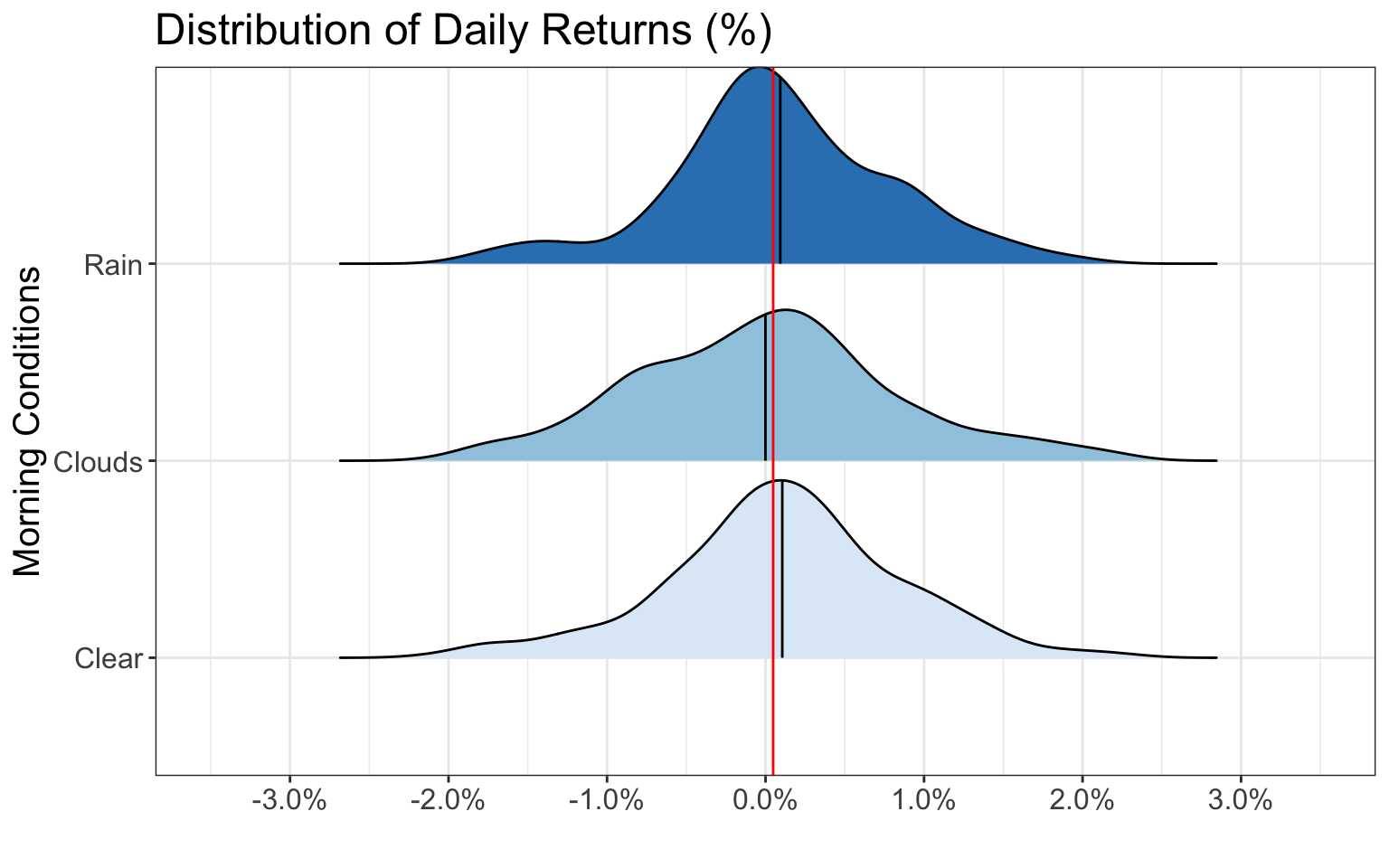
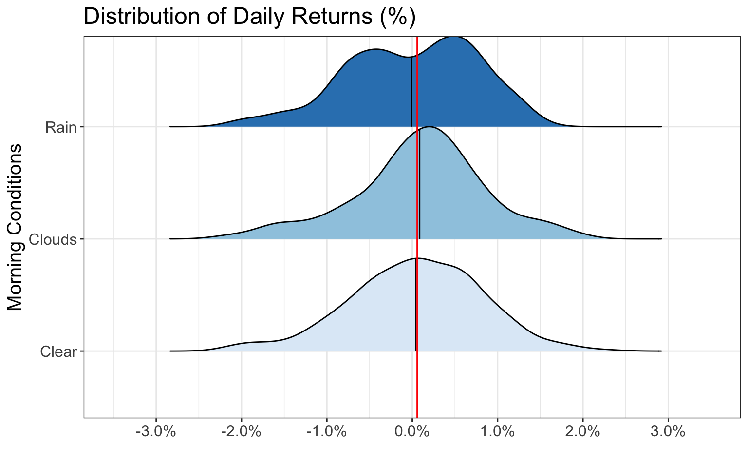
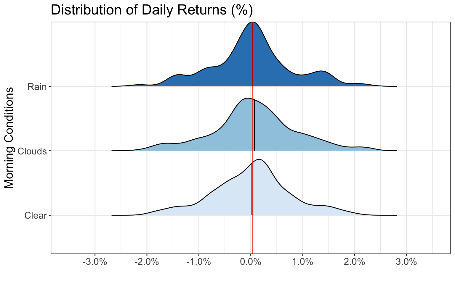
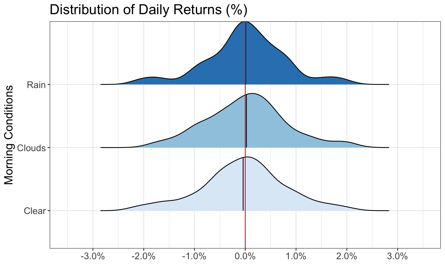
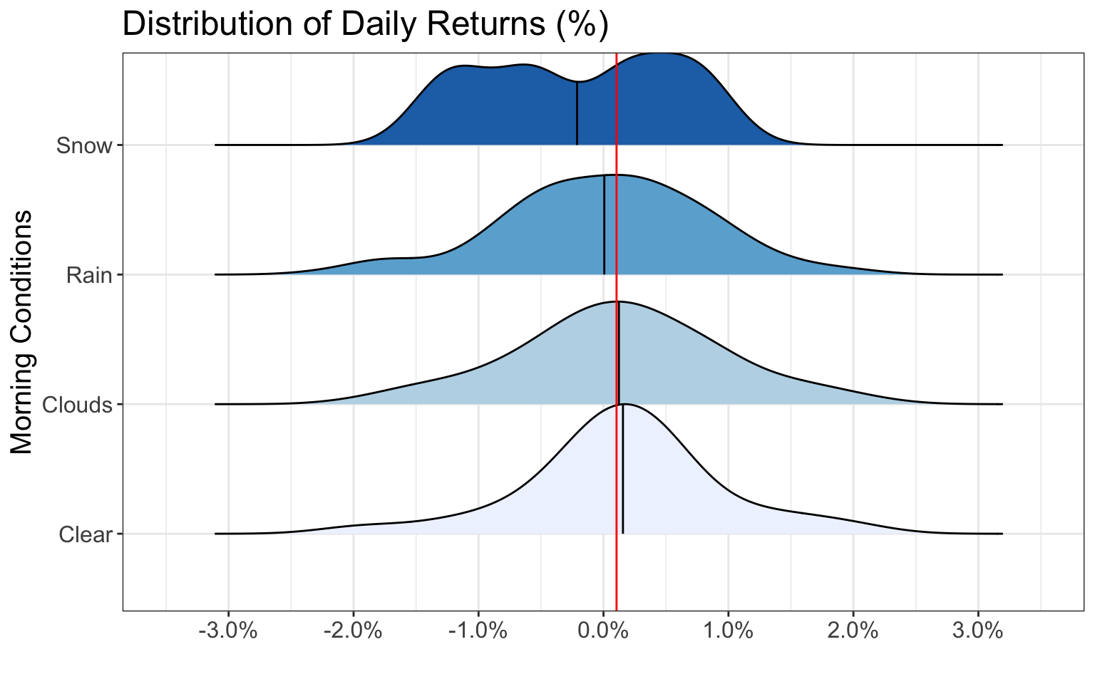
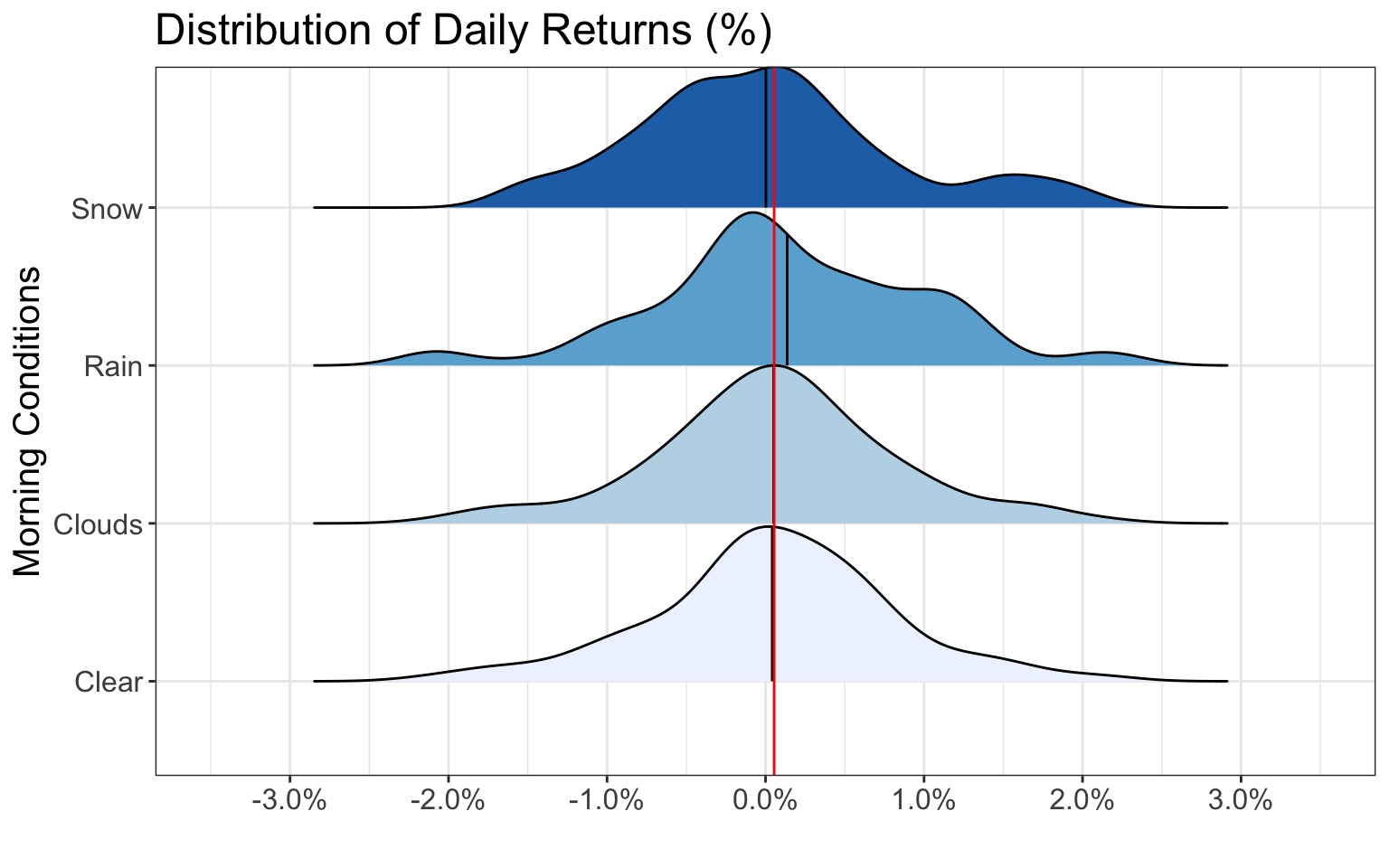
Black lines represent the average of the group whereas the red line represents the average across all groups
Black lines represent the average of the group whereas the red line represents the average across all groups
Black lines represent the average of the group whereas the red line represents the average across all groups
Black lines represent the average of the group whereas the red line represents the average across all groups
Black lines represent the average of the group whereas the red line represents the average across all groups
Black lines represent the average of the group whereas the red line represents the average across all groups
Black lines represent the average of the group whereas the red line represents the average across all groups
Black lines represent the average of the group whereas the red line represents the average across all groups
Black lines represent the average of the group whereas the red line represents the average across all groups
Black lines represent the average of the group whereas the red line represents the average across all groups
Black lines represent the average of the group whereas the red line represents the average across all groups
Black lines represent the average of the group whereas the red line represents the average across all groups
As we can see from the above plots, each of the distributions are relatively similar for different morning weather conditions. Therefore, morning weather seems to have little effect on the distribution of daily stock market returns.
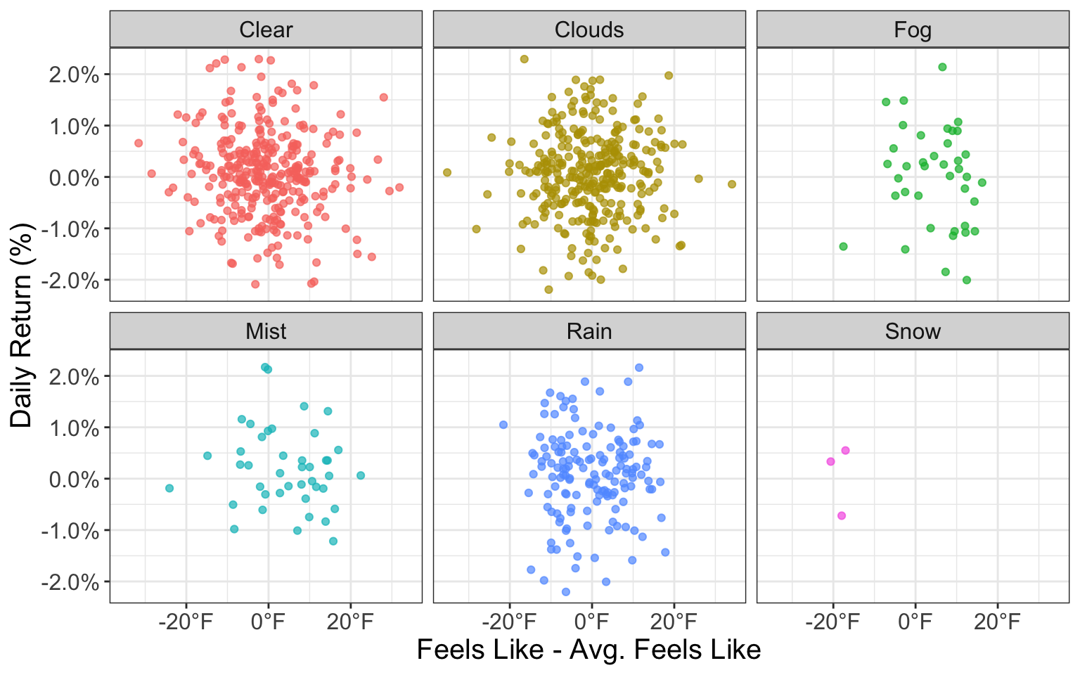
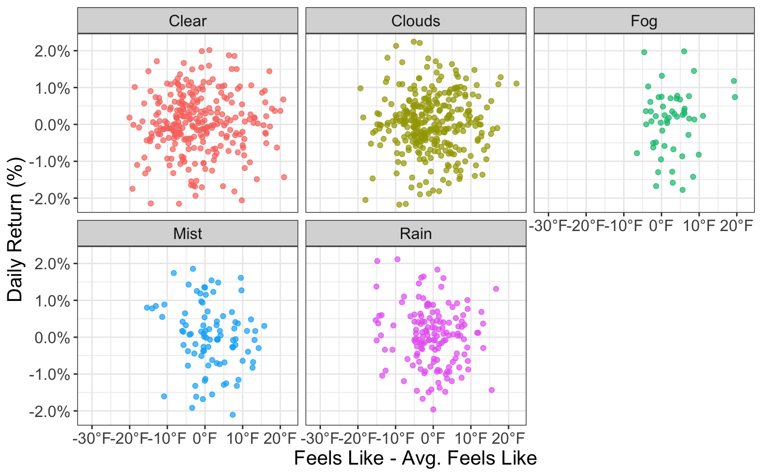
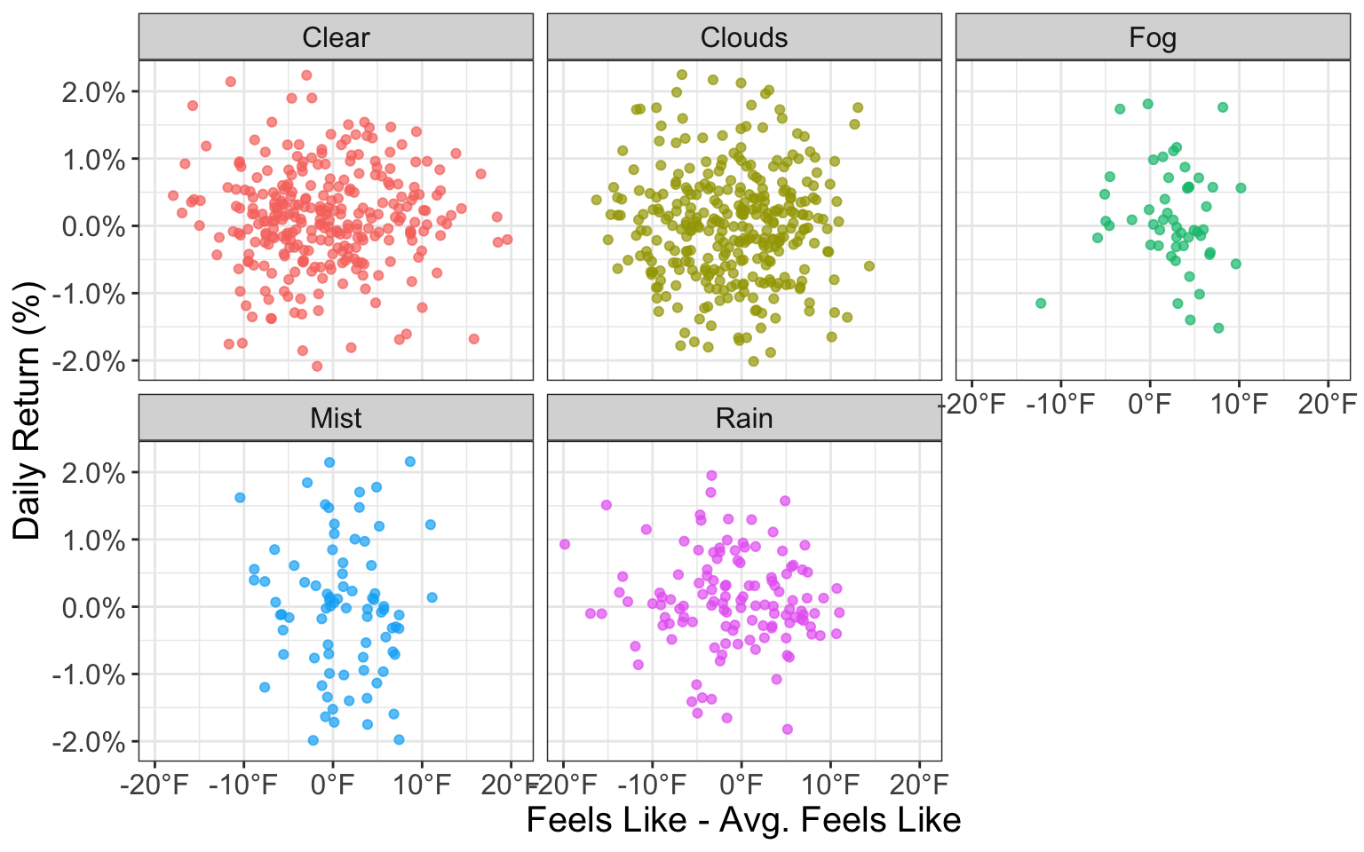
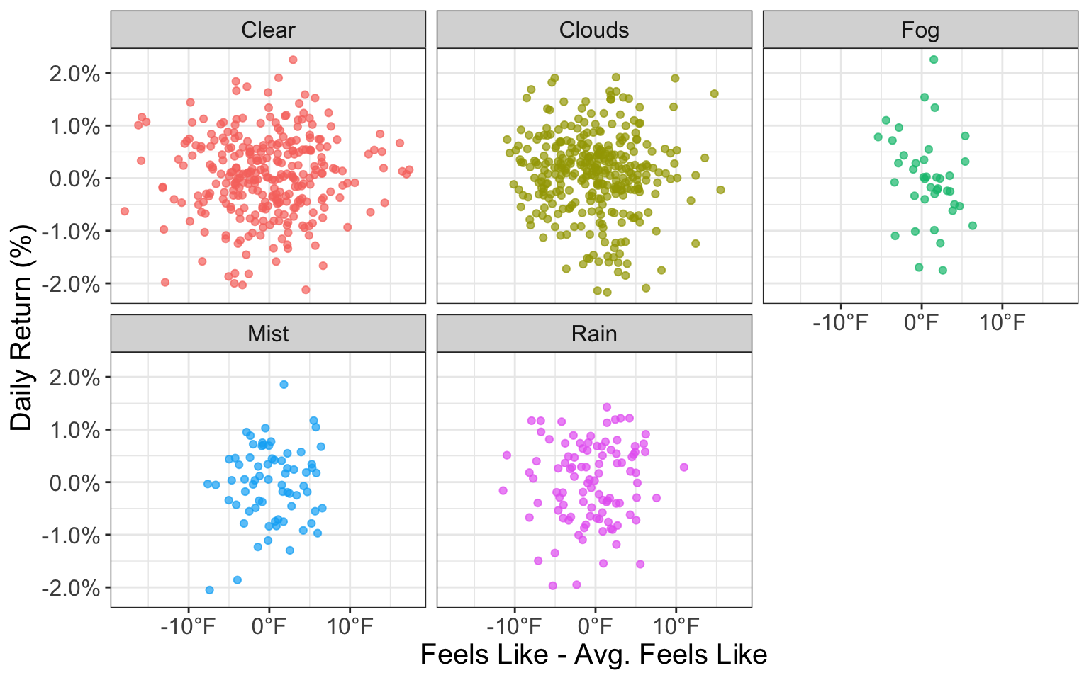
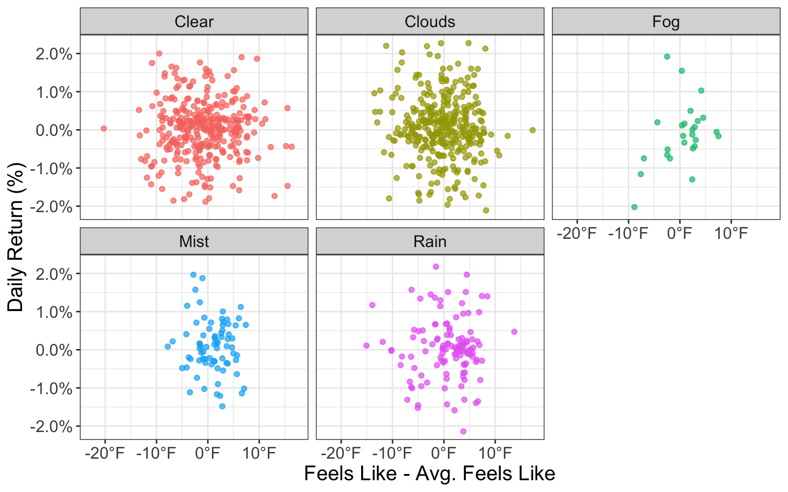
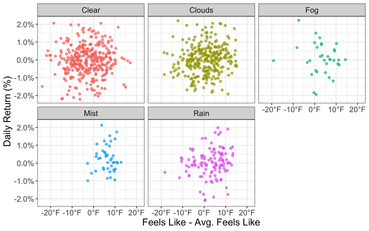
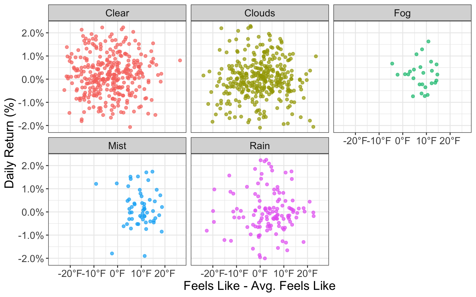
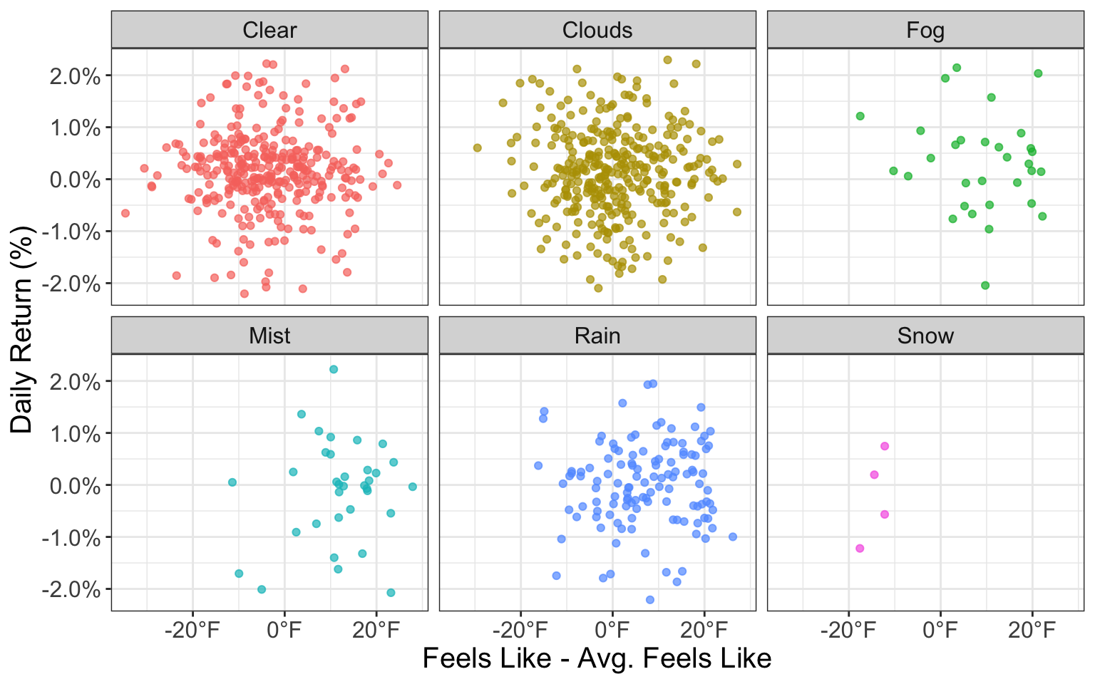
Let’s investigate if temperature differences have any impact on market returns…
The Impact of Temperature Differences
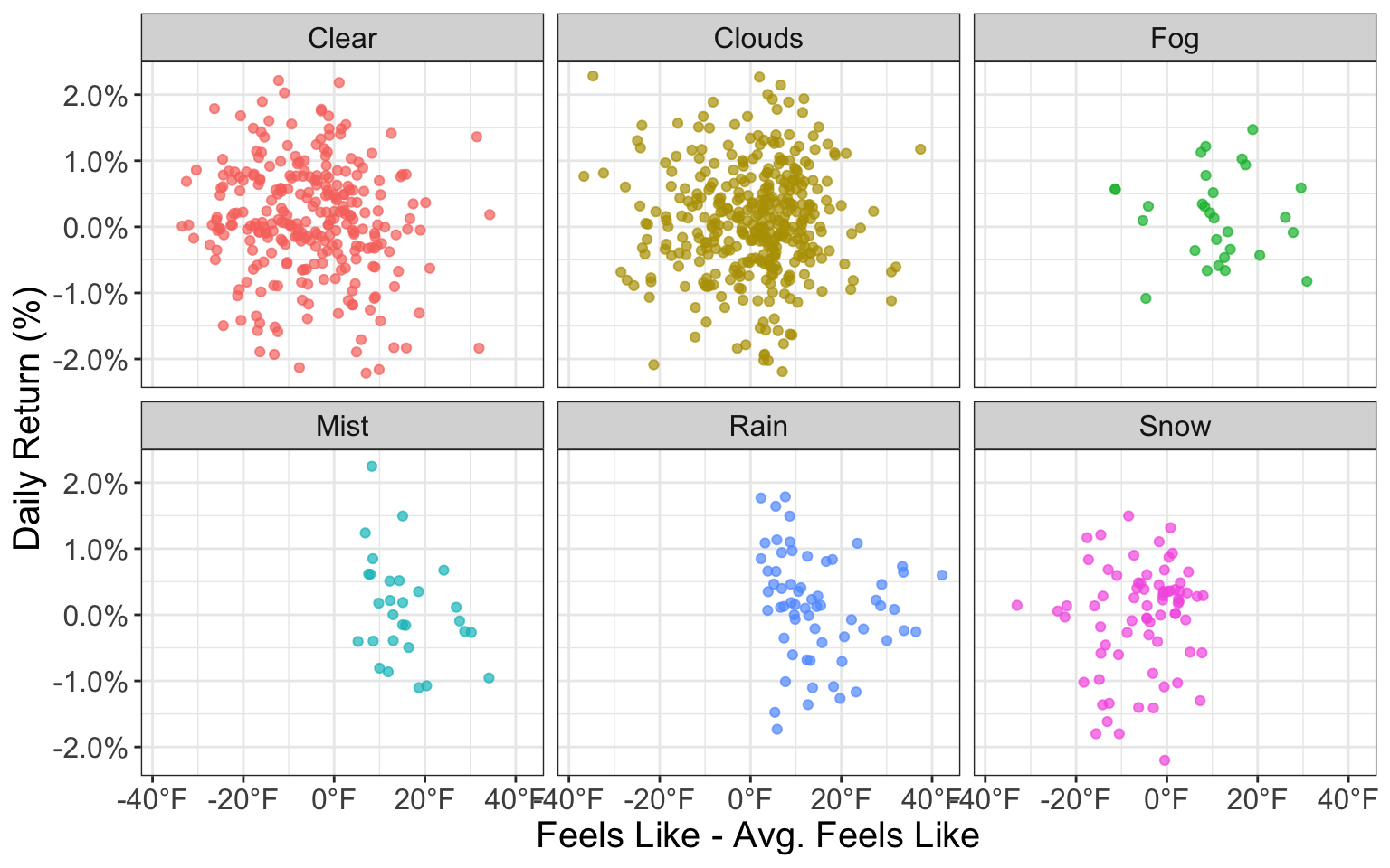
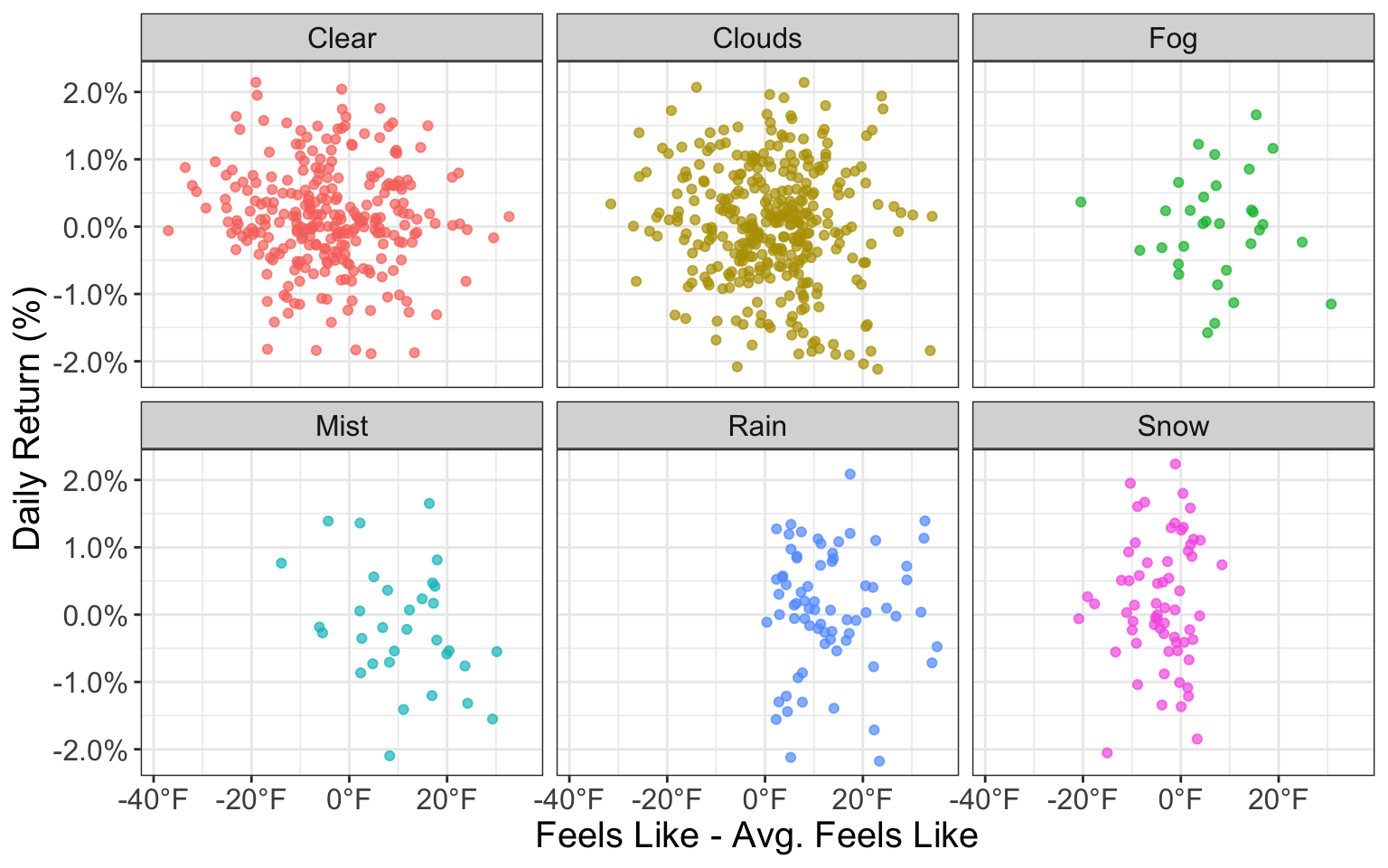
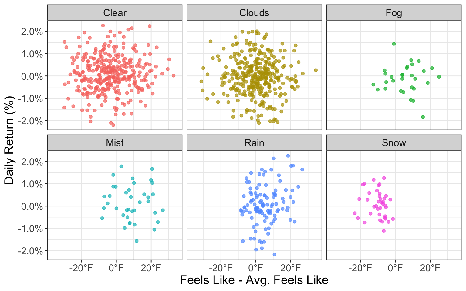
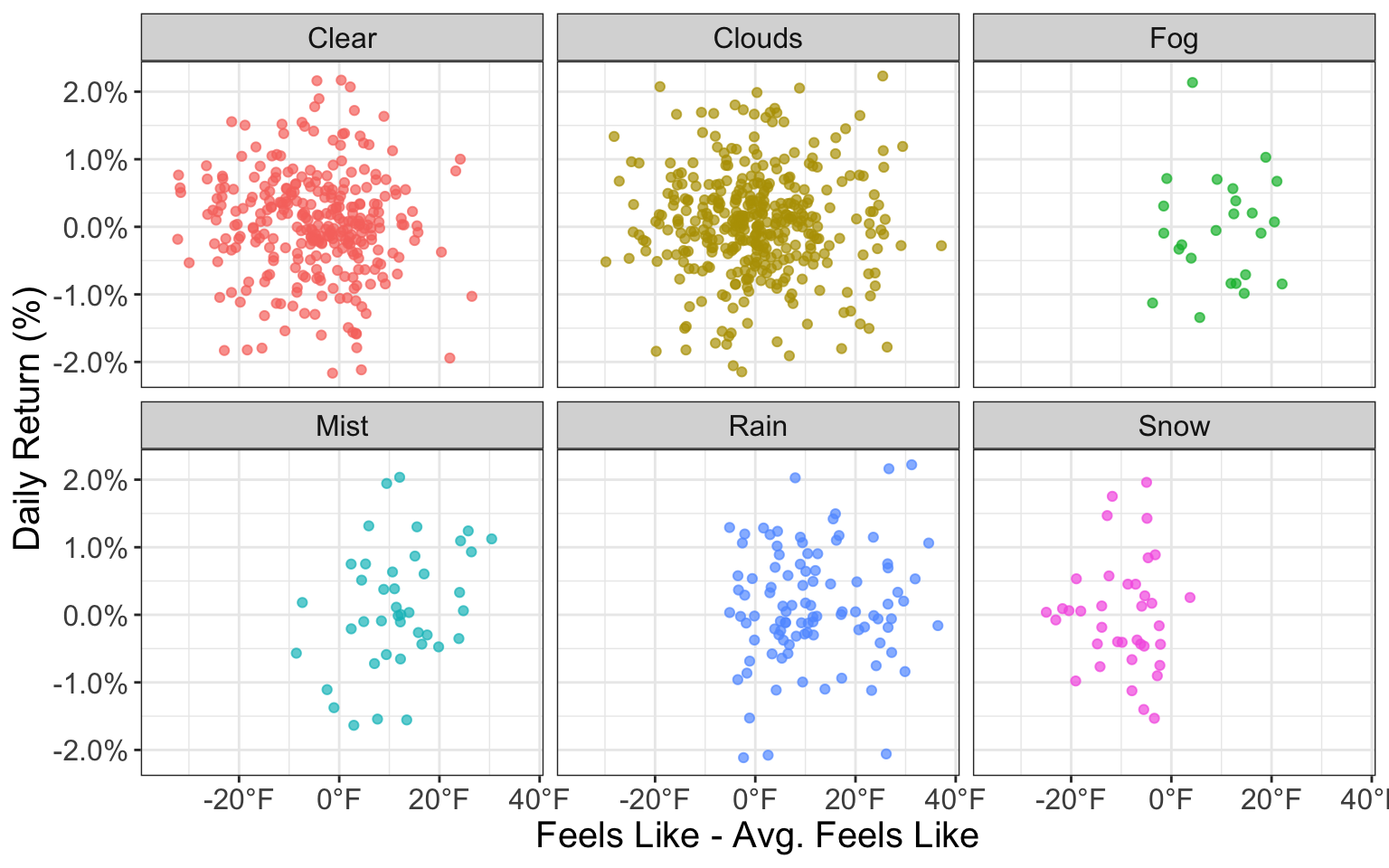
Let’s hypothesize that on days where it is colder than usual, returns are worse than days where it is warmer than usual. To quantify this hypothesis, let’s see if the difference of Feels Like from that month’s average Feels Like yields any interesting results on stock market returns:
Likewise, there is no evidence that variations in temperature can help explain daily stock returns.
Simple Modelling - Linear Regression
From our brief analysis above, it seems unlikely that we will be able to use weather data to model stock market returns accurately, but let’s run through a quick linear regression and examine the results.
Once again, we confirm that the weather cannot help explain variation in daily stock returns (with our model only explaining .7%). In fact, the month of the year seems to be more significant than the weather when explaining daily stock return variation.
Final Remarks
Evidently, there is no clear relationship between the weather and daily stock returns…
The above is intended as an exploration of historical data, and all statements and opinions are expressly my own; neither should be construed as investment advice.
Black lines represent the average of the group whereas the red line represents the average across all groupsBlack lines represent the average of the group whereas the red line represents the average across all groupsBlack lines represent the average of the group whereas the red line represents the average across all groupsBlack lines represent the average of the group whereas the red line represents the average across all groupsBlack lines represent the average of the group whereas the red line represents the average across all groupsBlack lines represent the average of the group whereas the red line represents the average across all groupsBlack lines represent the average of the group whereas the red line represents the average across all groupsBlack lines represent the average of the group whereas the red line represents the average across all groupsBlack lines represent the average of the group whereas the red line represents the average across all groupsBlack lines represent the average of the group whereas the red line represents the average across all groupsBlack lines represent the average of the group whereas the red line represents the average across all groupsBlack lines represent the average of the group whereas the red line represents the average across all groups