A Framework for Identifying Bubbles
Financial markets have experienced several notable financial bubbles in recent history. The Dot-Com bubble in 2001, the Great Financial Crisis in 2008, and the Tech bubble in 2022 are three examples. In each case, the period leading up to, during, and after the bubble’s collapse brought varying degrees of market volatility and returns. Investors who exited before the crash were able to achieve impressive returns, while those who remained in the market experienced significant losses. As such, it is valuable for investors to be able to identify where financial bubbles are forming and their stage of development to avoid potential losses.
In his book Principles for Navigating Big Debt Crises, Ray Dalio posits that markets are cyclical and that financial bubbles form for the same underlying reasons - healthy growth turns to unhealthy growth as entities over-lever which eventually yields the bust of a financial bubble; he outlines the following rough framework for identifying financial bubbles with the associated message:
At this point I want to emphasize that it is a mistake to think that any one metric can serve as an indicator of an impending debt crisis. The ratio of debt to income for the economy as a whole, or even debt service payments to income for the economy as a whole, which is better, are useful but ultimately inadequate measures. To anticipate a debt crisis well, one has to look at the specific debt-service abilities of the individual entities, which are lost in these averages. More specifically, a high level of debt or debt service to income is less problematic if the average is well distributed across the economy than if it is concentrated — especially if it is concentrated in key entities.
- Ray Dalio
While the above framework is tailored for large-scale economic bubbles that drastically affected national economies, we will extend, adapt, and apply this framework to create a Grand Financial Bubble Metric and identify financial bubbles within various sectors of the U.S. economy and markets.
Methods for Quantifying the Framework
The following table outlines certain figures that can help us measure each component of Dalio’s Rubric:
| Framework Component | Ways to Quantify |
|---|---|
| Are prices high relative to traditional measures? |
|
| Are prices discounting future rapid price appreciation? |
|
| Are purchases being financed by high leverage? |
|
| Are buyers/companies making forward purchases? |
|
| Have new participants entered the market? |
|
| Is there broad bullish sentiment? |
|
| Does tightening risk popping the bubble? |
|
Going forward, we will only consider the following framework components, as I believe they best encapsulate the main underpinnings of the framework and are simultaneously easy to quantify:
Are prices high relative to traditional measures?
Are purchases being financed w/ high leverage?
Have new participants entered the market?
Does monetary tightening risk popping the bubble?*
*We will qualitatively consider a variation of this section of the framework after building our Grand Financial Bubble Metric
The Data
In order to do this, I have collected:
Key figures from the Income Statements, Balance Sheets, and Cash Flow Statements of all the companies in the Russell 3000 Index since 1996, including the sector classification of each company
Global IPO data since 1993
Economic Data (GDP, Federal Funds Rate, etc.)
Here is a glimpse of each data-set:
| Year | Ticker | Name | Revenue | Cogs | Gross Profit | Interest Expense | Interest Income | Operating Income | Net Income |
|---|---|---|---|---|---|---|---|---|---|
| 2022 | A | Agilent Technologies Inc | $6,848M | $3,126M | $3,722M | $84M | $9M | $1,618M | $1,254M |
| 2022 | AA | Alcoa Corp | $12,152M | $9,153M | $2,999M | $195M | $0M | $949M | $429M |
| 2022 | AADI | Aadi Bioscience Inc | $1M | NA | NA | $1M | $0M | ($111M) | ($110M) |
| 2022 | AAL | American Airlines Group Inc | $29,882M | NA | NA | $1,800M | $18M | ($1,059M) | ($1,993M) |
| 2022 | AAN | Aaron’s Co Inc/The | $1,846M | $686M | $1,159M | $1M | $0M | $146M | $110M |
| 2022 | AAON | AAON Inc | $535M | $397M | $138M | $0M | $0M | $69M | $59M |
| 2022 | AAP | Advance Auto Parts Inc | $10,998M | $6,069M | $4,929M | $38M | $0M | $839M | $616M |
| 2022 | AAPL | Apple Inc | $394,328M | $223,546M | $170,782M | $2,931M | $2,825M | $119,437M | $99,803M |
| 2022 | AAT | American Assets Trust Inc | $376M | NA | NA | $59M | $0M | $100M | $37M |
| 2022 | AAWW | Atlas Air Worldwide Holdings Inc | $4,031M | $2,728M | $1,303M | $99M | $1M | $711M | $493M |
| Year | Ticker | Name | Current Assets | Non Current Assets | Total Assets | Inventory | Current Liabilities | Non Current Liabilities | Total Liabilities | St Debt | Lt Debt | Total Debt | Total Equity |
|---|---|---|---|---|---|---|---|---|---|---|---|---|---|
| 2022 | A | Agilent Technologies Inc | $3,778M | $6,754M | $10,532M | $1,038M | $1,861M | $3,366M | $5,227M | $87M | $2,834M | $2,921M | $5,305M |
| 2022 | AA | Alcoa Corp | $5,026M | $9,999M | $15,025M | $1,956M | $3,223M | $5,518M | $8,741M | $36M | $1,790M | $1,826M | $6,284M |
| 2022 | AADI | Aadi Bioscience Inc | $151M | $7M | $158M | $0M | $15M | $6M | $22M | $0M | $0M | $1M | $136M |
| 2022 | AAL | American Airlines Group Inc | $17,336M | $49,131M | $66,467M | $1,795M | $19,006M | $54,801M | $73,807M | $3,996M | $42,181M | $46,177M | ($7,340M) |
| 2022 | AAN | Aaron’s Co Inc/The | $824M | $617M | $1,441M | $772M | $245M | $478M | $723M | $95M | $320M | $415M | $718M |
| 2022 | AAON | AAON Inc | $218M | $432M | $650M | $130M | $87M | $97M | $184M | $0M | $40M | $40M | $466M |
| 2022 | AAP | Advance Auto Parts Inc | $6,275M | $5,919M | $12,194M | $4,659M | $5,180M | $3,886M | $9,066M | $465M | $3,372M | $3,837M | $3,128M |
| 2022 | AAPL | Apple Inc | $135,405M | $217,350M | $352,755M | $4,946M | $153,982M | $148,101M | $302,083M | $22,773M | $109,707M | $132,480M | $50,672M |
| 2022 | AAT | American Assets Trust Inc | NA | NA | $3,018M | NA | NA | NA | NA | $1,538M | $142M | $1,680M | $1,210M |
| 2022 | AAWW | Atlas Air Worldwide Holdings Inc | $1,326M | $5,117M | $6,443M | $0M | $1,420M | $2,214M | $3,634M | $695M | $1,821M | $2,516M | $2,809M |
| Year | Ticker | Name | Free Cash Flow | Capex |
|---|---|---|---|---|
| 2022 | A | Agilent Technologies Inc | $1,021M | ($291M) |
| 2022 | AA | Alcoa Corp | $530M | ($390M) |
| 2022 | AADI | Aadi Bioscience Inc | ($22M) | $0M |
| 2022 | AAL | American Airlines Group Inc | $496M | ($208M) |
| 2022 | AAN | Aaron’s Co Inc/The | $43M | ($93M) |
| 2022 | AAON | AAON Inc | $6M | ($55M) |
| 2022 | AAP | Advance Auto Parts Inc | $823M | ($290M) |
| 2022 | AAPL | Apple Inc | $111,443M | ($10,708M) |
| 2022 | AAT | American Assets Trust Inc | $64M | ($105M) |
| 2022 | AAWW | Atlas Air Worldwide Holdings Inc | $833M | ($90M) |
| Year | Ticker | Name | Num Employees | Price | Market Cap | Price To Sales | Price To Book | Price To Earnings | Num Shares | Inventory Turnover |
|---|---|---|---|---|---|---|---|---|---|---|
| 2022 | A | Agilent Technologies Inc | 18.1K | $150.04 | $40,813M | 6.0x | 7.7x | 29.4x | 295.00M | 3.3x |
| 2022 | AA | Alcoa Corp | 12.2K | $44.58 | $5,956M | 0.5x | 1.1x | 4.2x | 176.94M | 5.5x |
| 2022 | AADI | Aadi Bioscience Inc | 12 | $12.31 | $345M | 27.1x | 2.0x | NA | 24.40M | NA |
| 2022 | AAL | American Airlines Group Inc | 123.4K | $12.74 | $7,824M | 0.2x | NA | NA | 649.86M | NA |
| 2022 | AAN | Aaron’s Co Inc/The | 9.2K | $11.85 | $299M | 0.1x | 0.4x | 5.8x | 30.78M | 0.9x |
| 2022 | AAON | AAON Inc | 2.9K | $74.83 | $2,867M | 3.7x | 5.5x | 40.9x | 53.21M | 3.7x |
| 2022 | AAP | Advance Auto Parts Inc | 41.0K | $151.54 | $9,630M | 0.9x | 3.5x | 14.6x | 59.70M | 1.3x |
| 2022 | AAPL | Apple Inc | 164.0K | $125.07 | $2,398,369M | 6.2x | 47.3x | 24.6x | 15,943.43M | 38.8x |
| 2022 | AAT | American Assets Trust Inc | 208 | $26.51 | $1,557M | 3.7x | 1.3x | 36.2x | 60.53M | NA |
| 2022 | AAWW | Atlas Air Worldwide Holdings Inc | 4.1K | $101.25 | $2,711M | 0.6x | 0.9x | 7.2x | 28.36M | NA |
| Year | Ticker | Name | Classification 1 | Classification 2 | Classification 3 | Classification 4 | Classification 5 | Classification 6 | Classification 7 | Classification 8 |
|---|---|---|---|---|---|---|---|---|---|---|
| 2022 | A | Agilent Technologies Inc | Health Care | Health Care | Medical Equipment & Devices | Life Science & Diagnostics | Life Science Equipment | Life Science Equipment | Life Science Equipment | Life Science Equipment |
| 2022 | AA | Alcoa Corp | Materials | Materials | Metals & Mining | Base Metals | Aluminum | Aluminum | Aluminum | Aluminum |
| 2022 | AADI | Aadi Bioscience Inc | Health Care | Health Care | Biotech & Pharma | Biotech | Biotech | Biotech | Biotech | Biotech |
| 2022 | AAL | American Airlines Group Inc | Industrials | Industrial Services | Transportation & Logistics | Airlines | Full Service Airline | Full Service Airline | Full Service Airline | Full Service Airline |
| 2022 | AAN | Aaron’s Co Inc/The | Consumer Discretionary | Consumer Discretionary Services | Consumer Services | Consumer Goods Rental | Consumer Goods Rental | Consumer Goods Rental | Consumer Goods Rental | Consumer Goods Rental |
| 2022 | AAON | AAON Inc | Industrials | Industrial Products | Electrical Equipment | Comml & Res Bldg Equip & Sys | HVAC Building Products | A/C Heating & Fridge Equip | A/C Heating & Fridge Equip | A/C Heating & Fridge Equip |
| 2022 | AAP | Advance Auto Parts Inc | Consumer Discretionary | Retail & Whsle - Discretionary | Retail - Discretionary | Automotive Retailers | Auto Parts & Accessories Stores | Auto Parts & Accessories Stores | Auto Parts & Accessories Stores | Auto Parts & Accessories Stores |
| 2022 | AAPL | Apple Inc | Technology | Tech Hardware & Semiconductors | Technology Hardware | Communications Equipment | Mobile Phones | Mobile Phones | Mobile Phones | Mobile Phones |
| 2022 | AAT | American Assets Trust Inc | Real Estate | Real Estate | REIT | Multi Asset Class REIT | Multi Asset Class REIT | Multi Asset Class REIT | Multi Asset Class REIT | Multi Asset Class REIT |
| 2022 | AAWW | Atlas Air Worldwide Holdings Inc | Industrials | Industrial Services | Transportation & Logistics | Air Freight | Air Freight | Air Freight | Air Freight | Air Freight |
| Announced Date | Ticker | Issuer Name | Size | Classification 1 |
|---|---|---|---|---|
| 2021-10-01 | RIVN US EQUITY | Rivian Automotive Inc | $13,724,100,000M | Consumer Discretionary |
| 2021-10-04 | GFS US EQUITY | GLOBALFOUNDRIES Inc | $2,855,160,000M | Technology |
| 2021-07-01 | HOOD US EQUITY | Robinhood Markets Inc | $2,255,460,000M | Financials |
| 2021-06-24 | SPNGU US EQUITY | Spinning Eagle Acquisition Cor | $2,000,000,000M | Financials |
| 2021-08-27 | OLPX US EQUITY | Olaplex Holdings Inc | $1,779,850,000M | Consumer Staples |
| 2022-03-28 | CRBG US EQUITY | Corebridge Financial Inc | $1,680,000,000M | Financials |
| 2021-06-21 | RYAN US EQUITY | Ryan Specialty Holdings Inc | $1,538,220,000M | Financials |
| 2021-06-03 | S US EQUITY | SentinelOne Inc | $1,408,750,000M | Technology |
| 2021-11-04 | HCP US EQUITY | HashiCorp Inc | $1,322,400,000M | Technology |
| 2021-10-15 | HTZ US EQUITY | Hertz Global Holdings Inc | $1,291,080,000M | Consumer Discretionary |
Quantifying the Framework
In the following, we will inspect each element of the framework with the data available to us:
1) Prices are High Relative to Traditional Measures
Let’s take a look at the historical P/S, P/B, and P/E ratios of each sector. To do this, we will plot the median value of these ratios since 1995 for different sectors while also aggregating by company size according to the following schema:
| Small Cap | Market Cap between 0th-40th Percentile for its Sector |
| Mid Cap | Market Cap between 40th-80th Percentile for its Sector |
| Large Cap | Market Cap between 80th-95th Percentile for its Sector |
| Ultra-Large Cap | Market Cap between 95th-100th Percentile for its Sector |
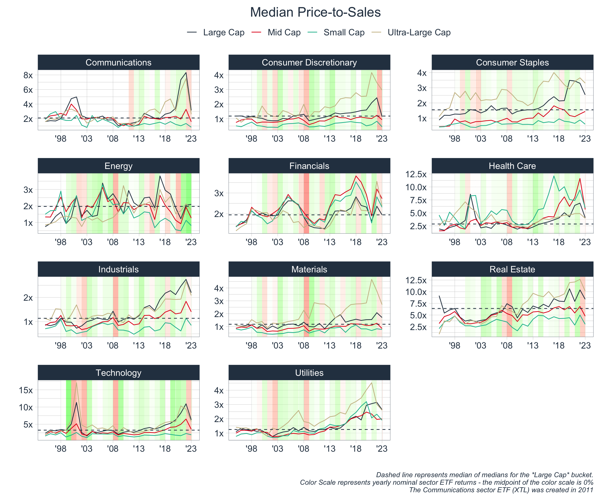
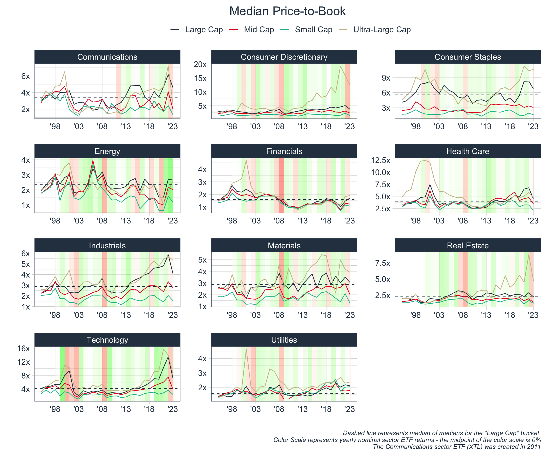
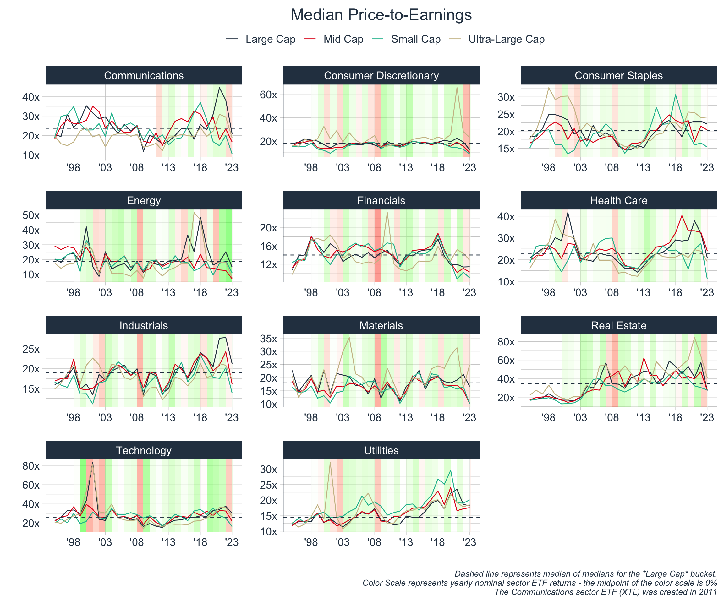
The above is overwhelming, but it does paint the general picture that financial bubbles have formed when prices are high relative to traditional measures. For instance, the Dot-Com Bubble of ’00/’01 is seen most uniformly in the above with high price ratios across the board.
However, let’s try to represent the data in a more concise and standardized fashion.
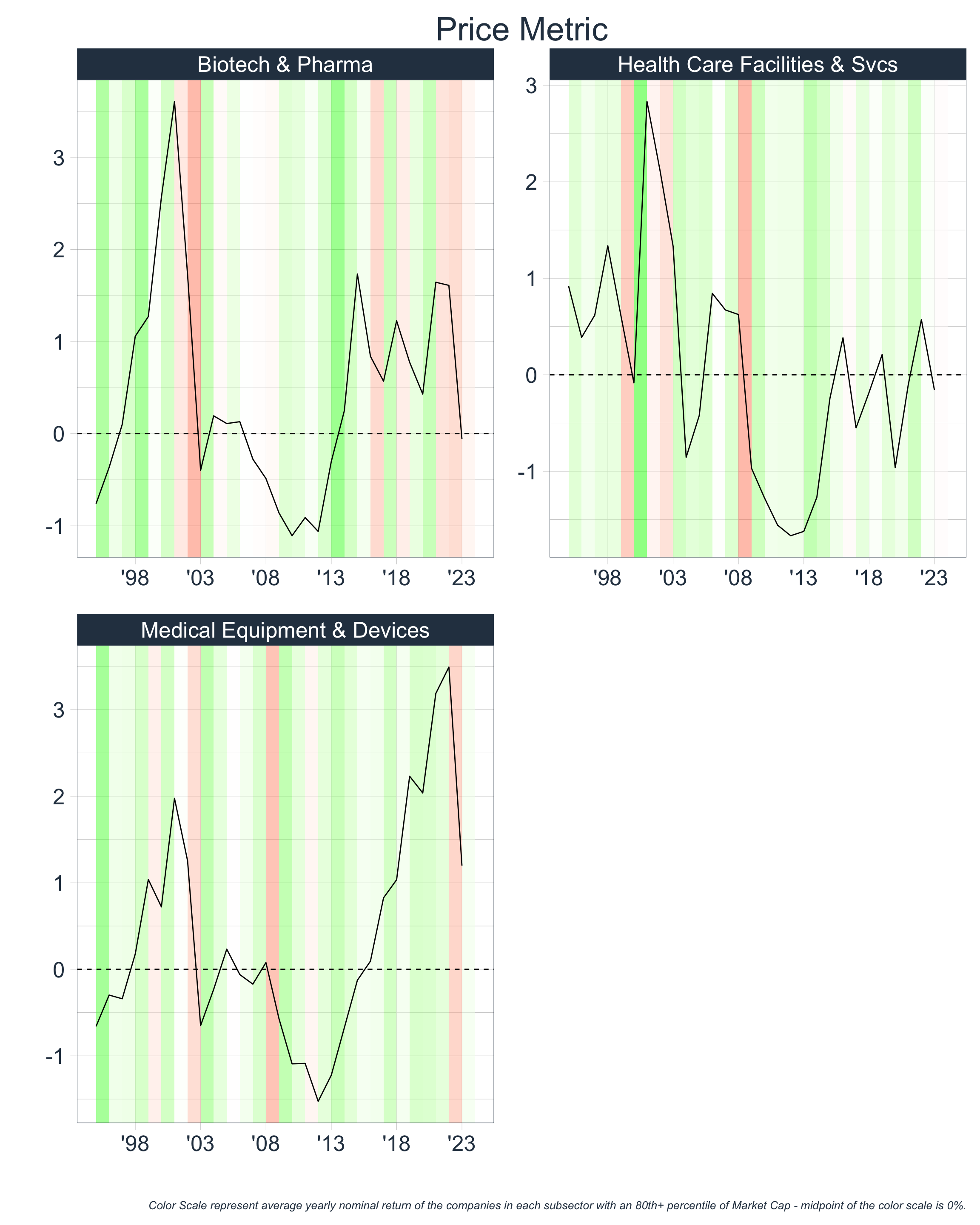
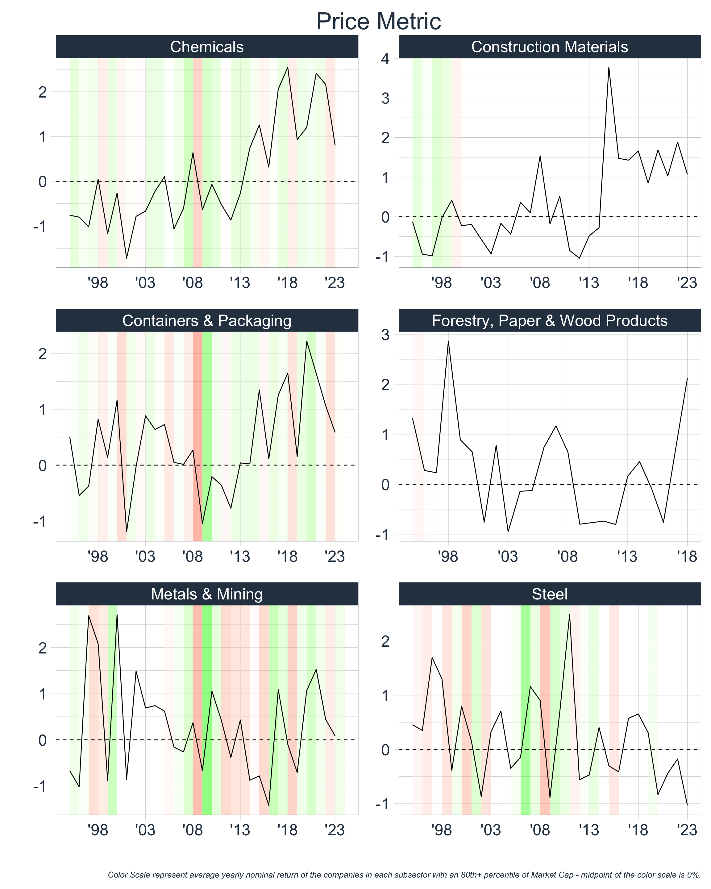
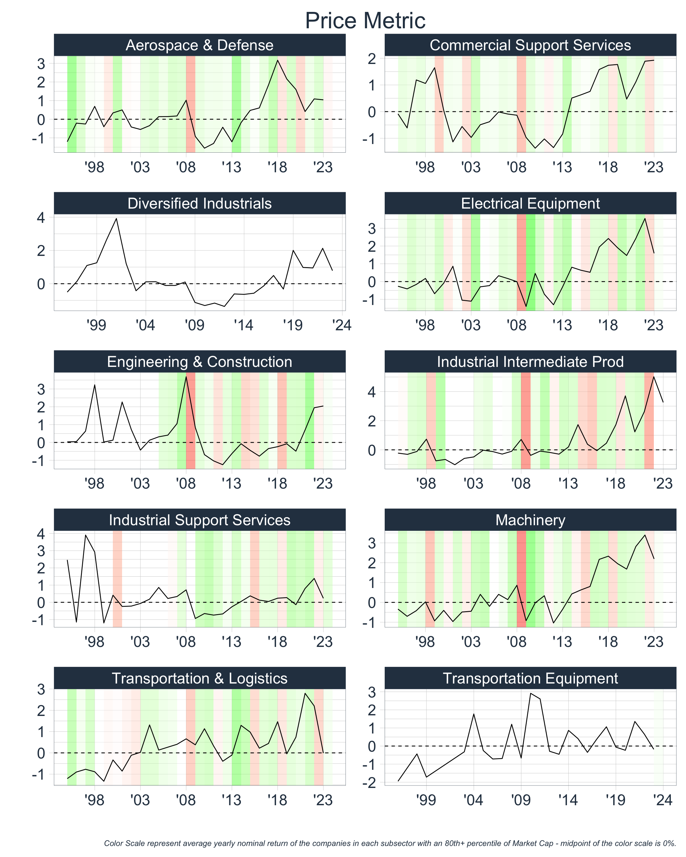
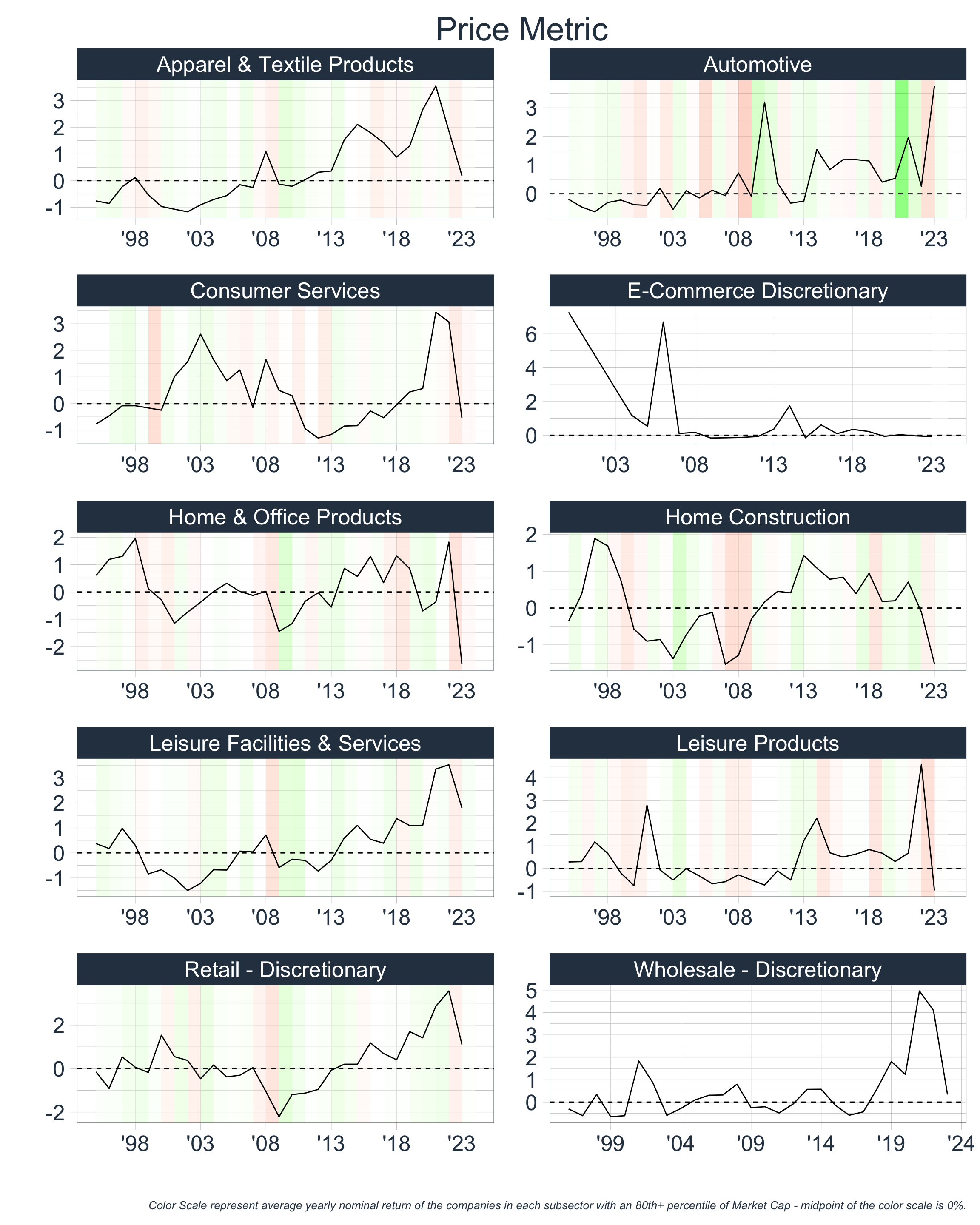
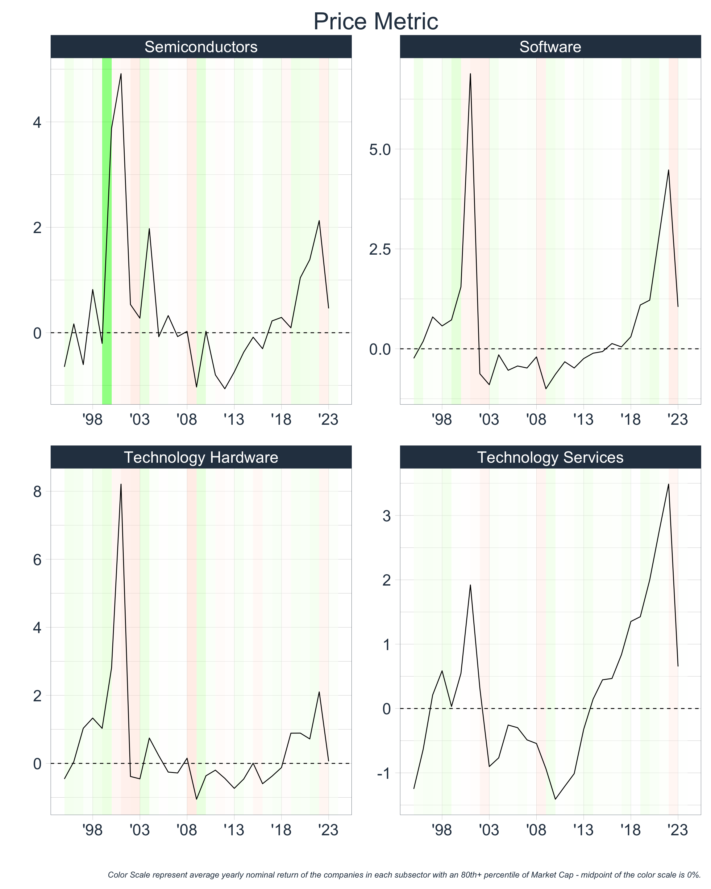
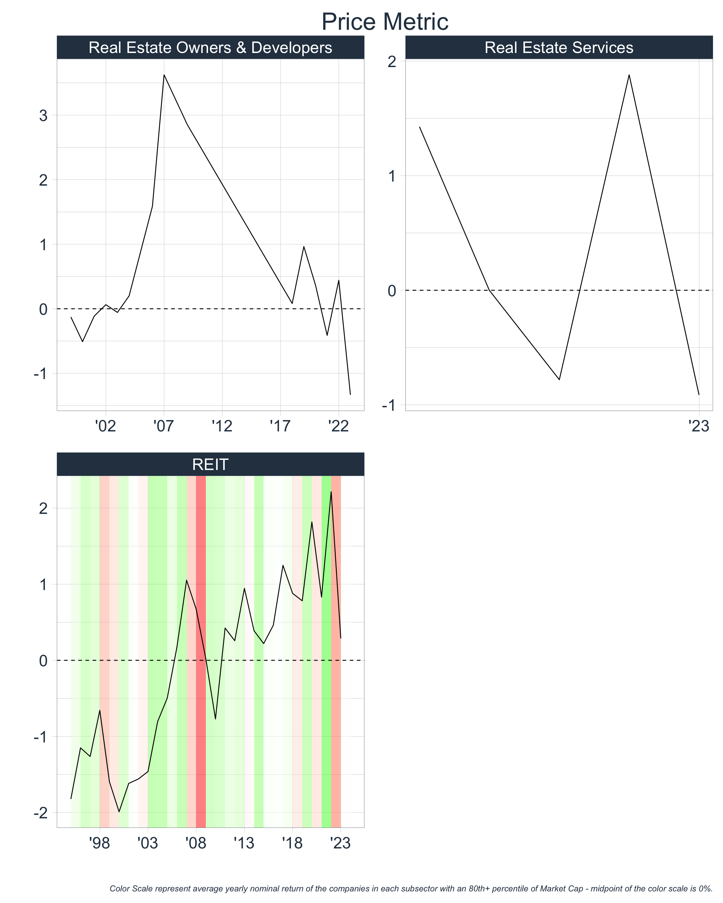
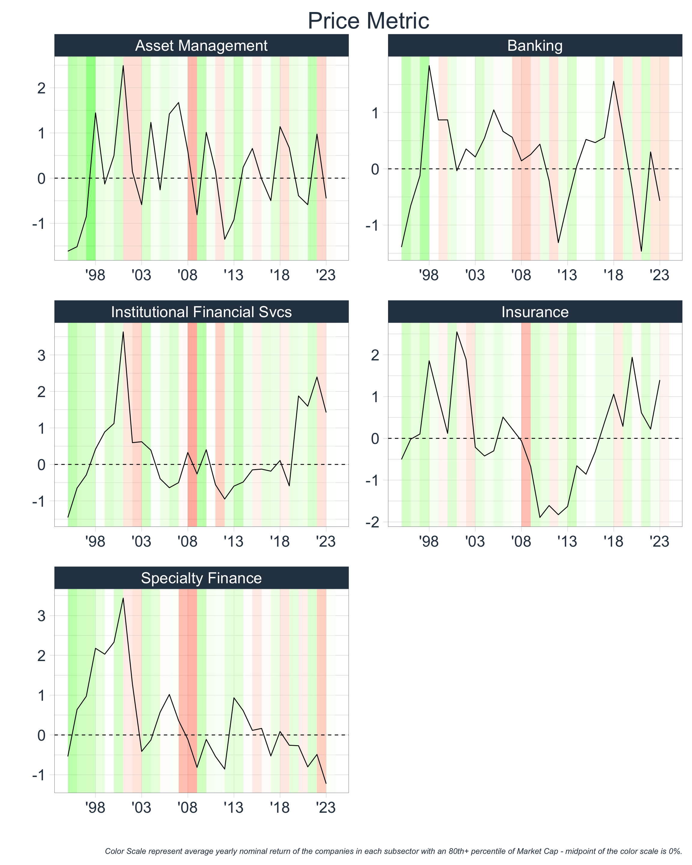
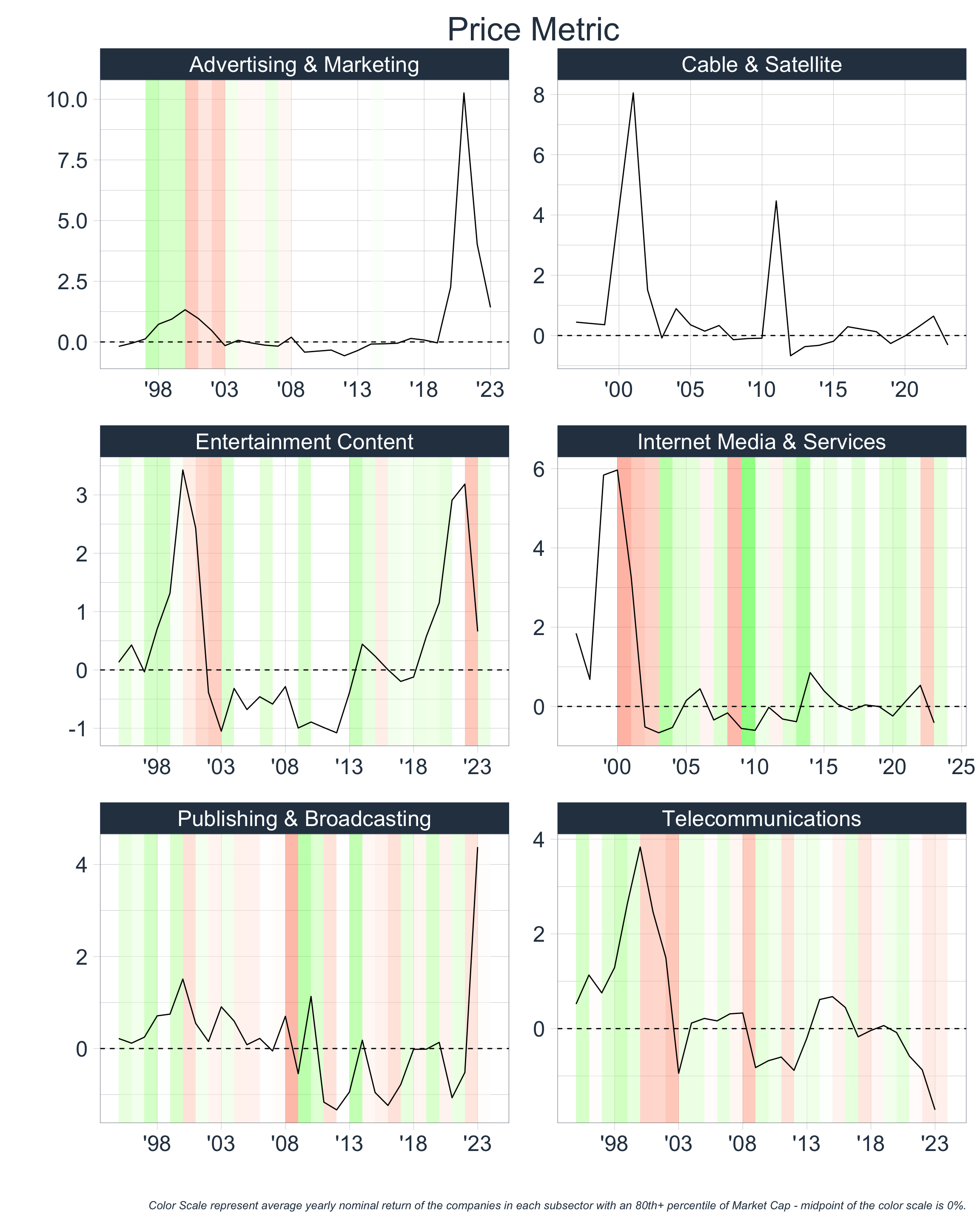
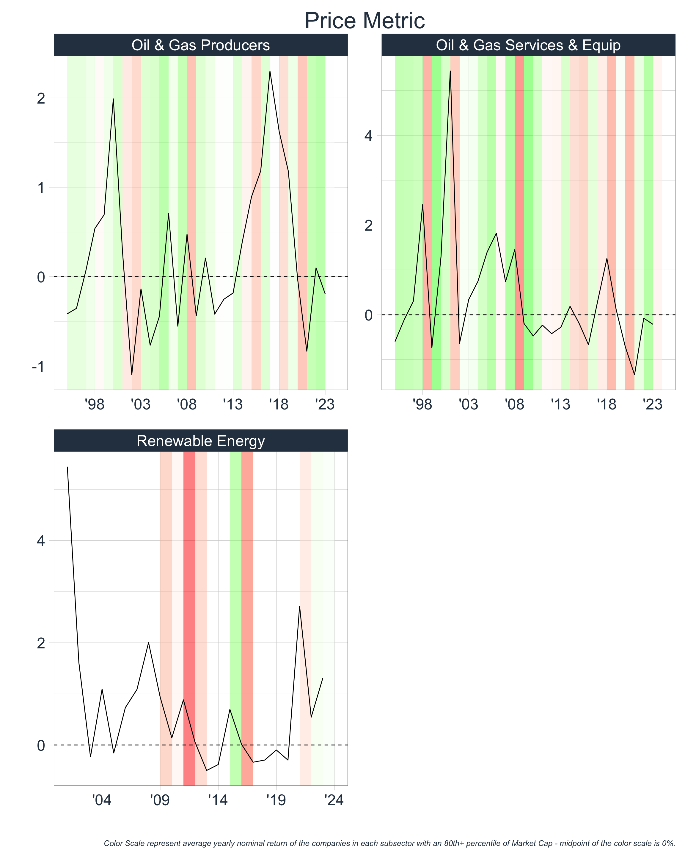
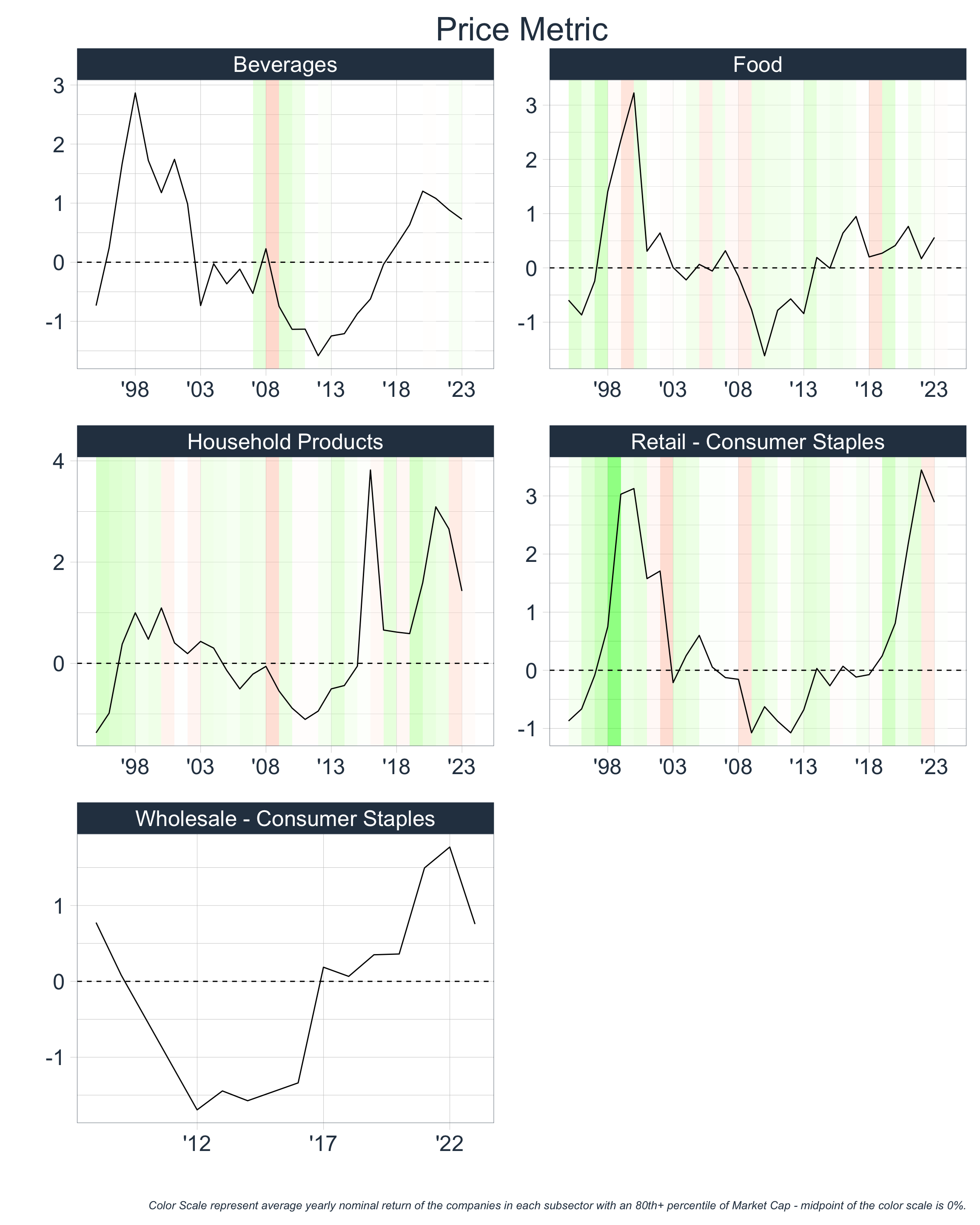
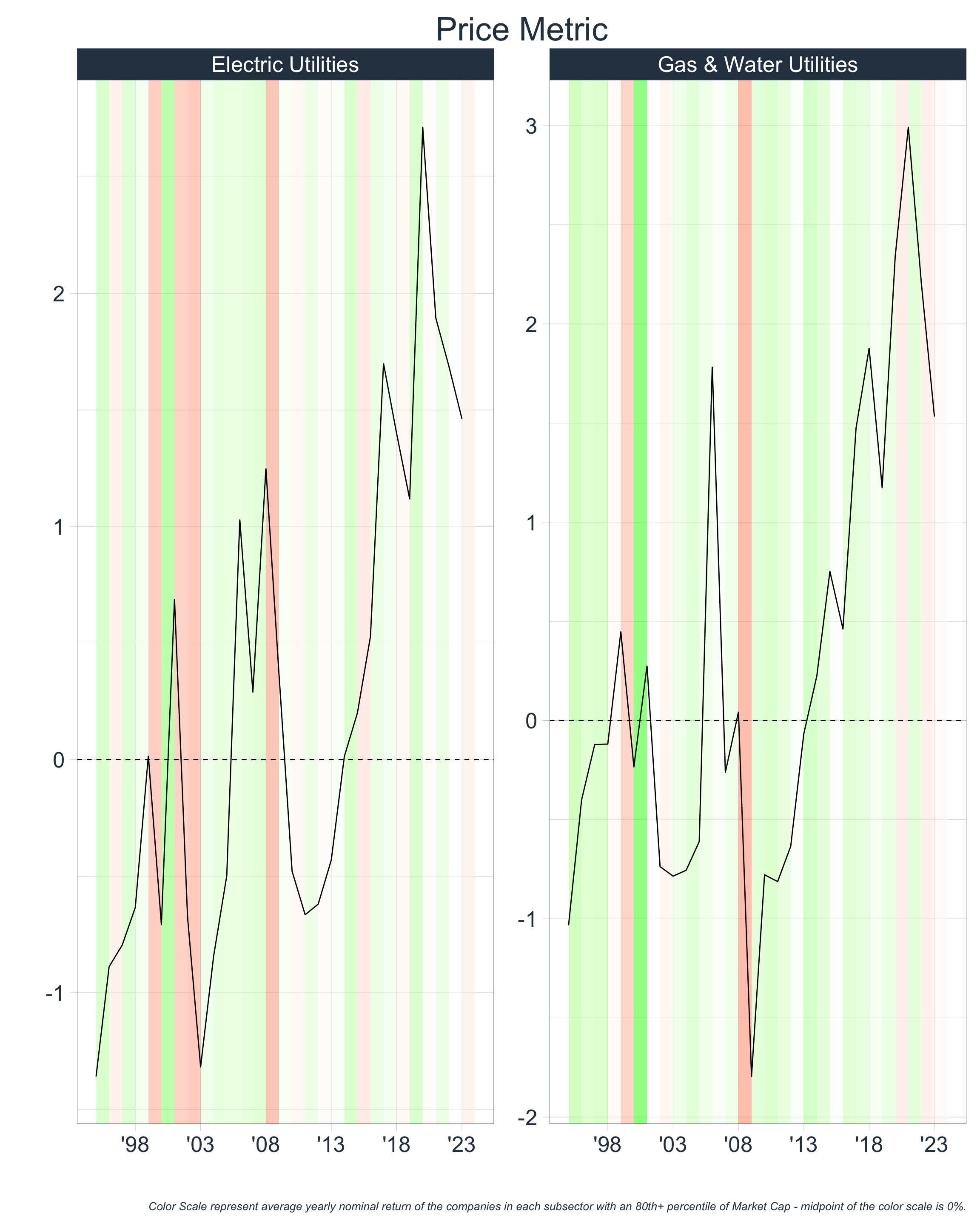
Creating a Price Metric
Let’s create a standard Price Metric by:
- Calculating the distance of each of these ratios from a median line
- Dividing this distance by the average absolute distance from the median line
- Averaging the standardized distances for the P/S, P/B, & P/E ratios together to a create a single
Price Metric
By doing this we will have a rough estimation of how elevated prices are for each of these sectors and market cap buckets.

Takeaways:
From eye-balling the above charts we can conclude that the following sectors were highly priced relative to traditional measures:
| Sector | Time Periods |
|---|---|
| Communications | ’99 - ’01, ’20 - ’22 |
| Consumer Discretionary | ’20 - ’22 |
| Consumer Staples | ’97 - ’02, ’22 |
| Energy | ’00, ’17 - ’18 |
| Financials | ’98 - ’02, ’18 |
| Health Care | ’98-’02, ’20 - ’22 |
| Industrials | ’20 - ’22 |
| Materials | ’20 - ’22 |
| Real Estate | ’19 - ’22 |
| Technology | ’99 - ’02, ’20 - ’23 |
| Utilities | ’01, ’07, ’18 - ’23 |
As we continue through our framework, we will see if the same time periods resurface.
Digging Deeper
Now that we have time periods in which certain broad sectors were highly priced, we can repeat the above at a more granular level. This is important since large values can be washed away in averages when aggregating at broader hierarchical sector levels. For instance, we could have a high price metric of +3 for Semiconductors and a low metric of -3 for Software; if these were the only two sub-sectors in the Technology space, then the price metric for Technology would likely lie around 0. This scenario is much different from one wherein both Semiconductors and Software have price metrics of 0, which would also consequently yield a price metric of around 0 for Technology.
In the following, we consider only Large Cap and Ultra-Large Cap as there are fewer companies in each bucket when aggregating at a more granular sector level:
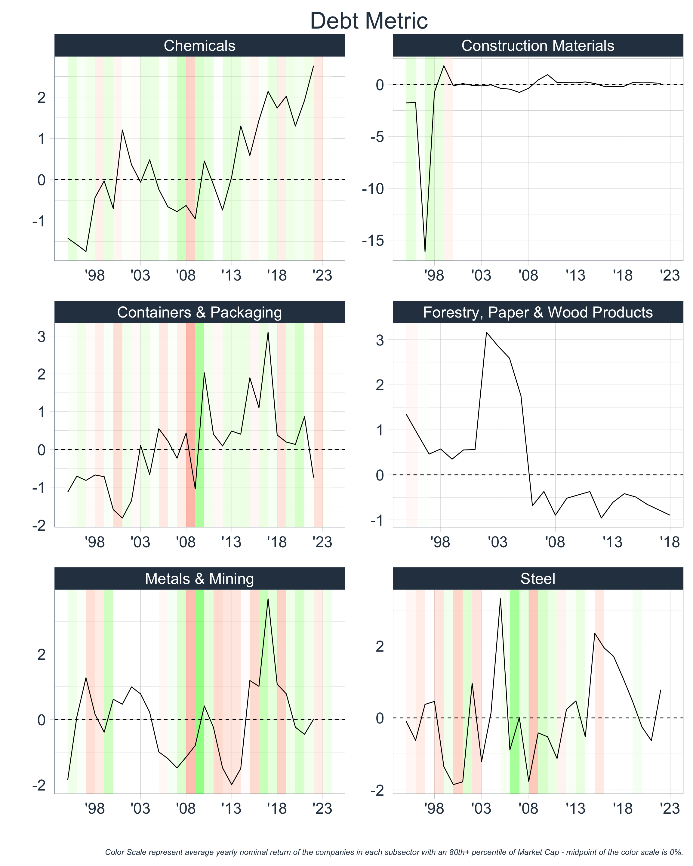
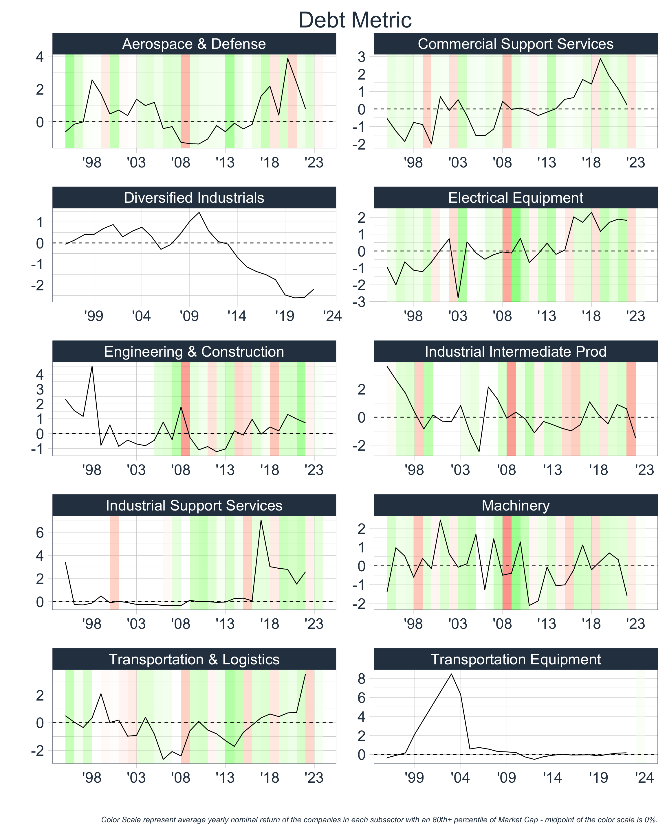
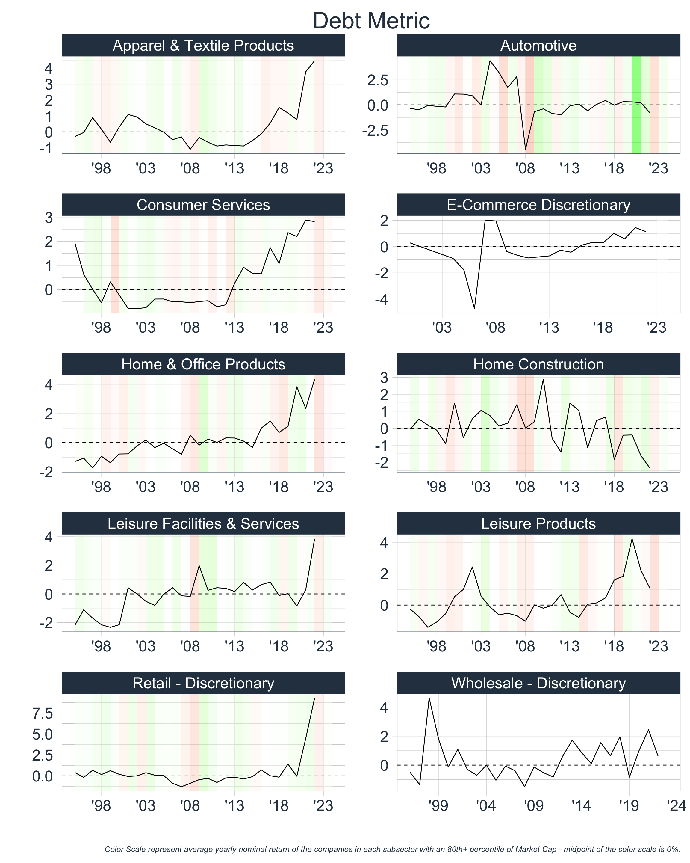
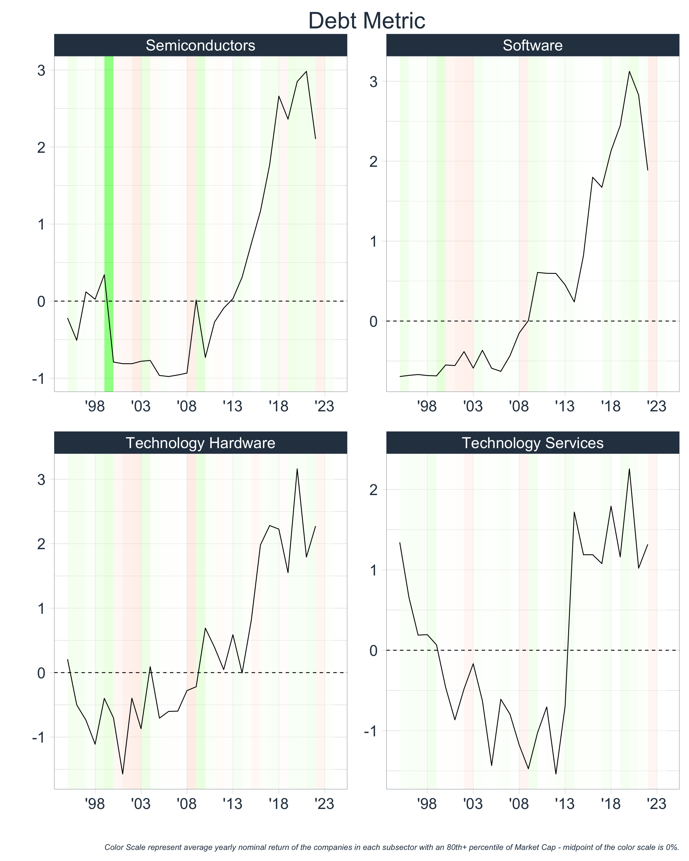
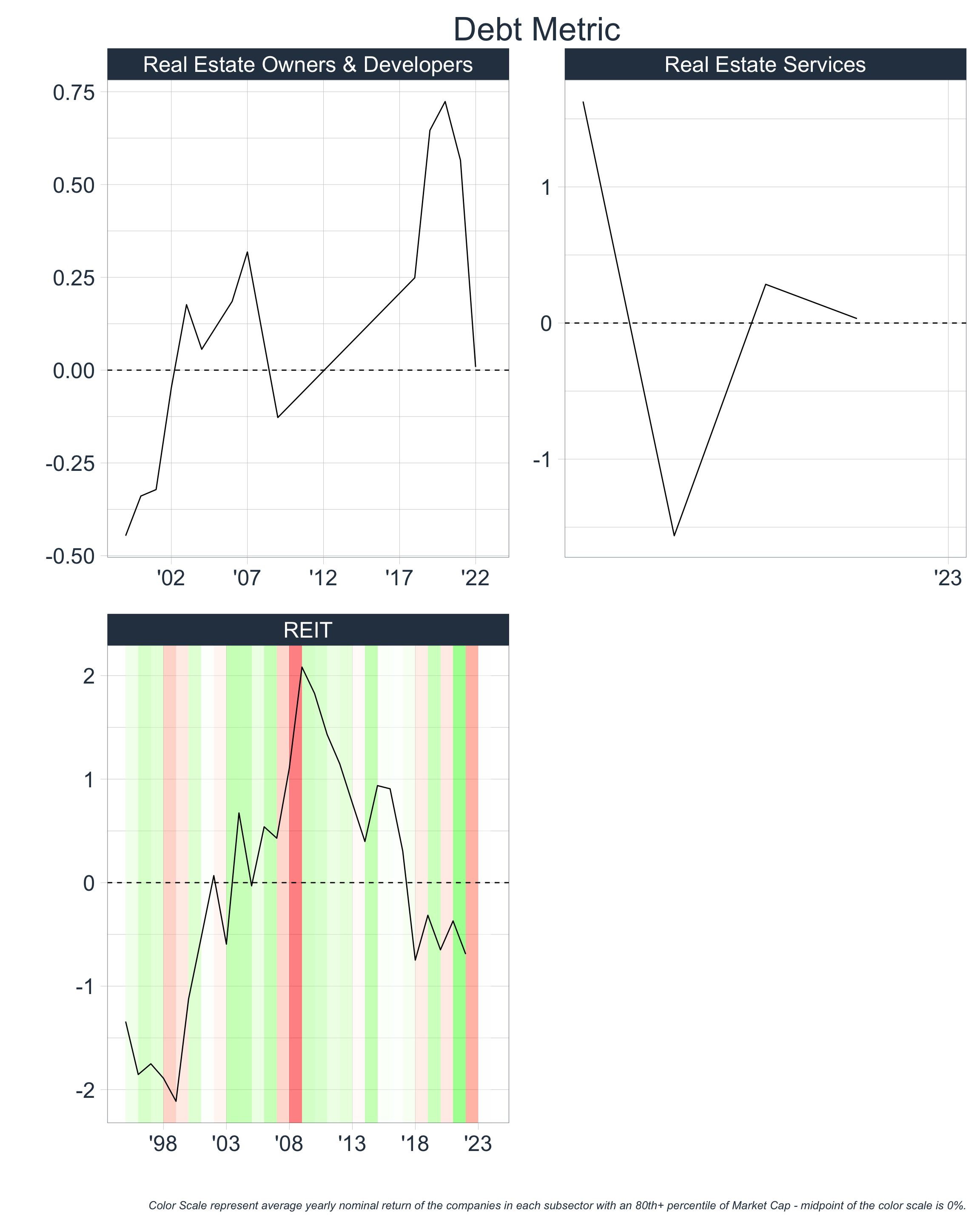
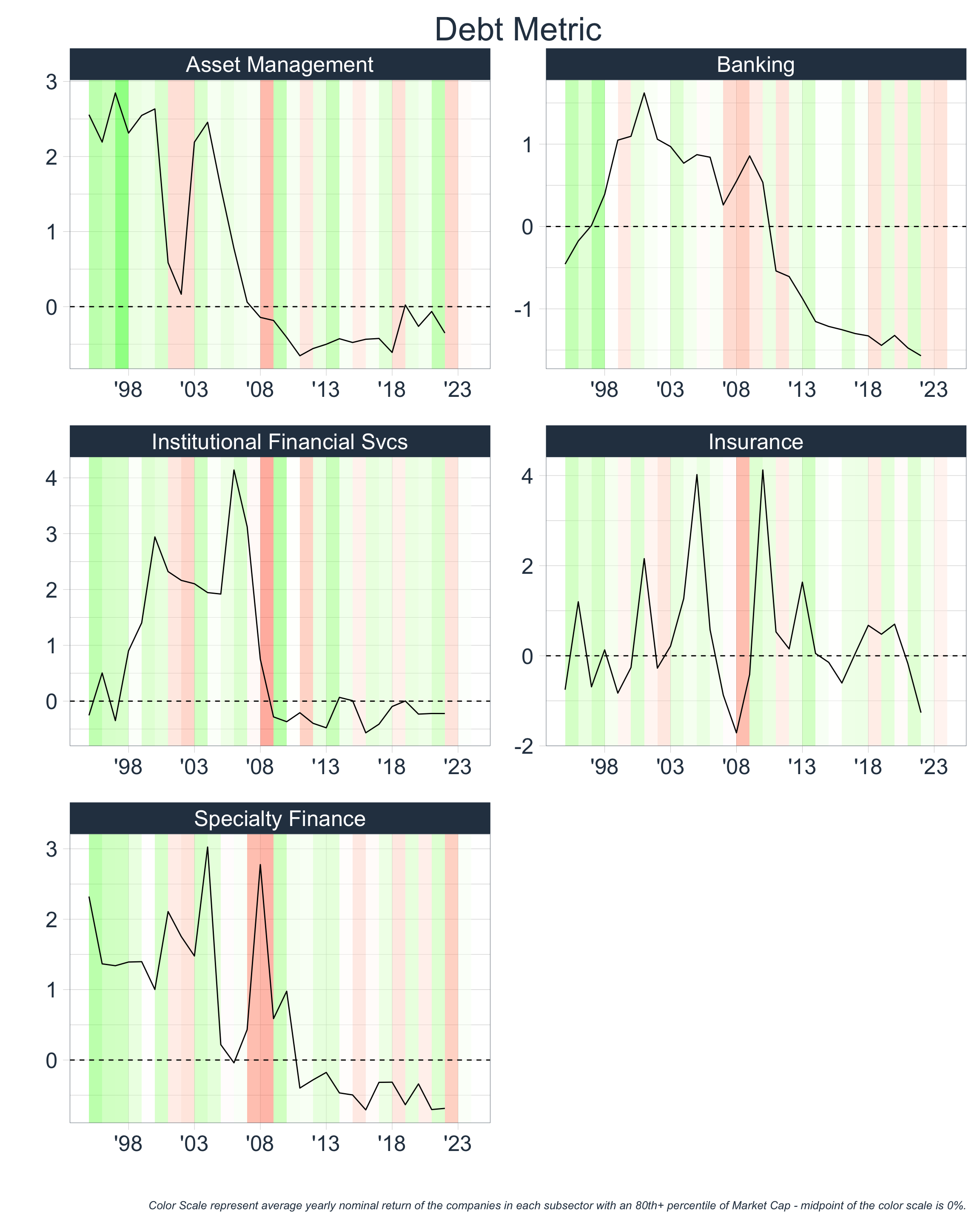
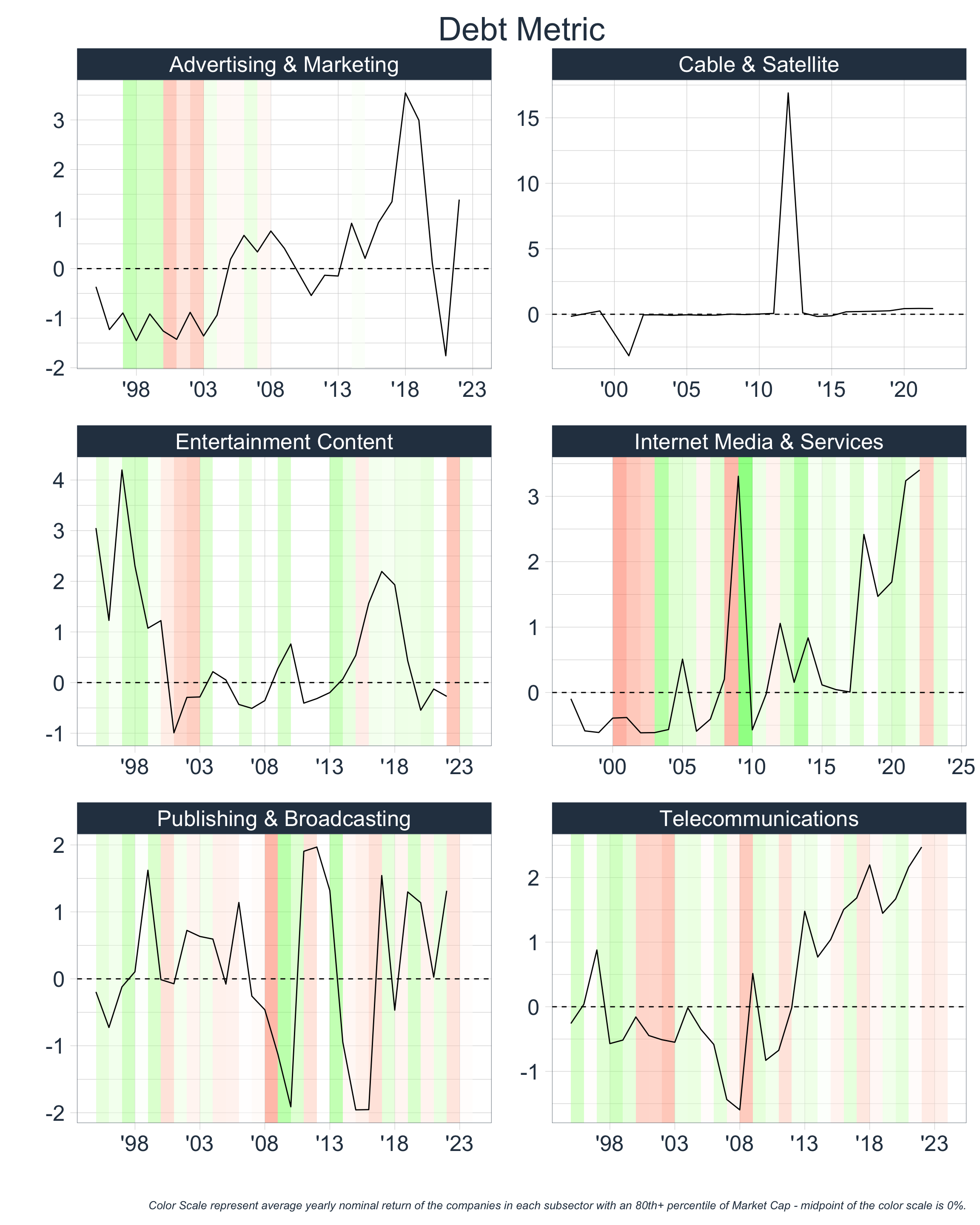
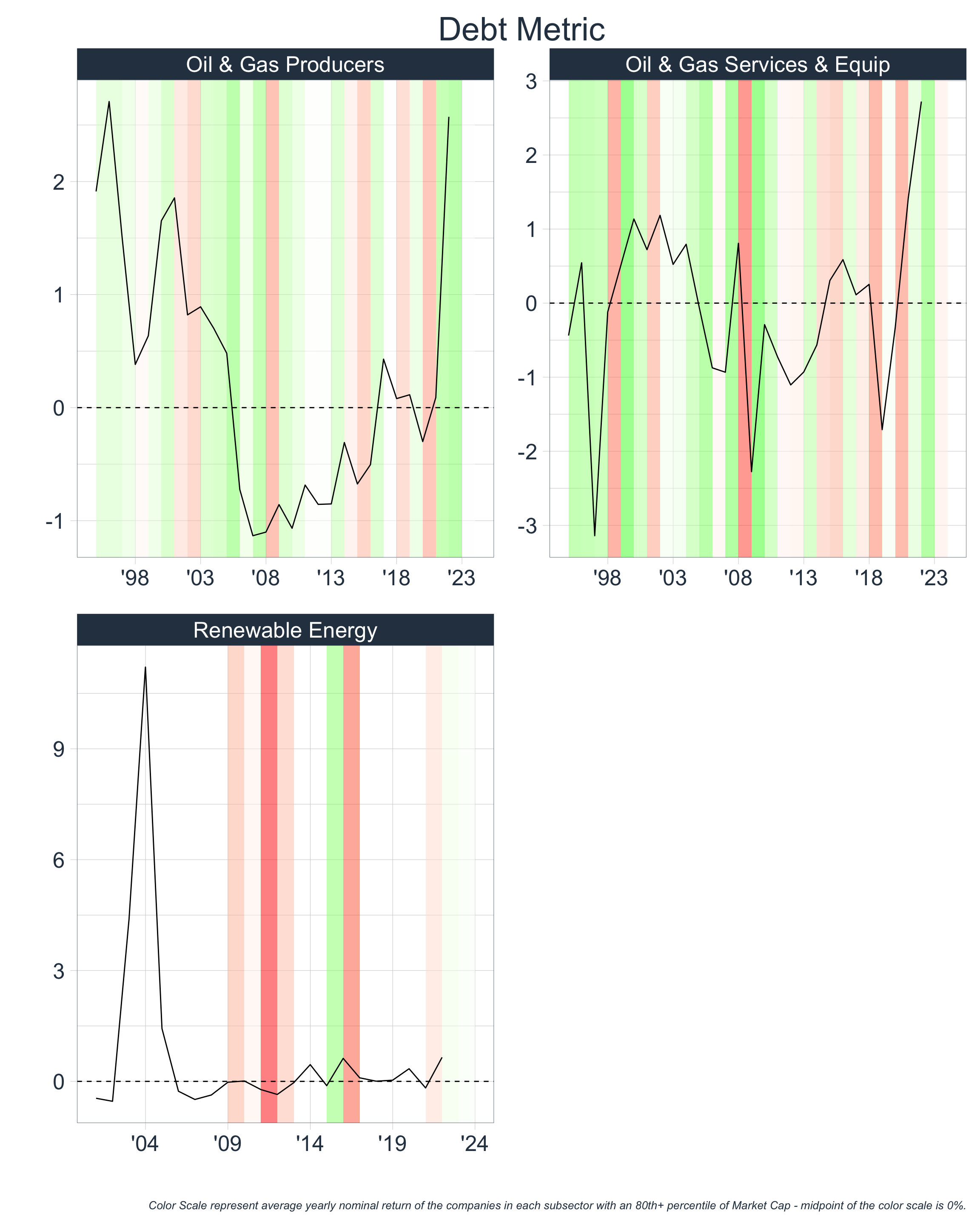
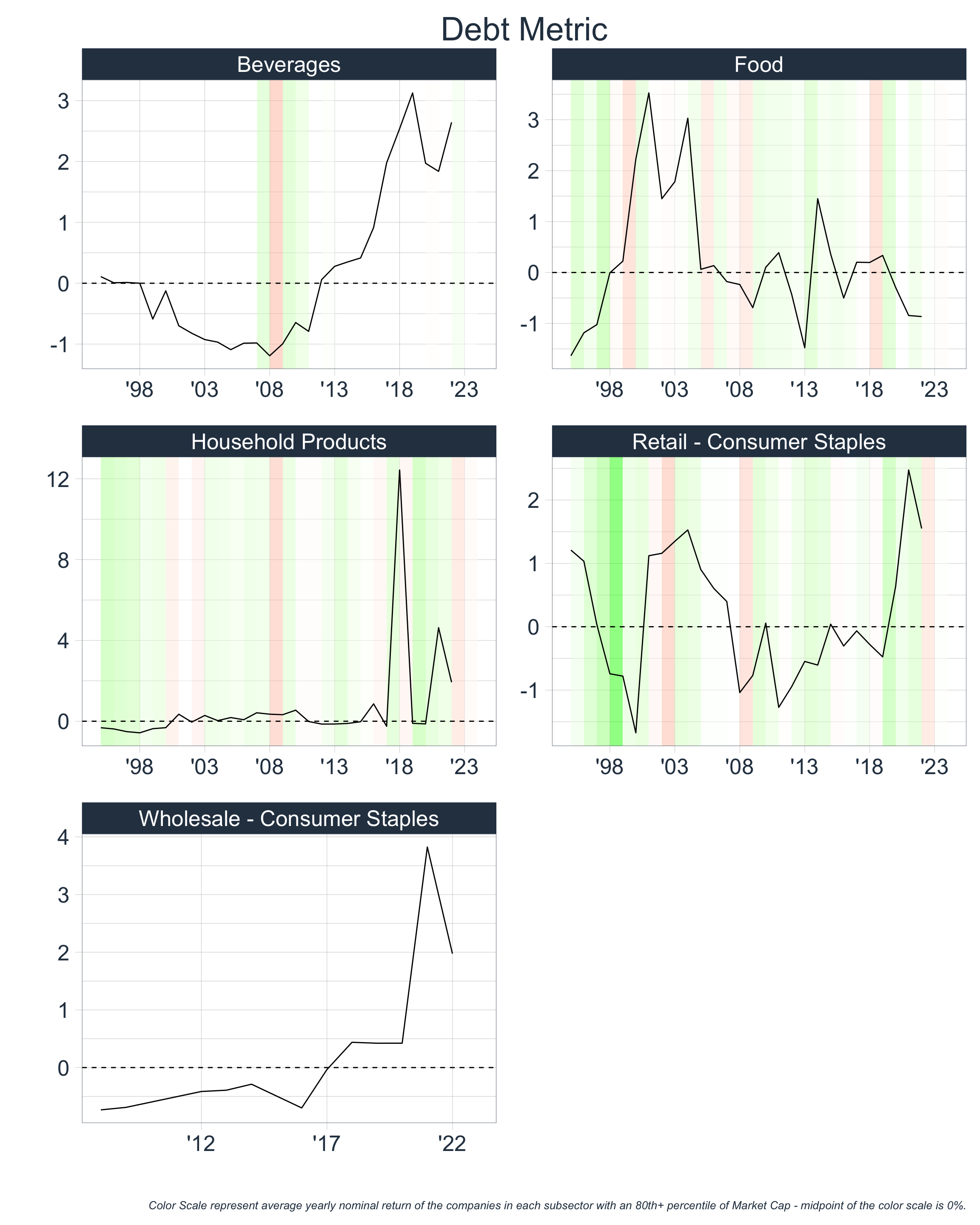
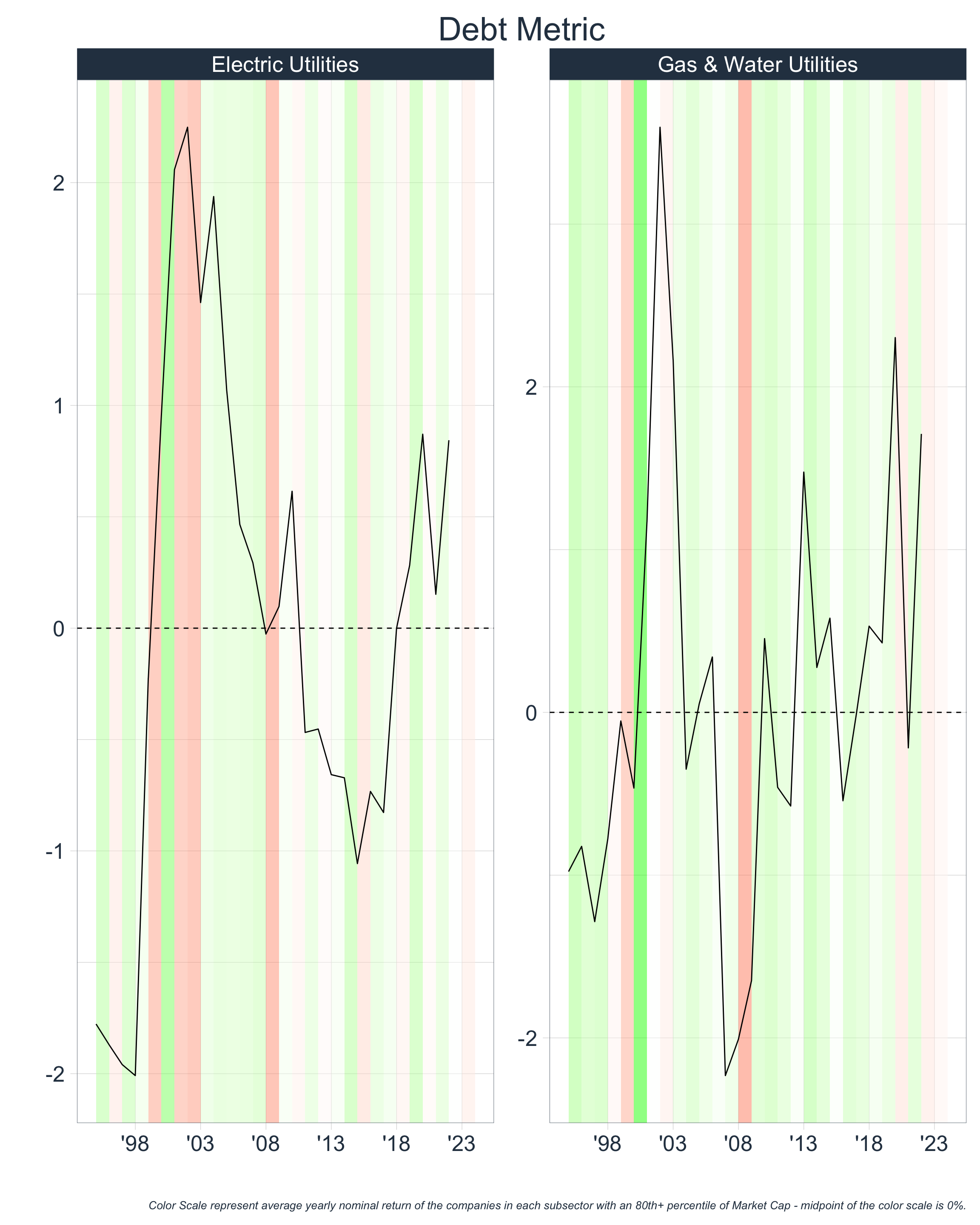
2) Purchases are Being Financed w/ High Leverage
Let’s take a look at the historical debt levels of each sector since 1995. Once again, we will aggregate by company size and plot the median value for different sectors. In this section we will consider two metrics to assess debt levels:
The first metric aims to represent leverage at the company level, whereas the second metric aims to represent the significance of that debt in relation to the size of the general economy.
In the second metric, we consider the average debt level as a ratio to GDP because the number of companies within each sector of the Russell 3000 varies each year. Therefore, simply calculating the sum for each year could overstate debt levels for years in which there are more companies than usual. Instead, we hope to measure this in isolation in the section 3) New entrants are entering the market.
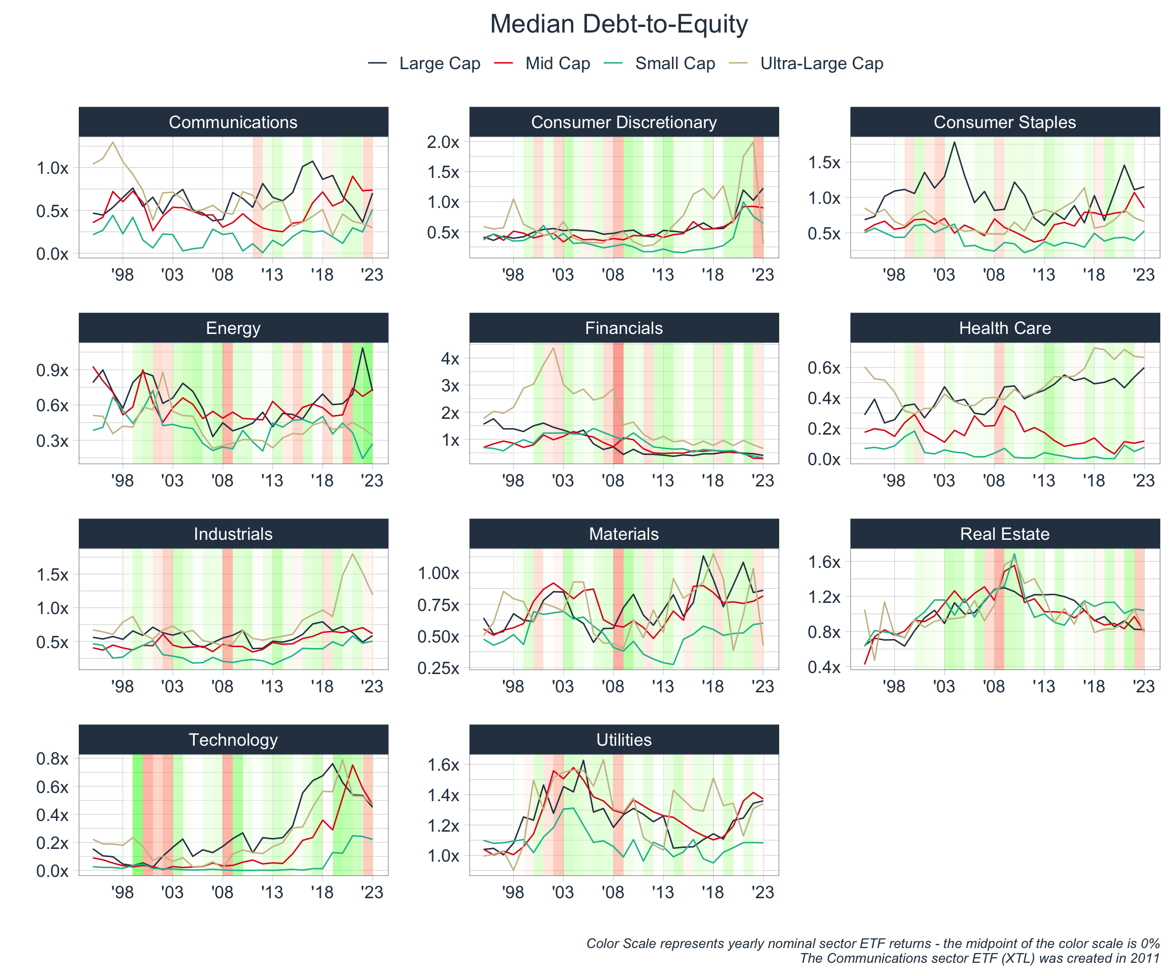
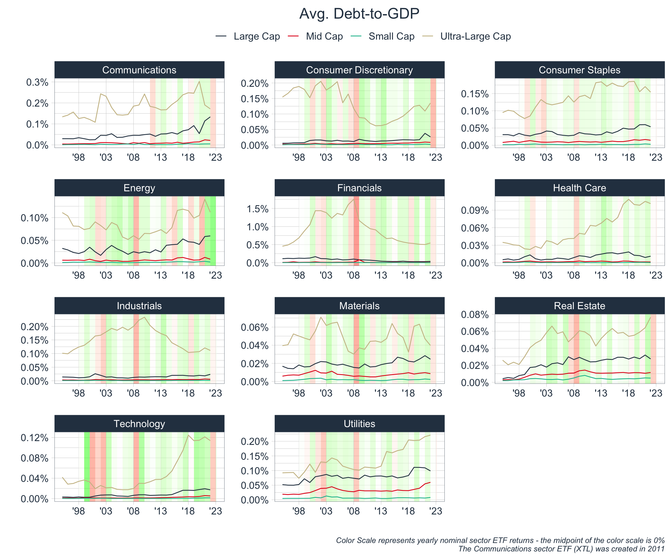
While the data is not crystal clear, the above generally corroborates the idea that financial bubbles have formed during times of increased leverage. Again, let’s try to represent the data in a more concise and standard fashion.
Creating a Debt Metric
Let’s create a standard Debt Metric by:
- Calculating the distance of each of these ratios from a median line
- Dividing this distance by the average absolute distance from the median line
- Averaging the standardized distances for Metric 1 & Metric 2 with the respective weights of 90% and 10%*
*Metric 1 is more stationary and cyclical; therefore, we are giving it a greater weight as it will be more reliable when measuring absolute debt levels.
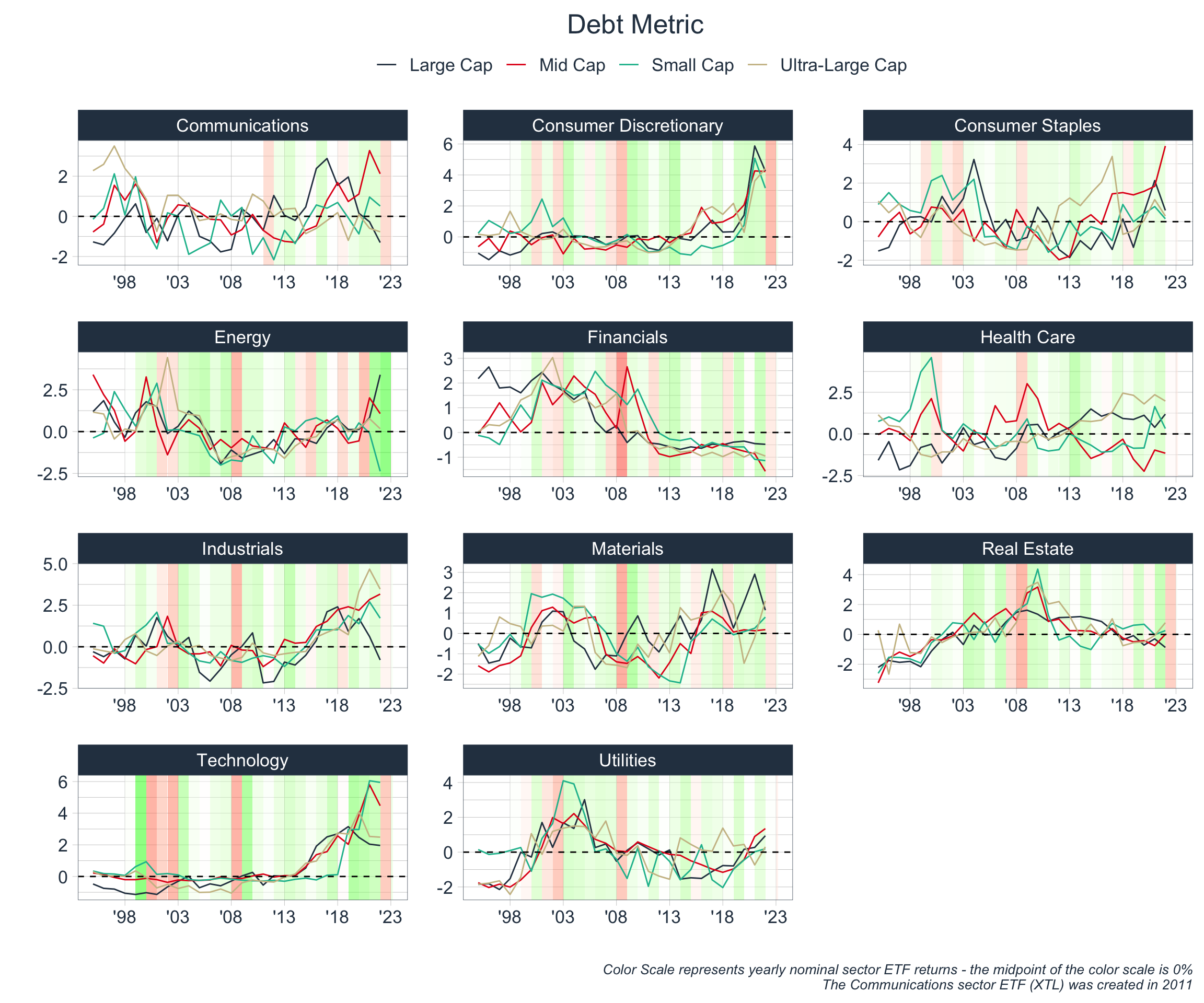
Takeaways:
Let’s repeat our process and identify time periods where debt levels were high in each sector:
| Sector | Time Periods |
|---|---|
| Communications | ’97 - ’99, ’02, ’10, ’18 - ’21 |
| Consumer Discretionary | ’18, ’20-’22 |
| Consumer Staples | |
| Energy | ’01, ’03, ’19 - ’22 |
| Financials | ’01 - ’09 |
| Health Care | ’18 - ’23 |
| Industrials | ’09, ’19-’23 |
| Materials | ’01 - ’03, ’15, ’21 |
| Real Estate | ’08-’10 |
| Technology | ’18 - ’23 |
| Utilities | ’03 - ’05, ’18 - ’23 |
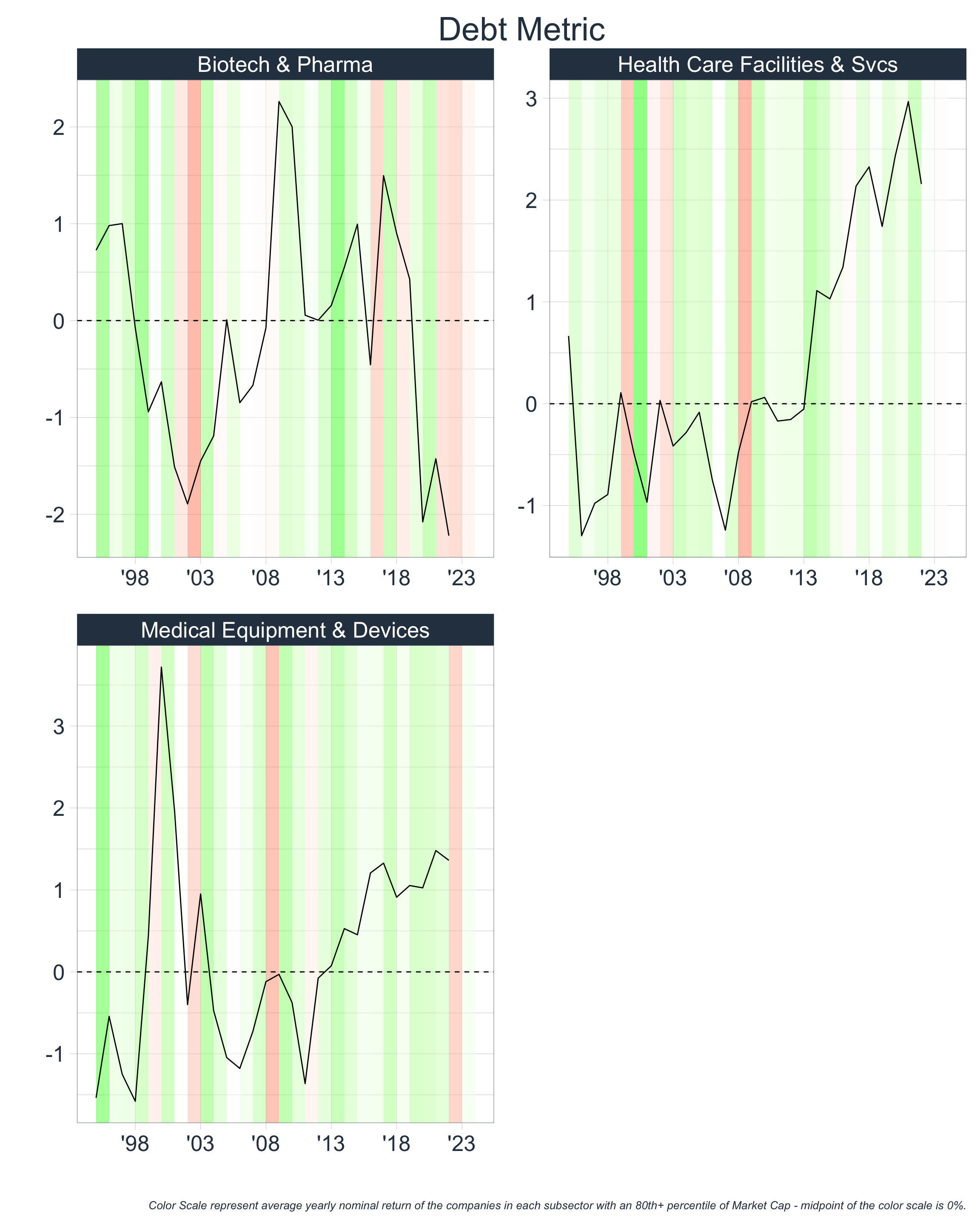
Digging Deeper
Once again, we can take a more granular look at the data:
3) New Entrants to the Market
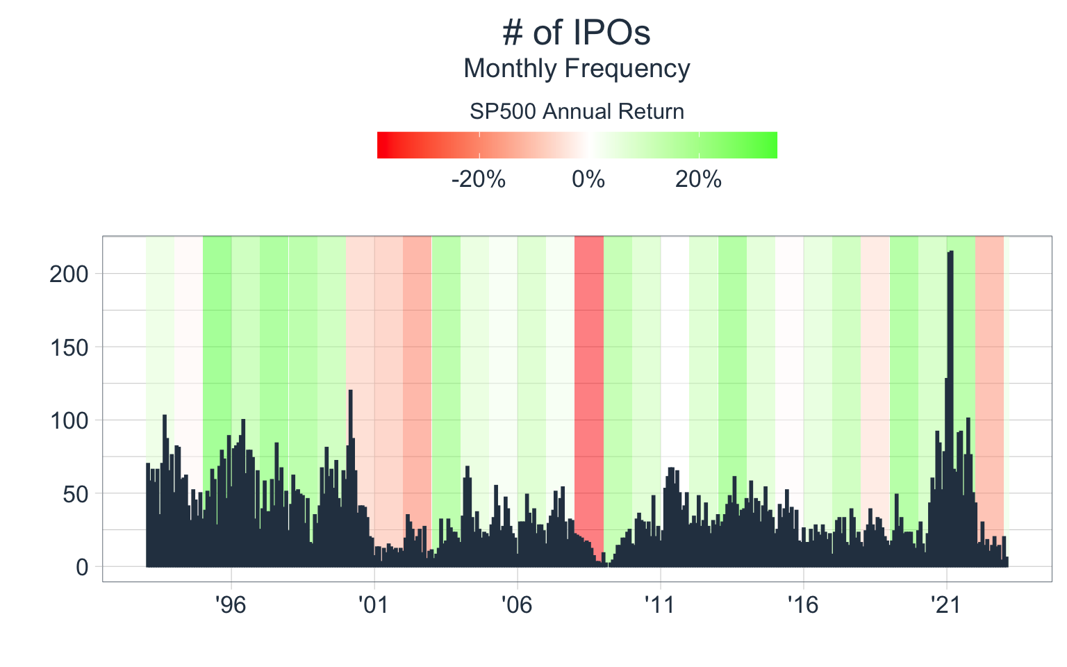
There are several ways that we can assess whether new players are entering markets. The most direct and simple method is to track when private companies become public (i.e. IPO data). Let’s track IPO activity by:
- Counting the # of IPOs each month
- Summing the IPO Offer Size each month
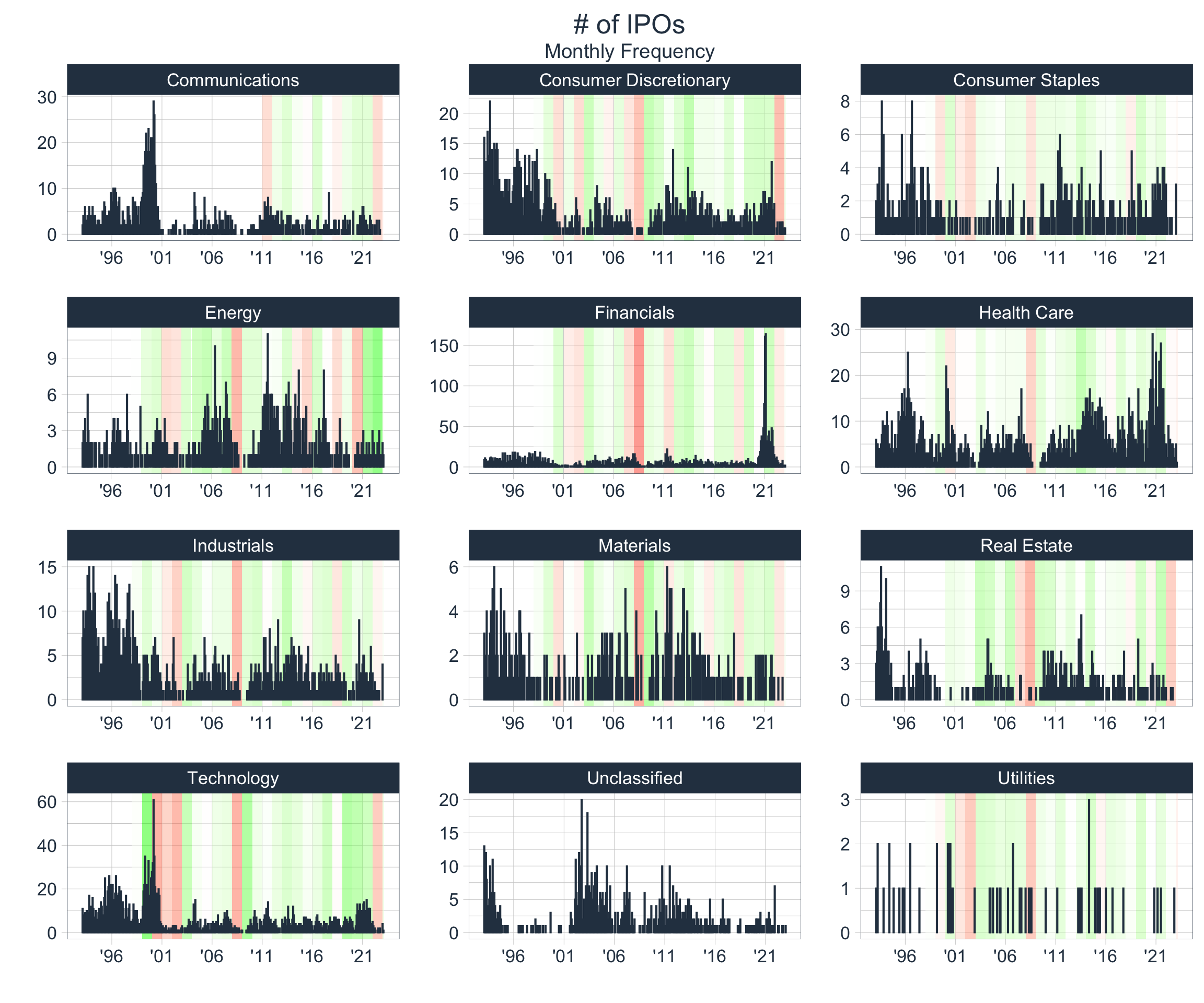
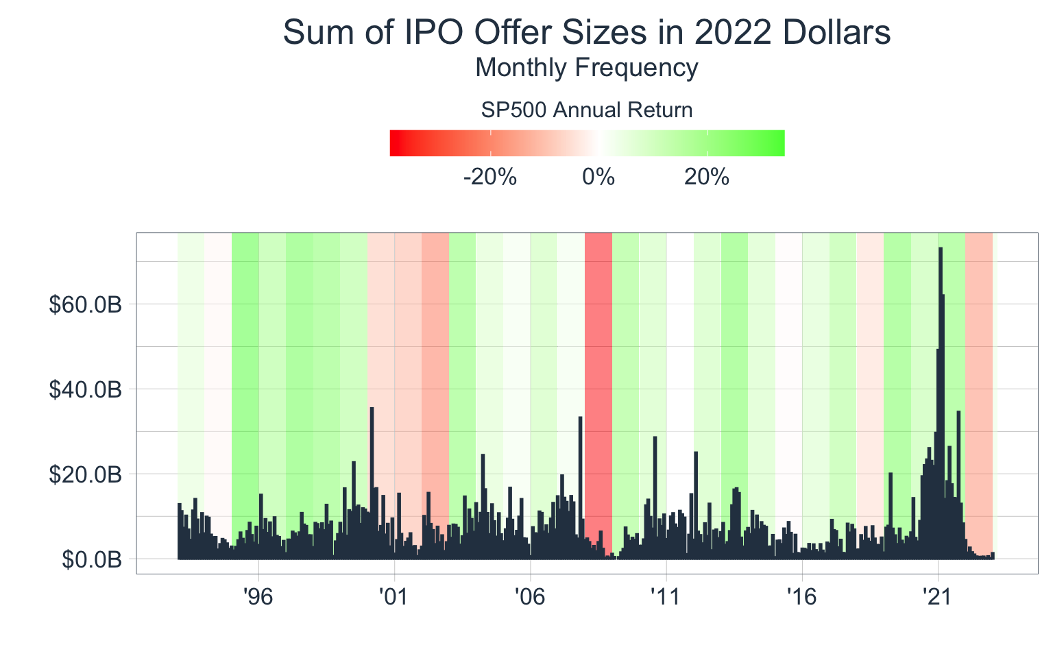
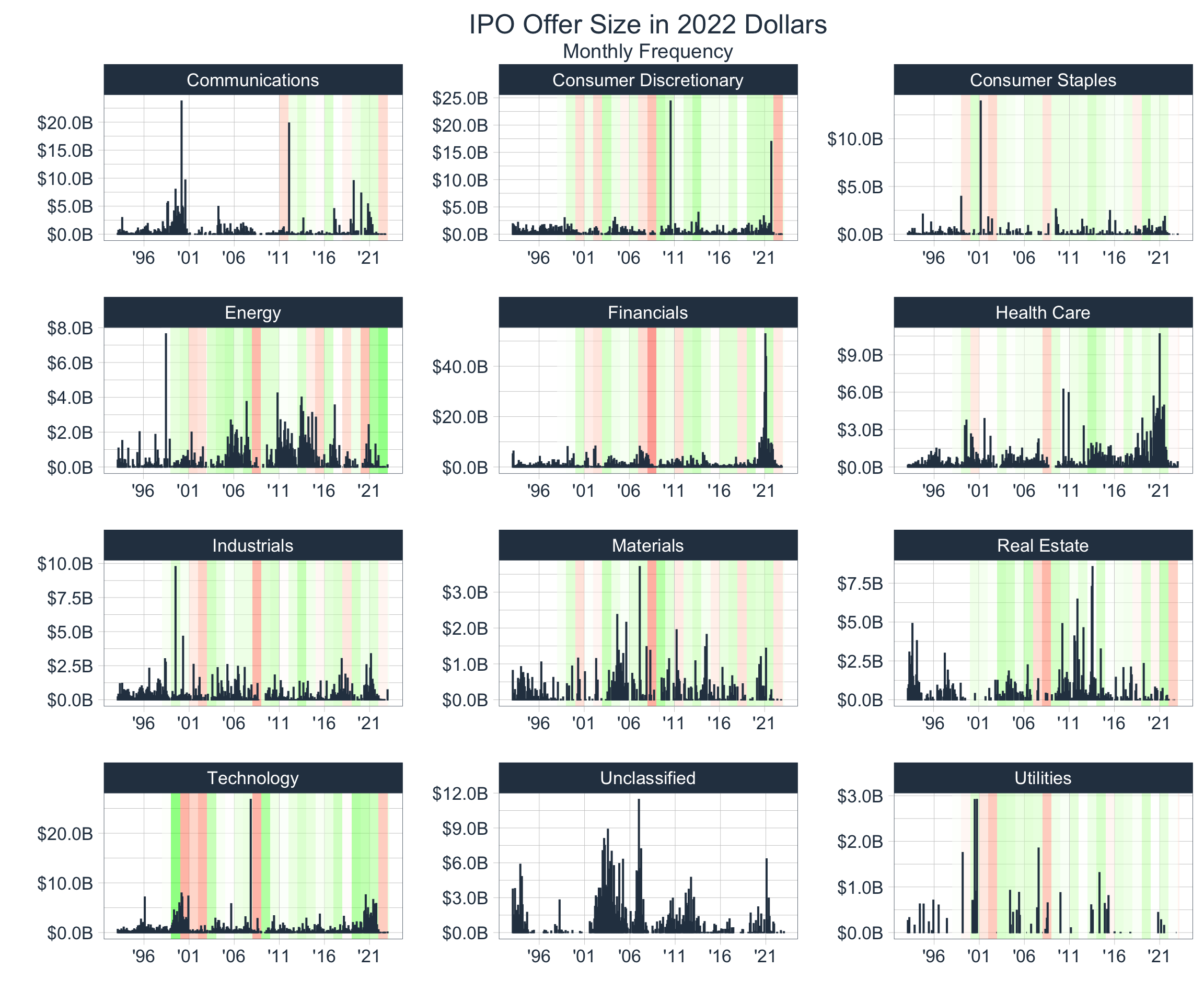

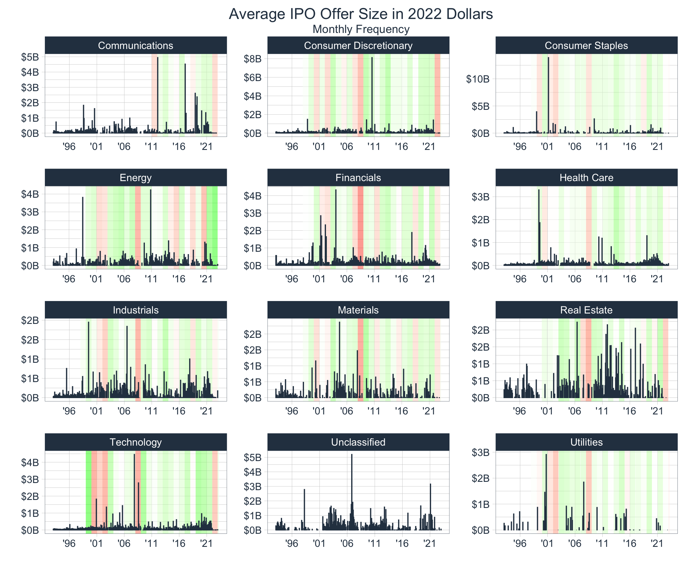
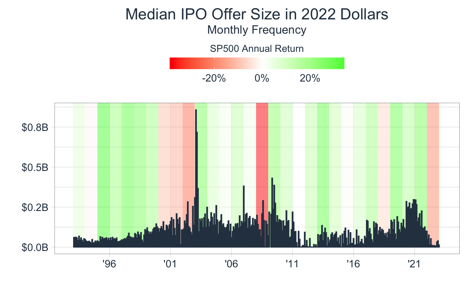
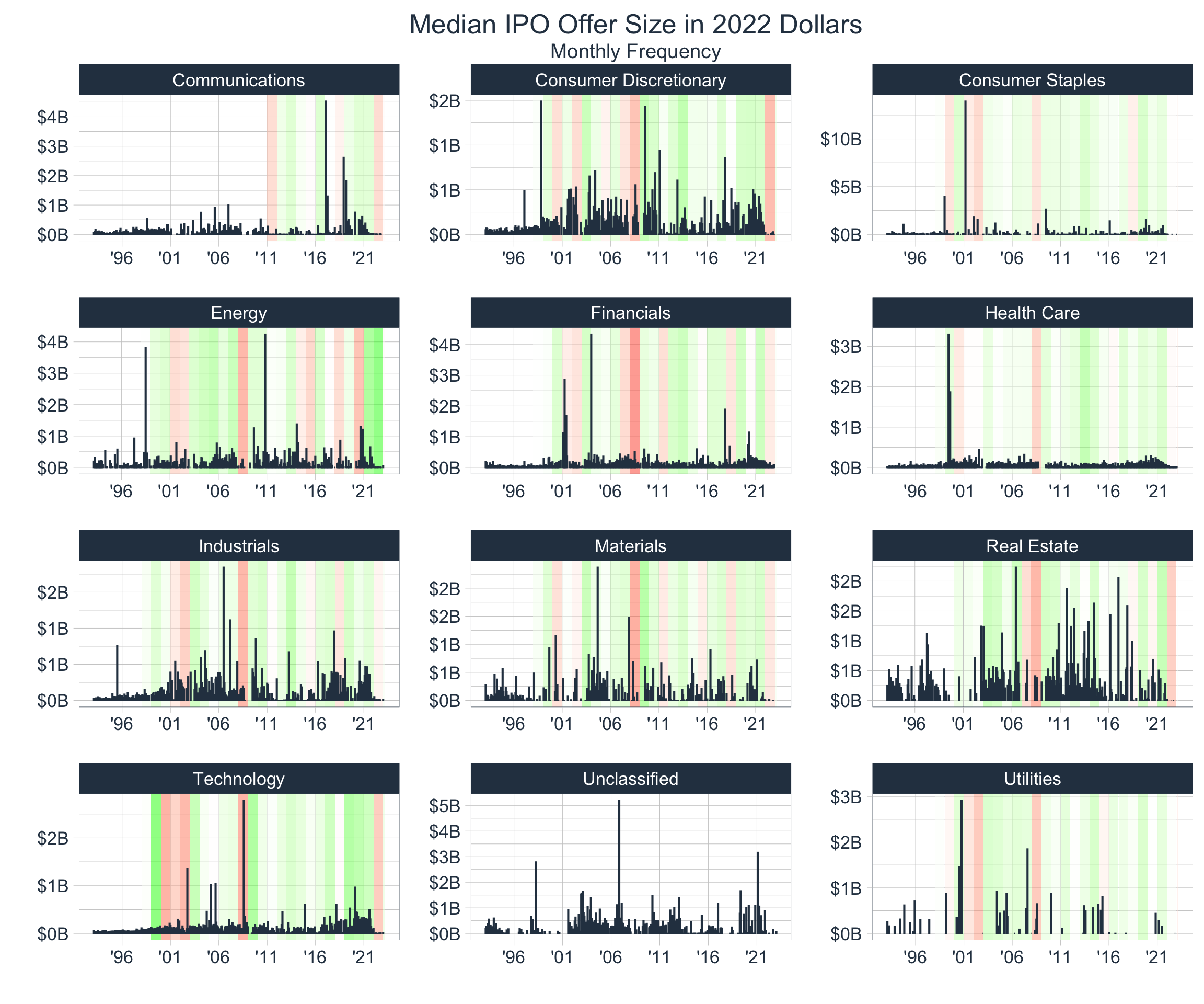
From eye-balling the data, we notice that IPO data is a helpful indicator when assessing if markets are growing past capacity. We notice that the count of monthly IPOs is somewhat cyclical with peaks before time periods typically associated with financial bubbles (’01, ’08, ’22).
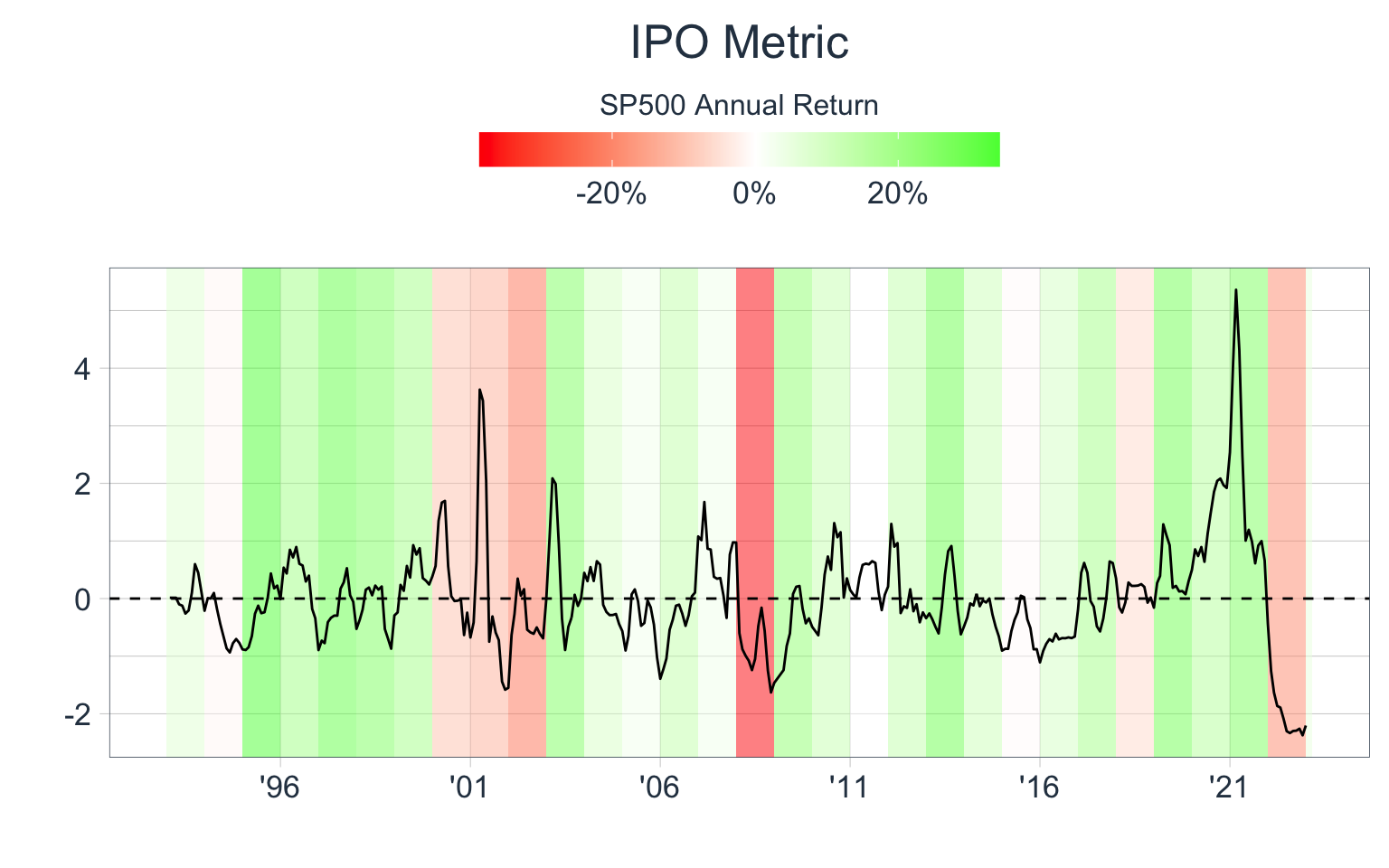
Creating an IPO Metric
Let’s create a standard IPO Metric by:
- Calculating the distance between a 3-month rolling average and a 4-year rolling average of IPO Count & Avg. Offer Size
- Calculating a standardized distance for both of these rolling averages
- Averaging the standardized distances together to a create a single
IPO Metric
By doing this we will have a rough estimation of how ‘hot’ markets are and if the number of entrants is high relative to historical averages:
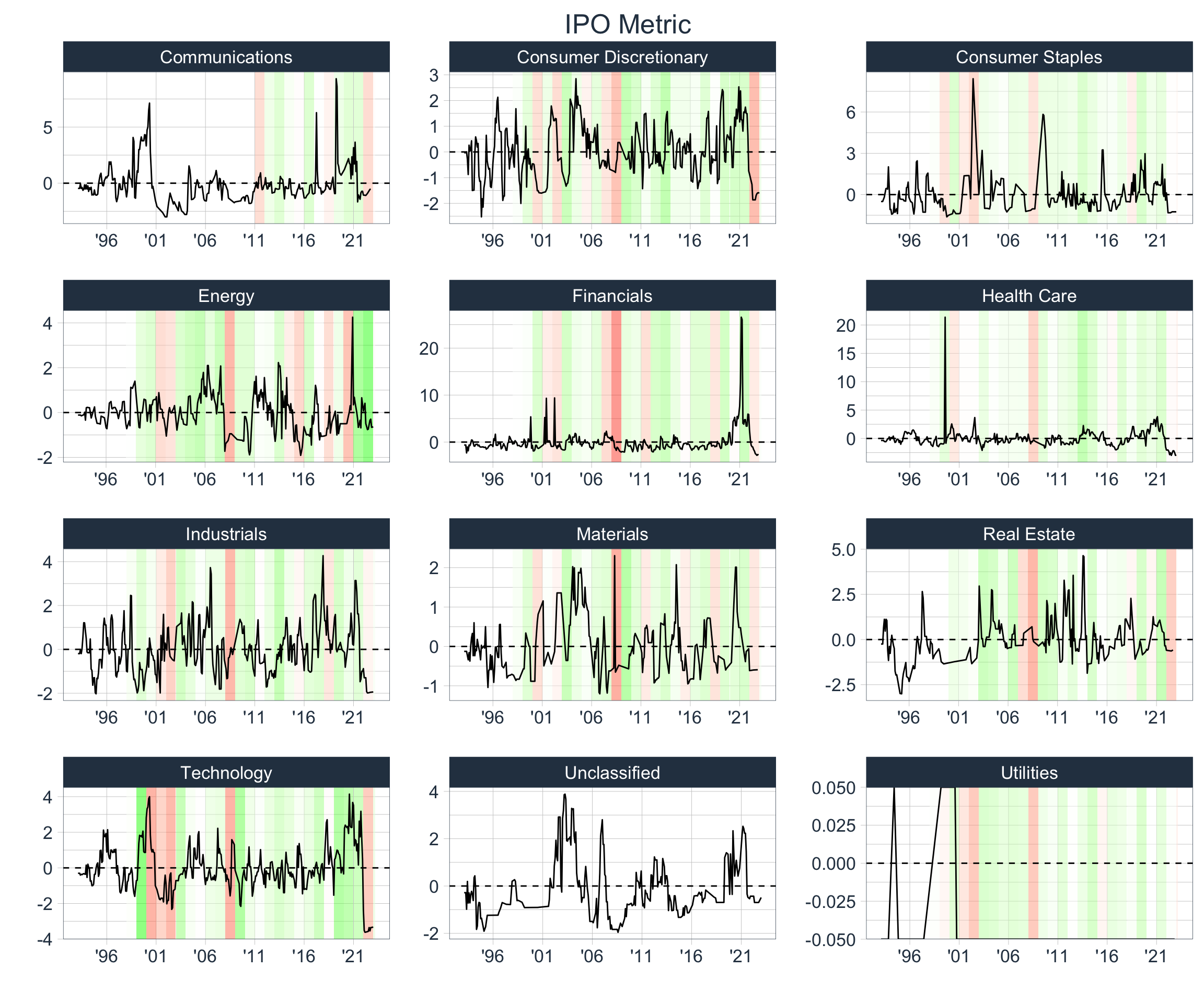
Digging Deeper
Once again, let’s take a more granular look at the data:
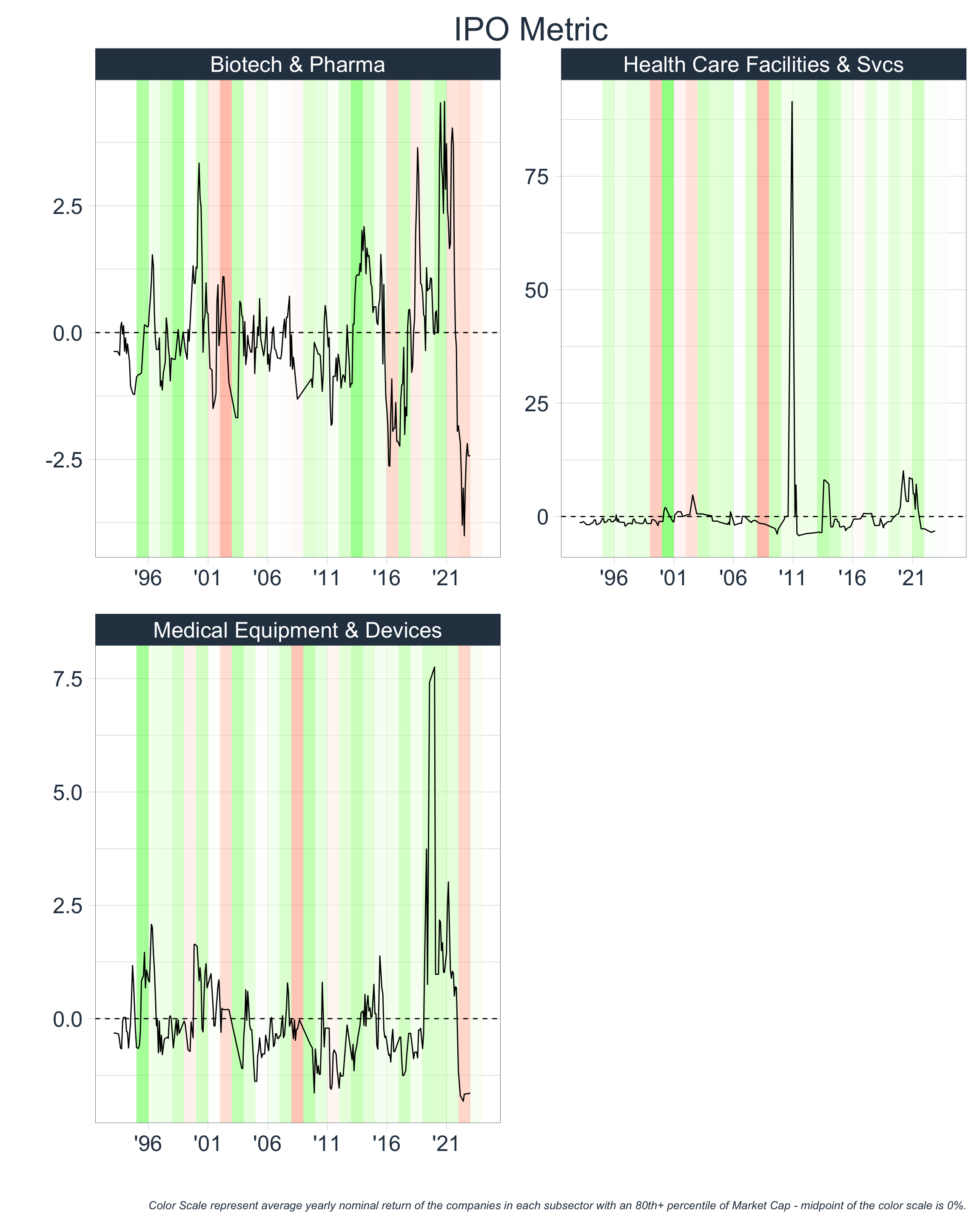
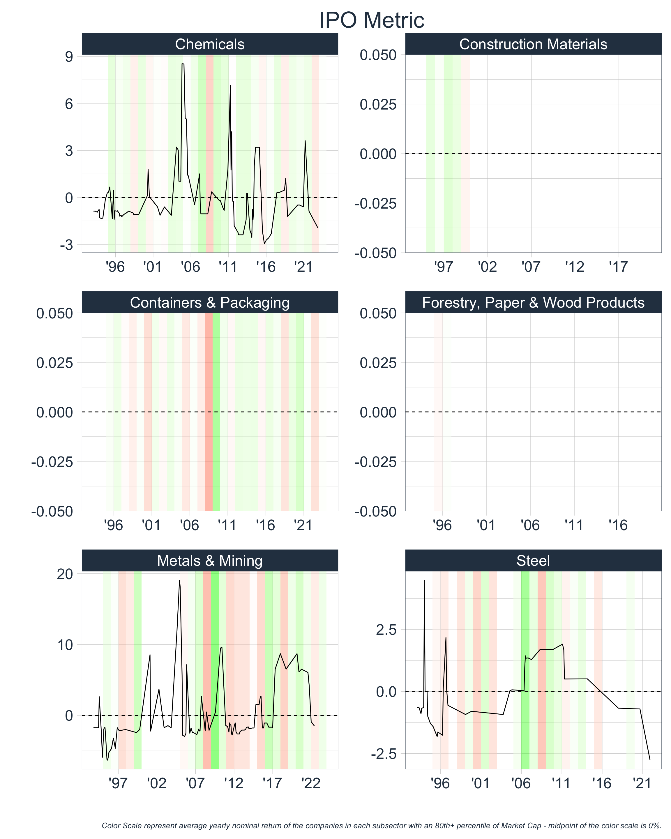
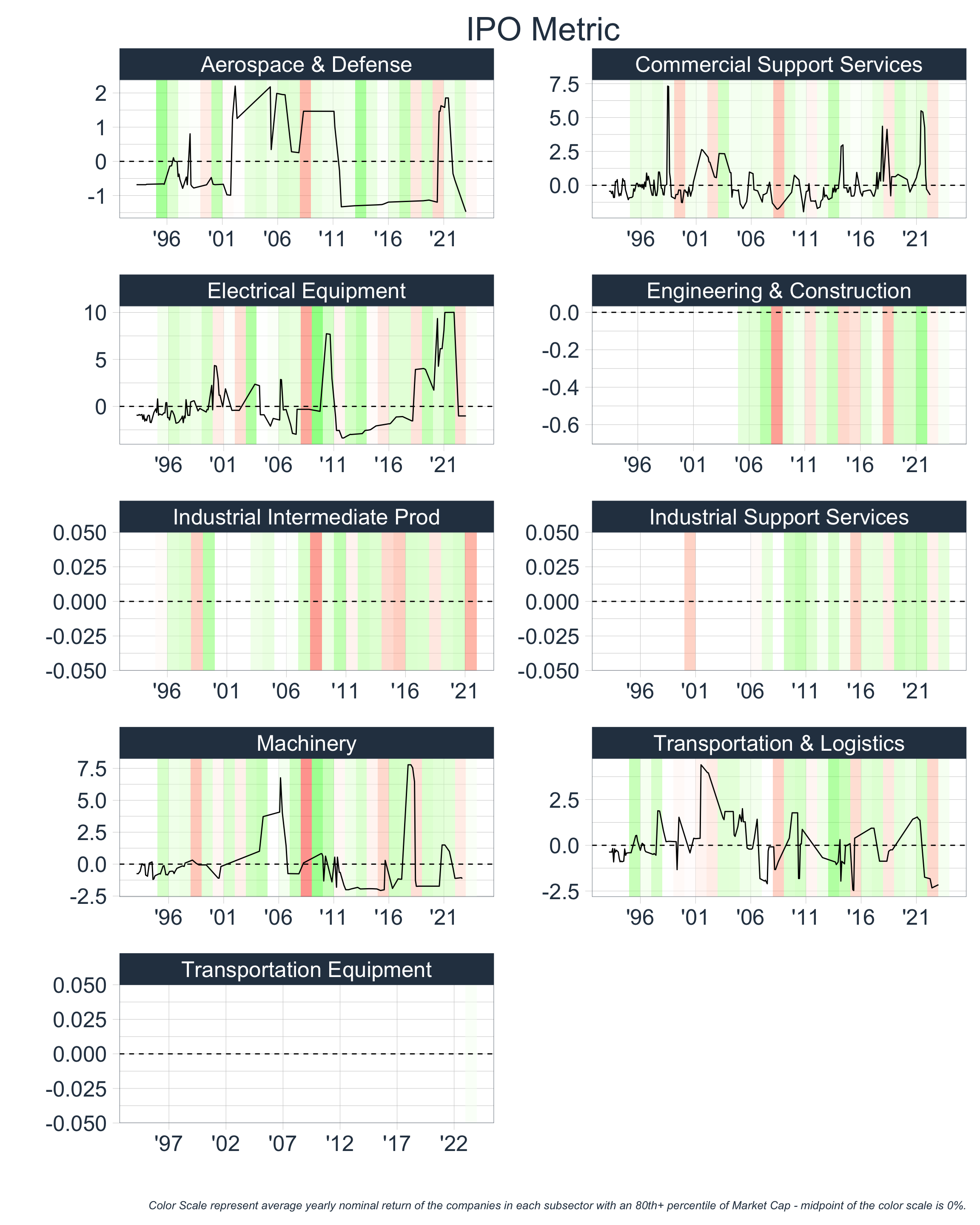
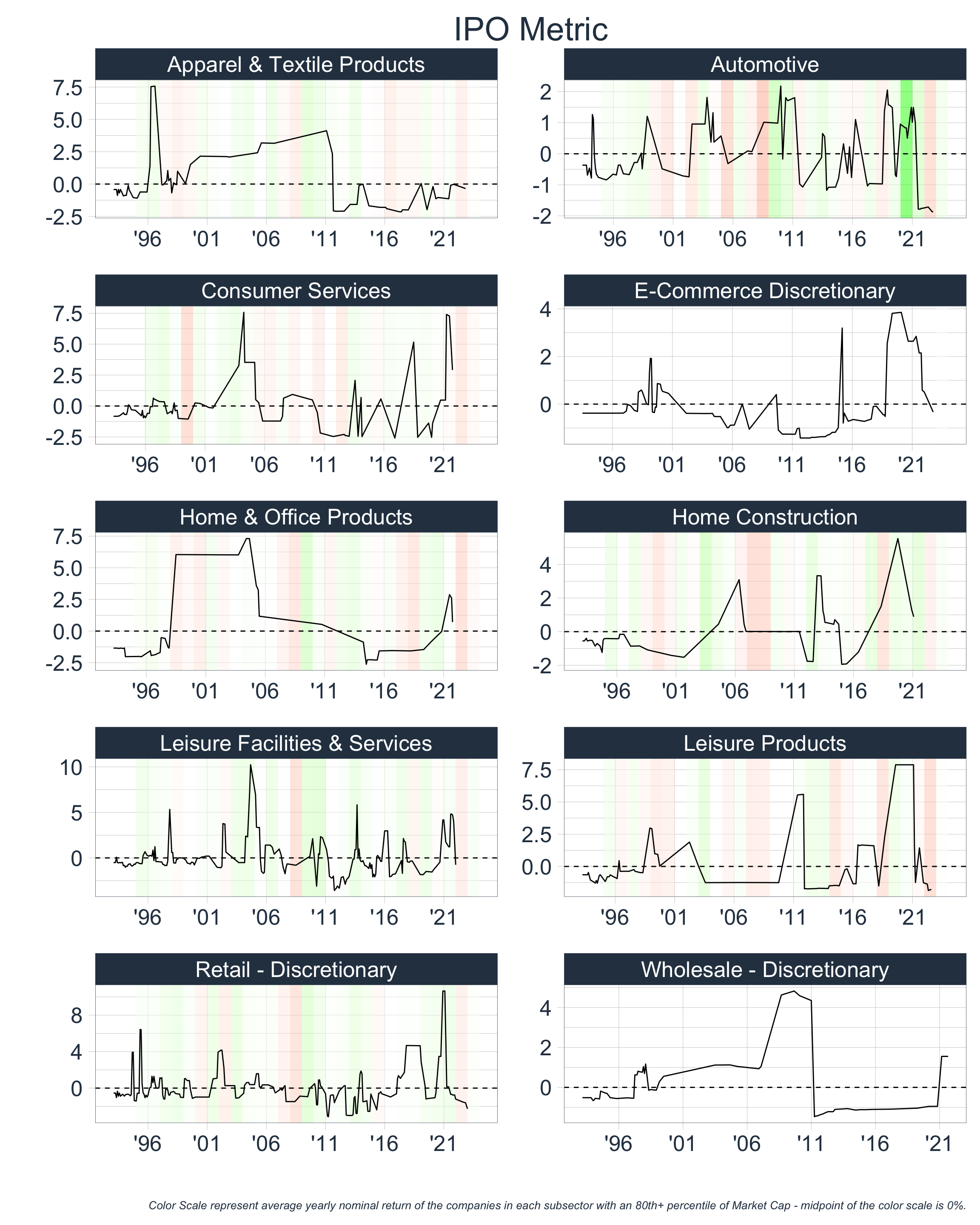

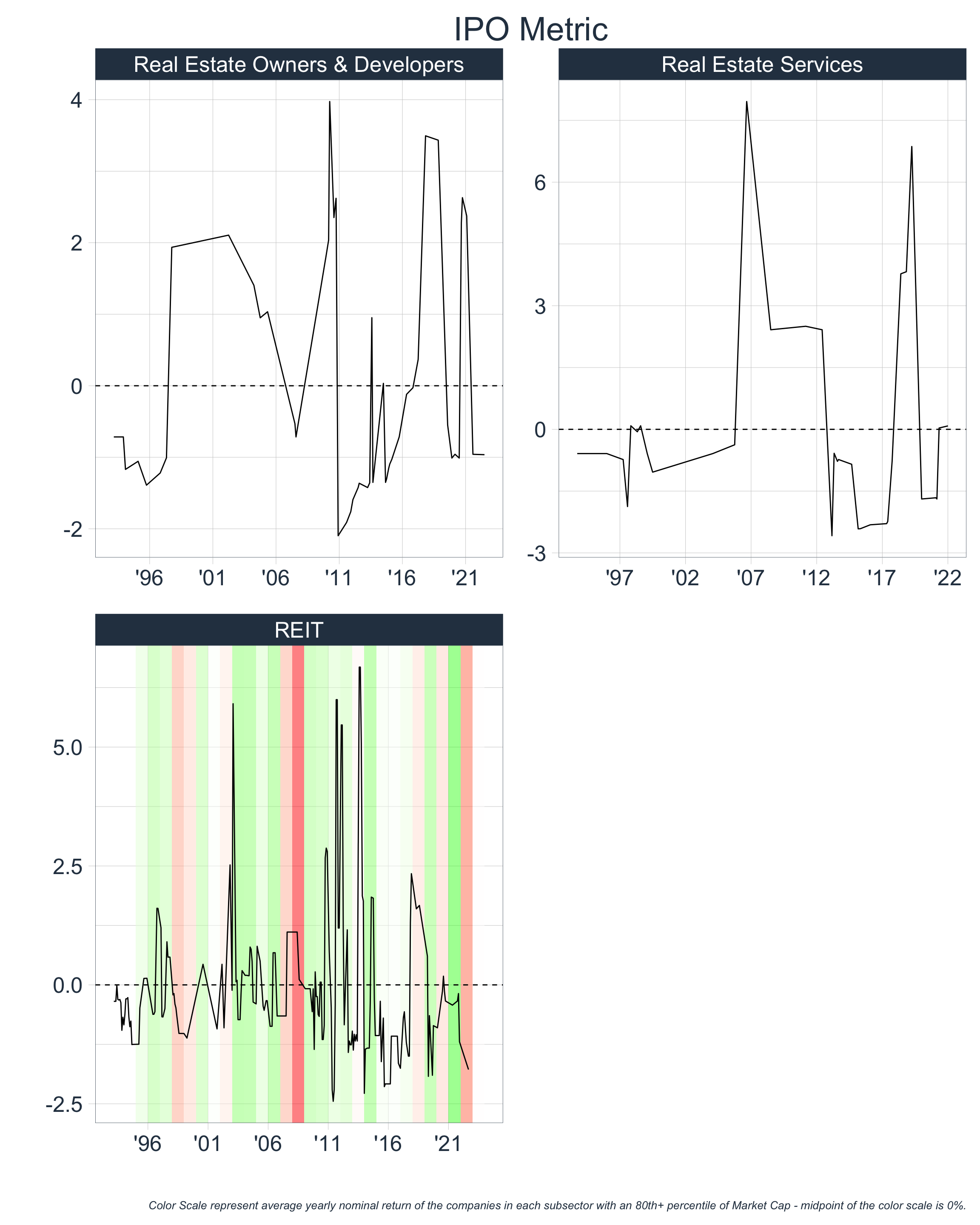
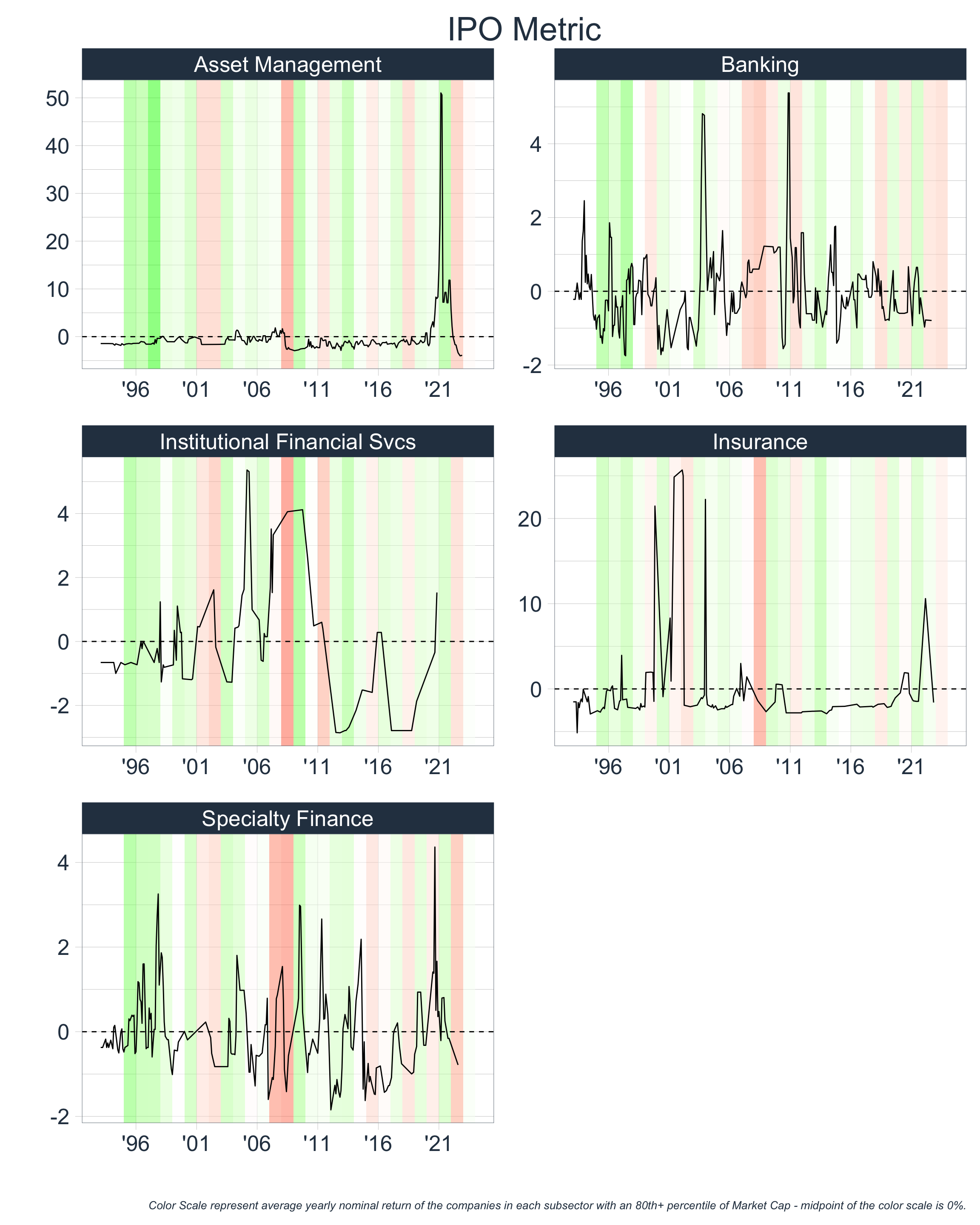
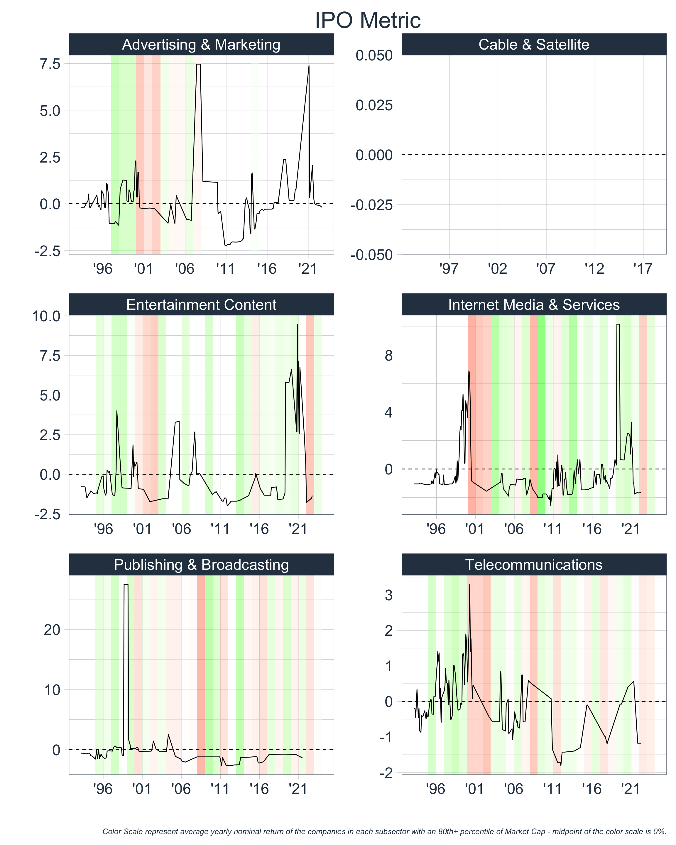
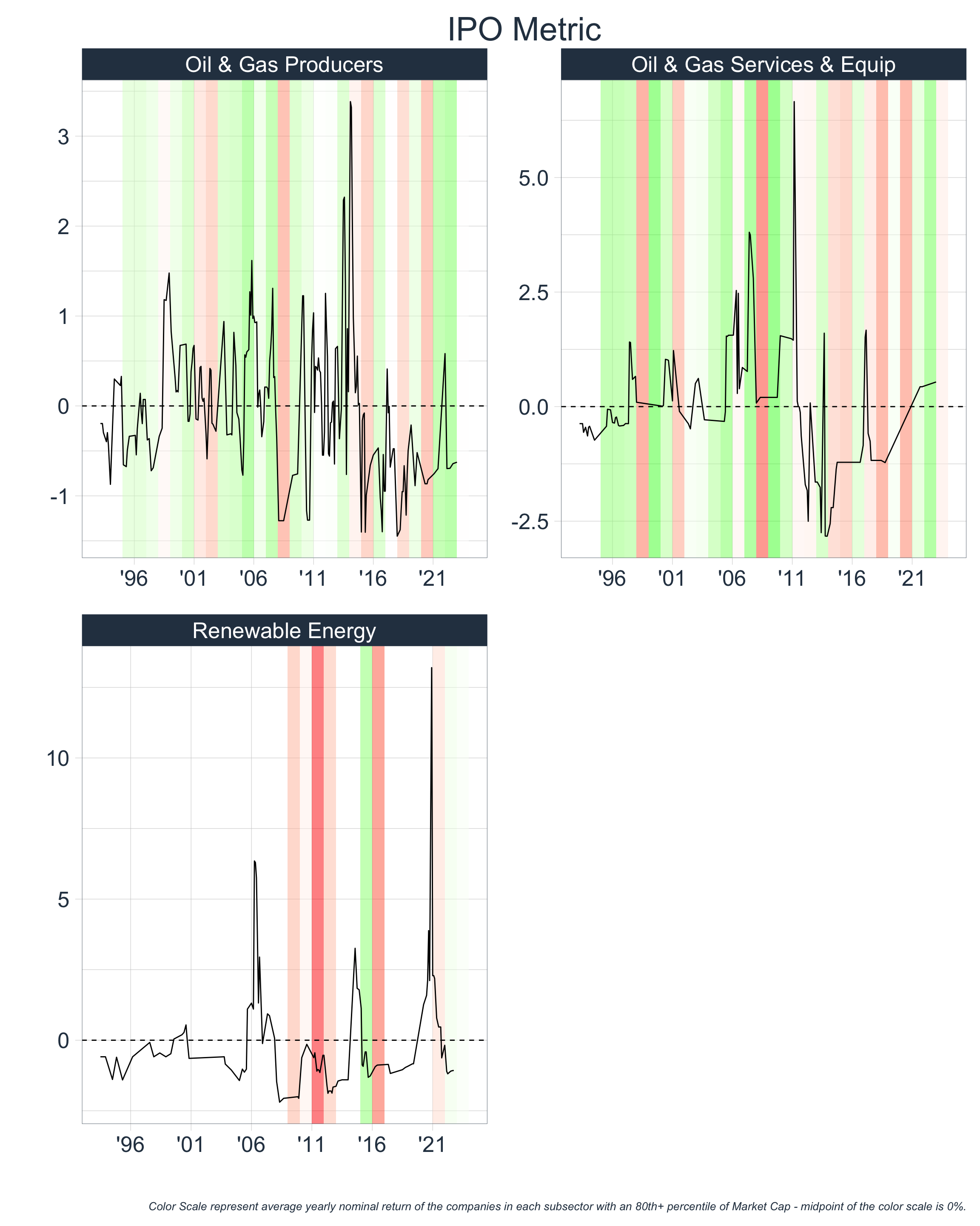
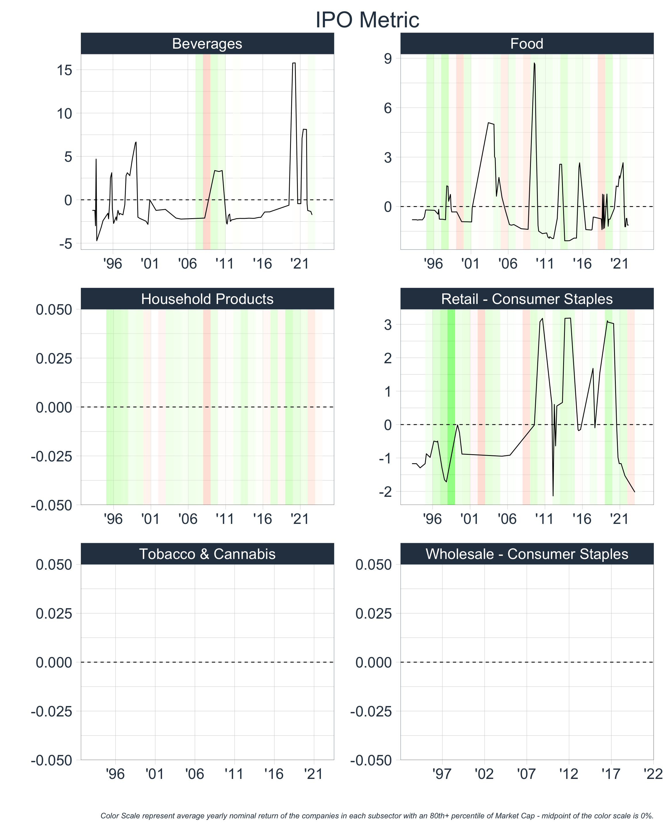
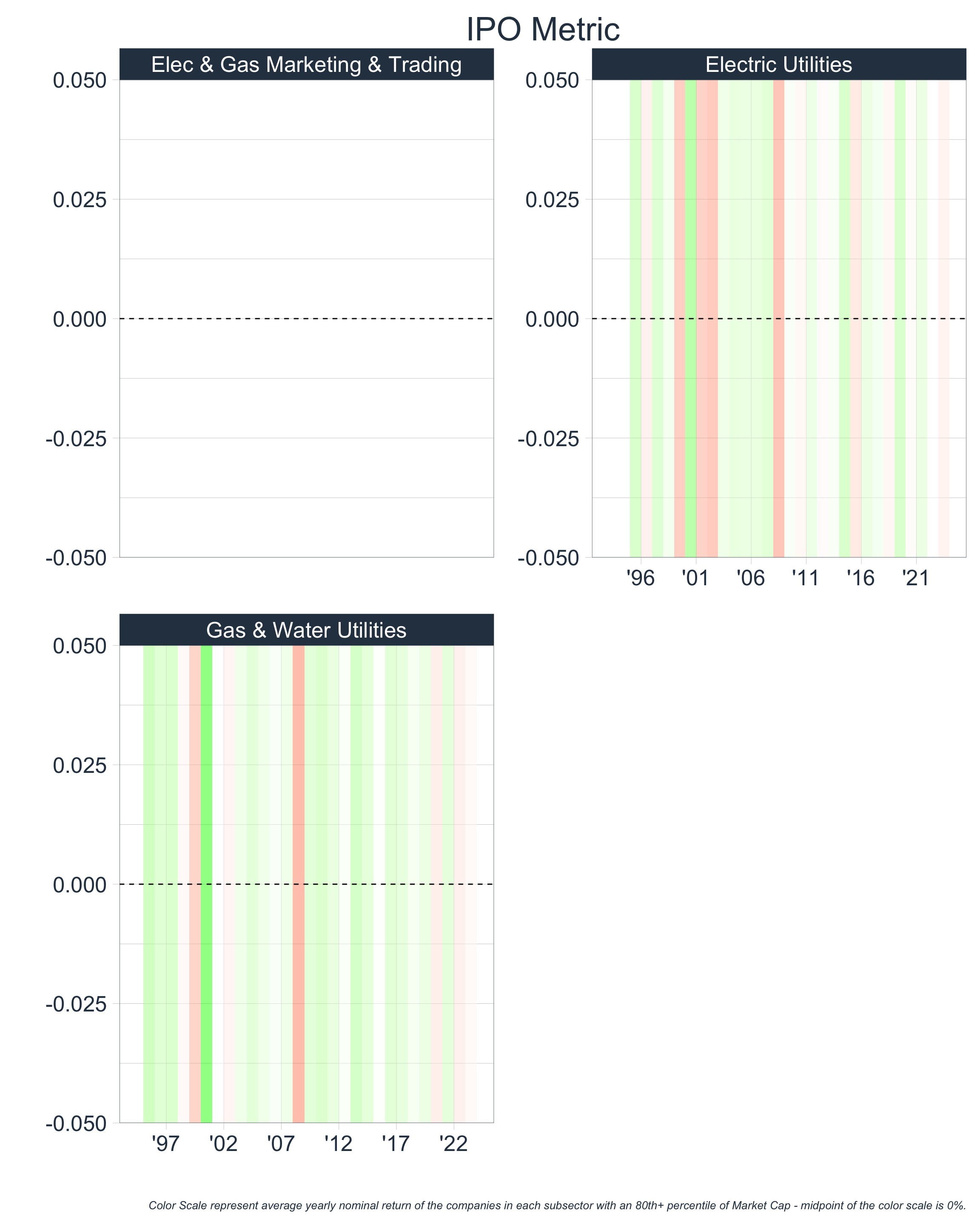
From observing the above at Sector Level 3, we notice that the IPO metric behaves oddly for several segments. This odd behavior is the result of limited IPO data for those segments and we will have to address this when creating our grand summary Financial Bubble Metric.
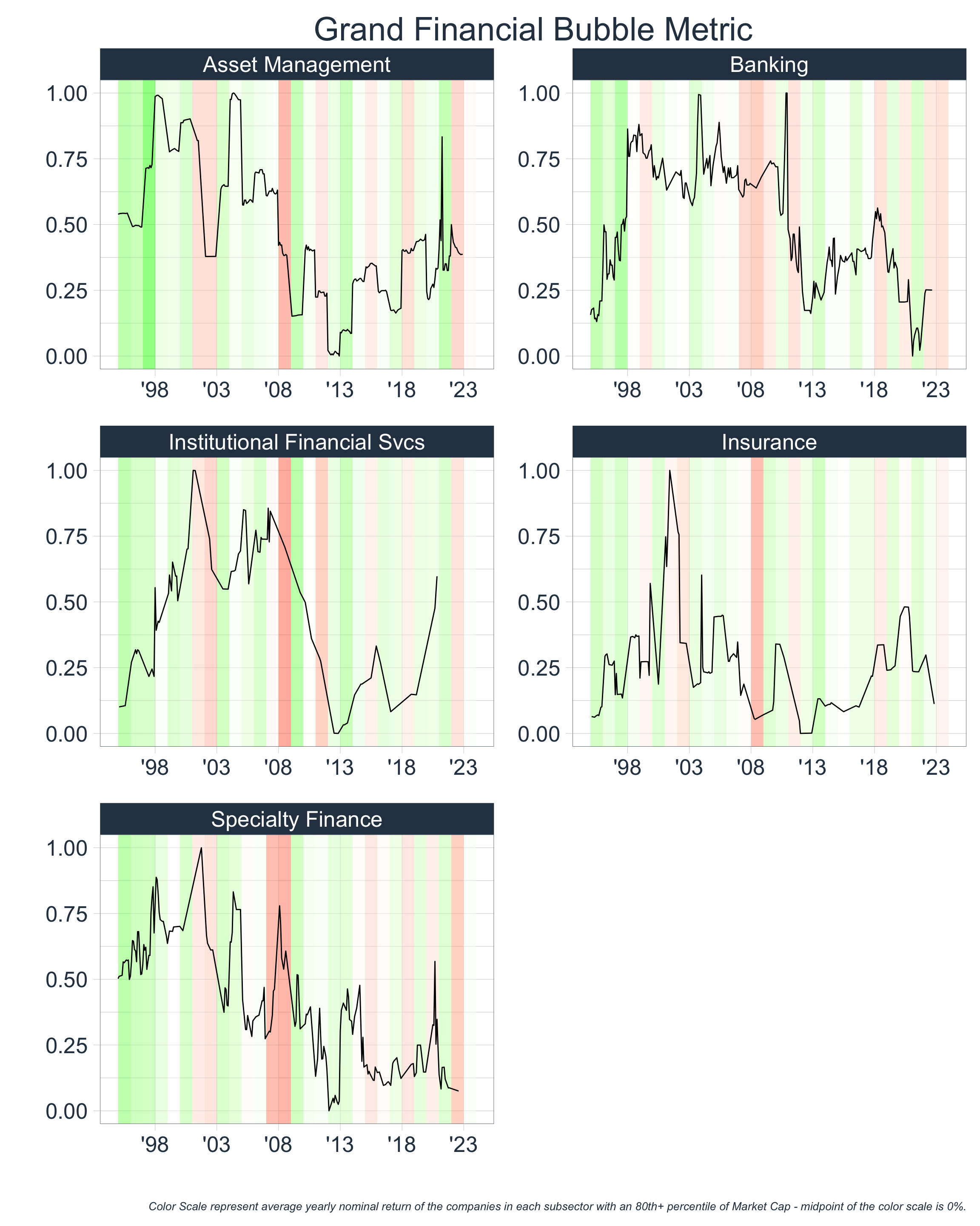
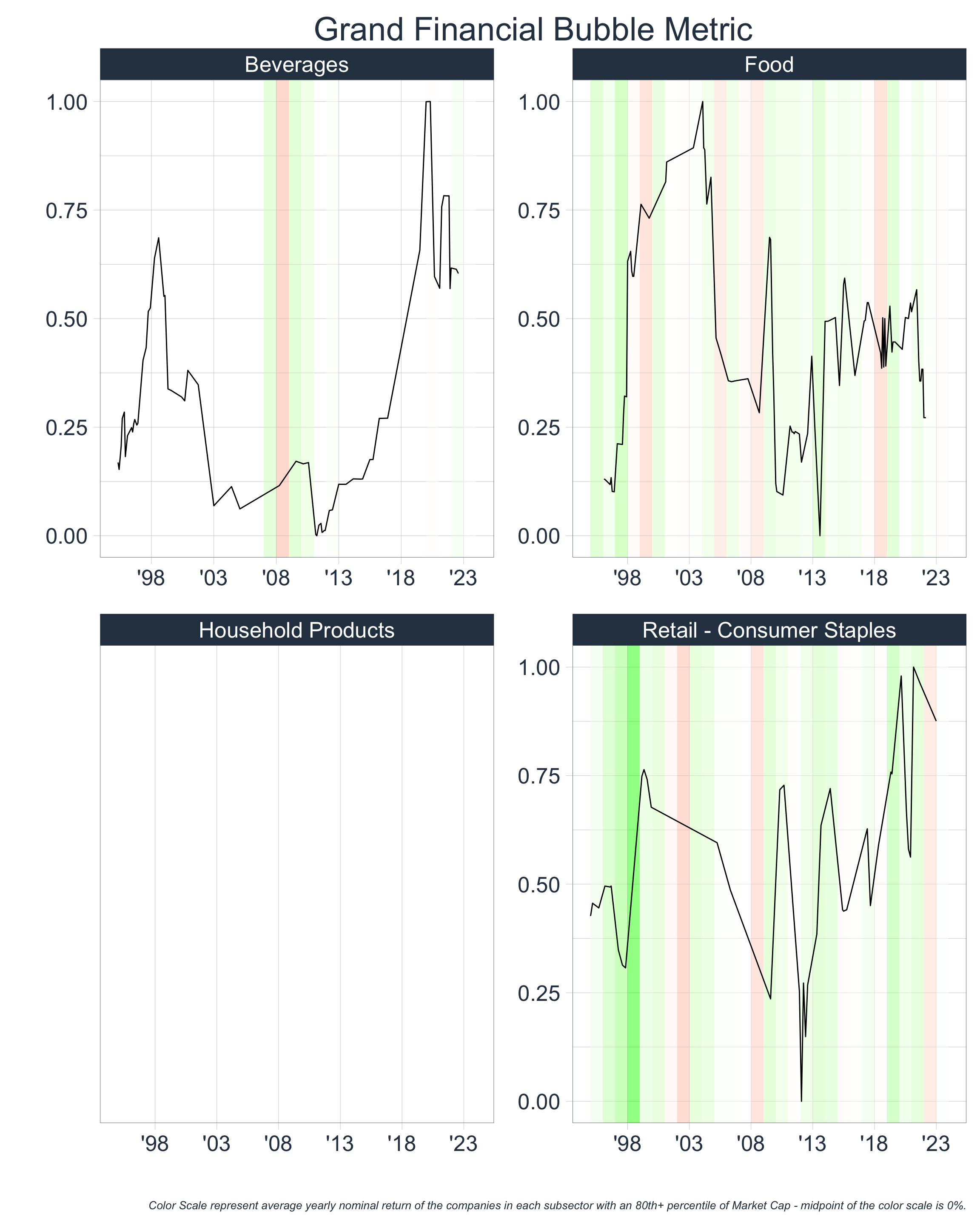
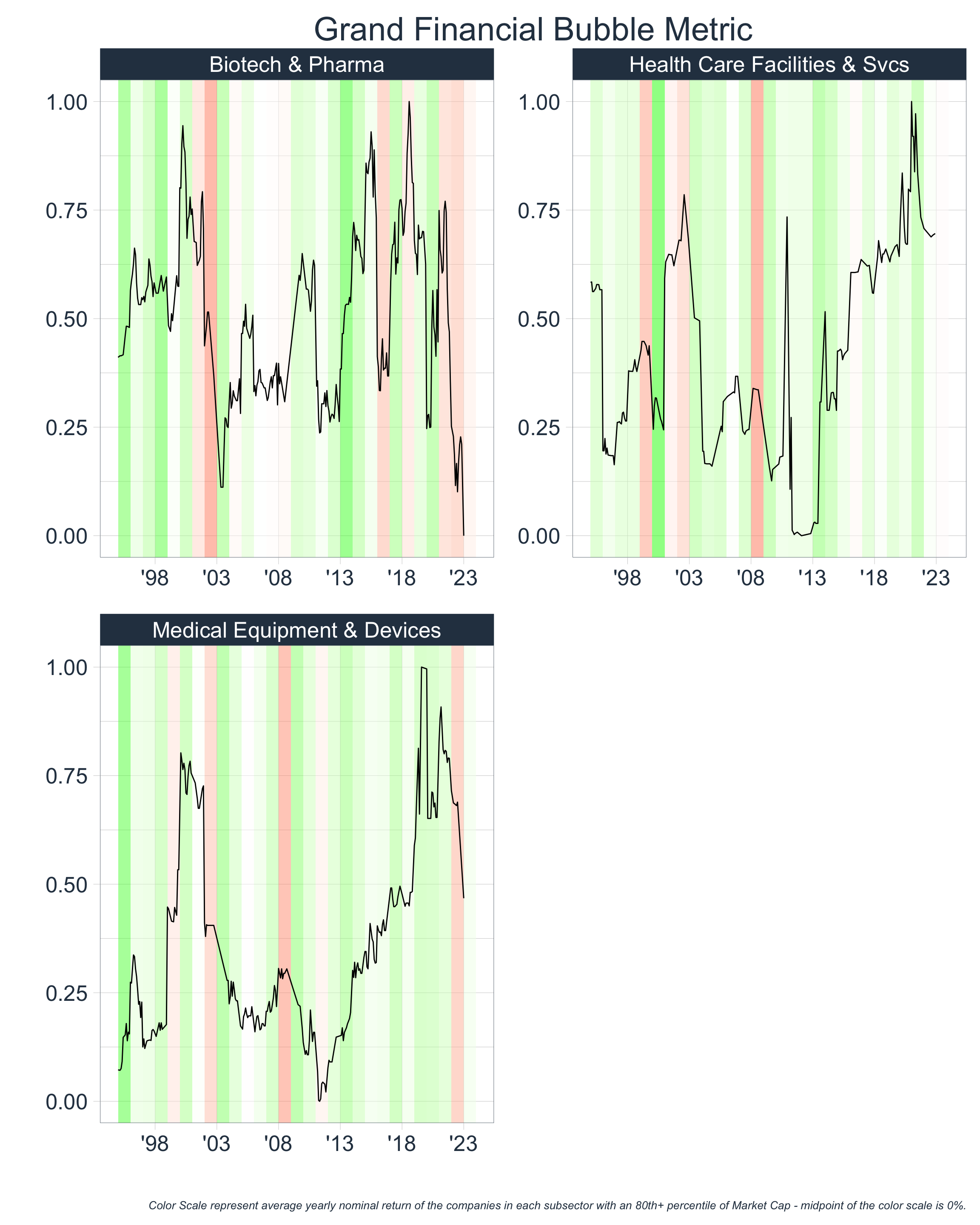
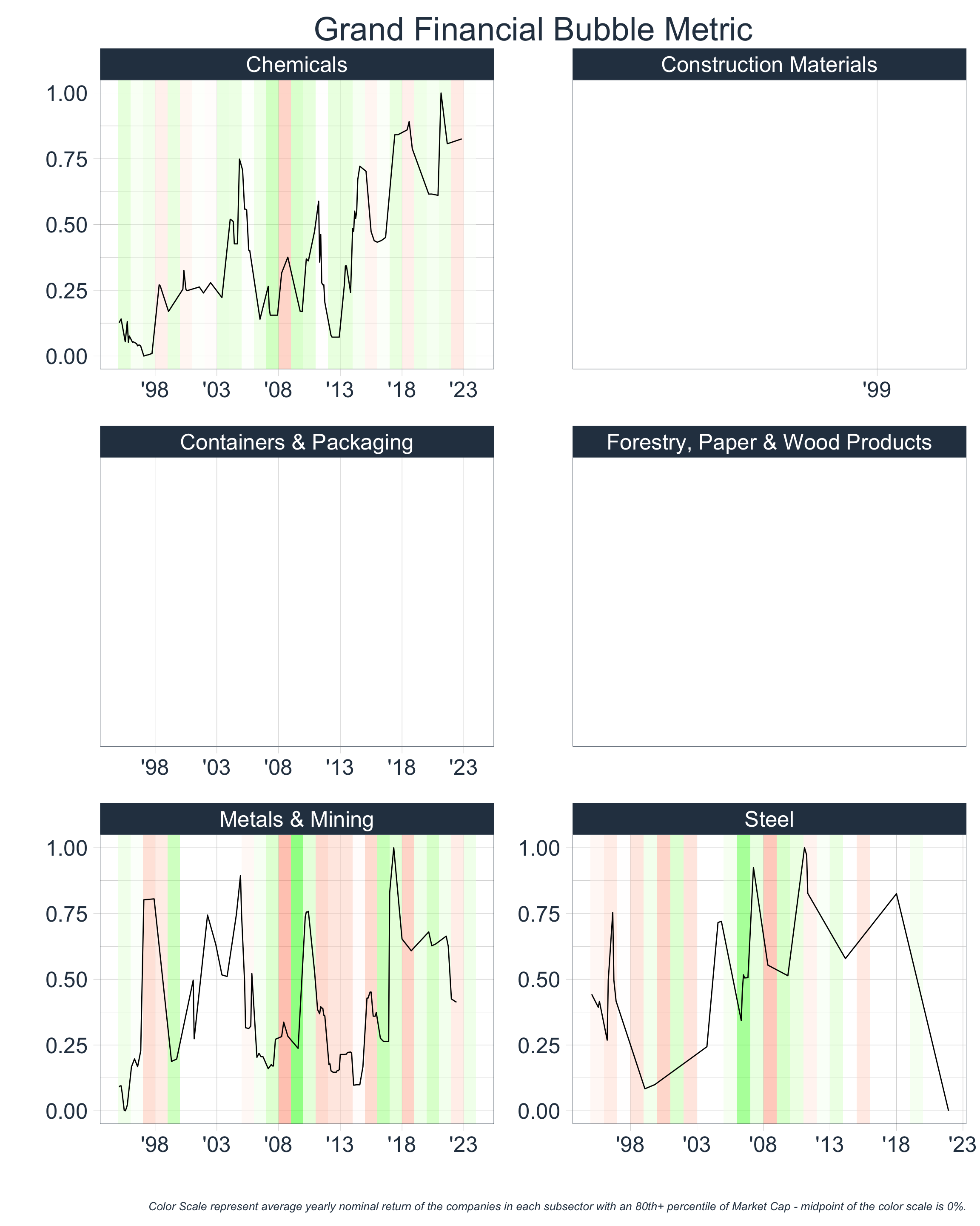
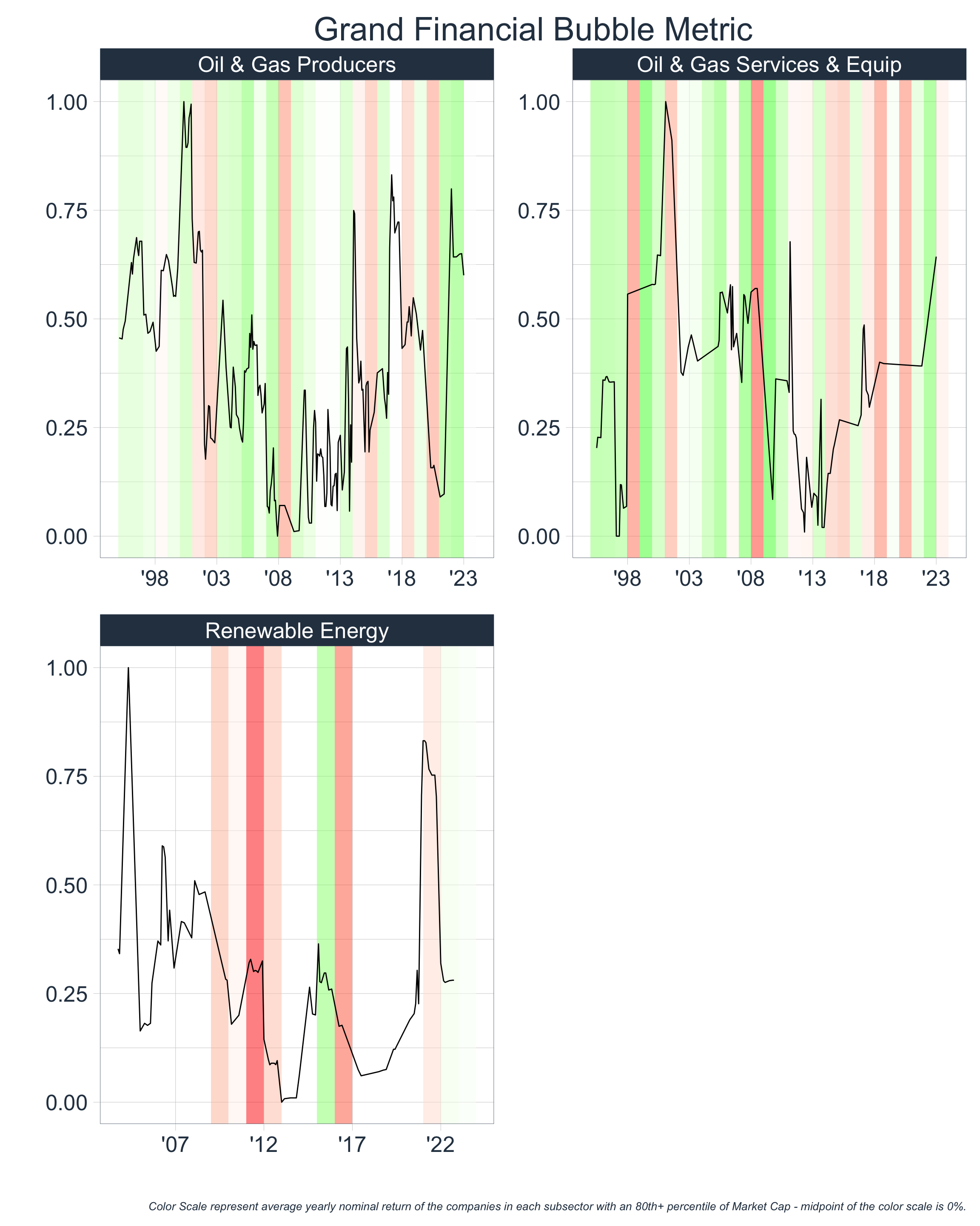
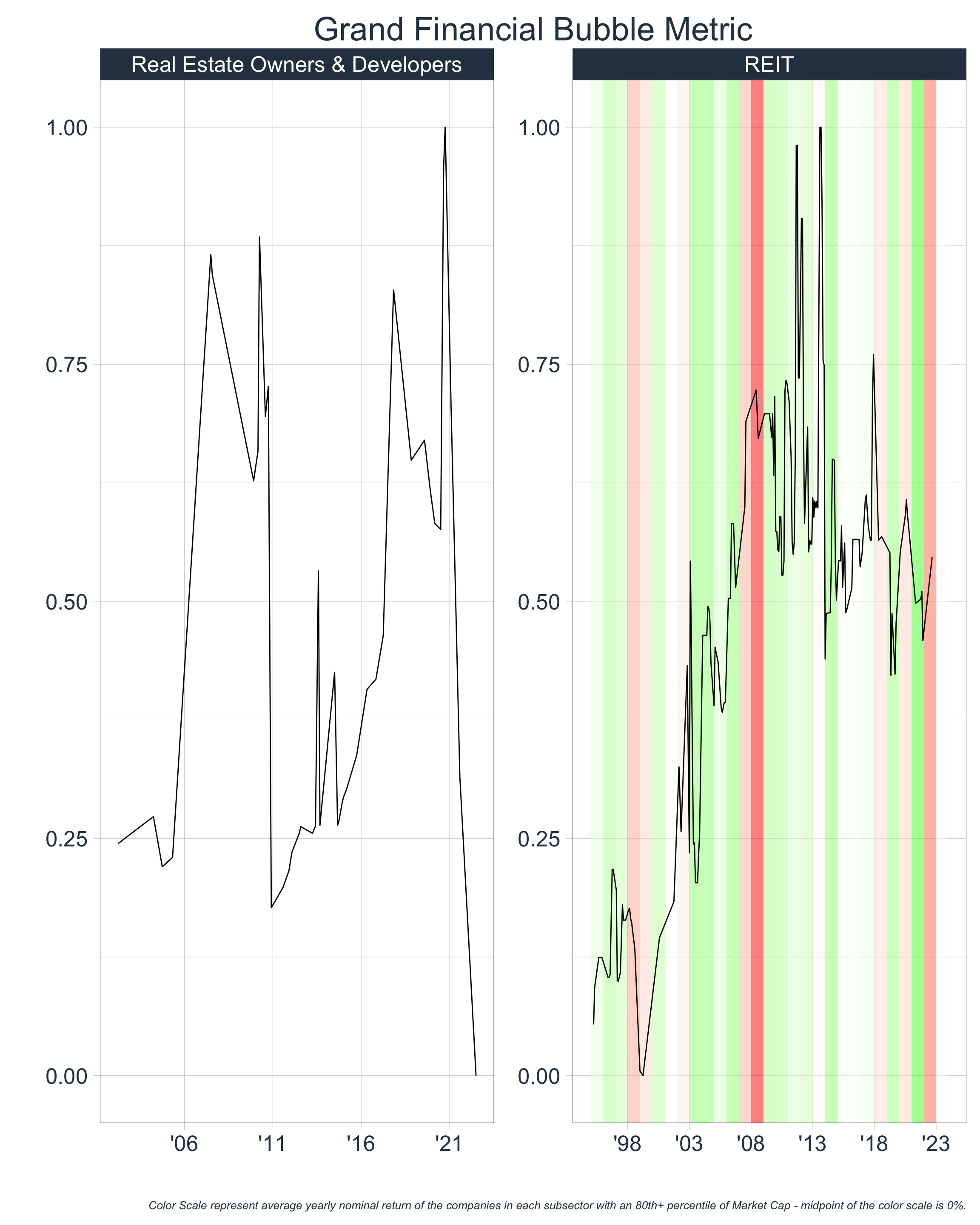
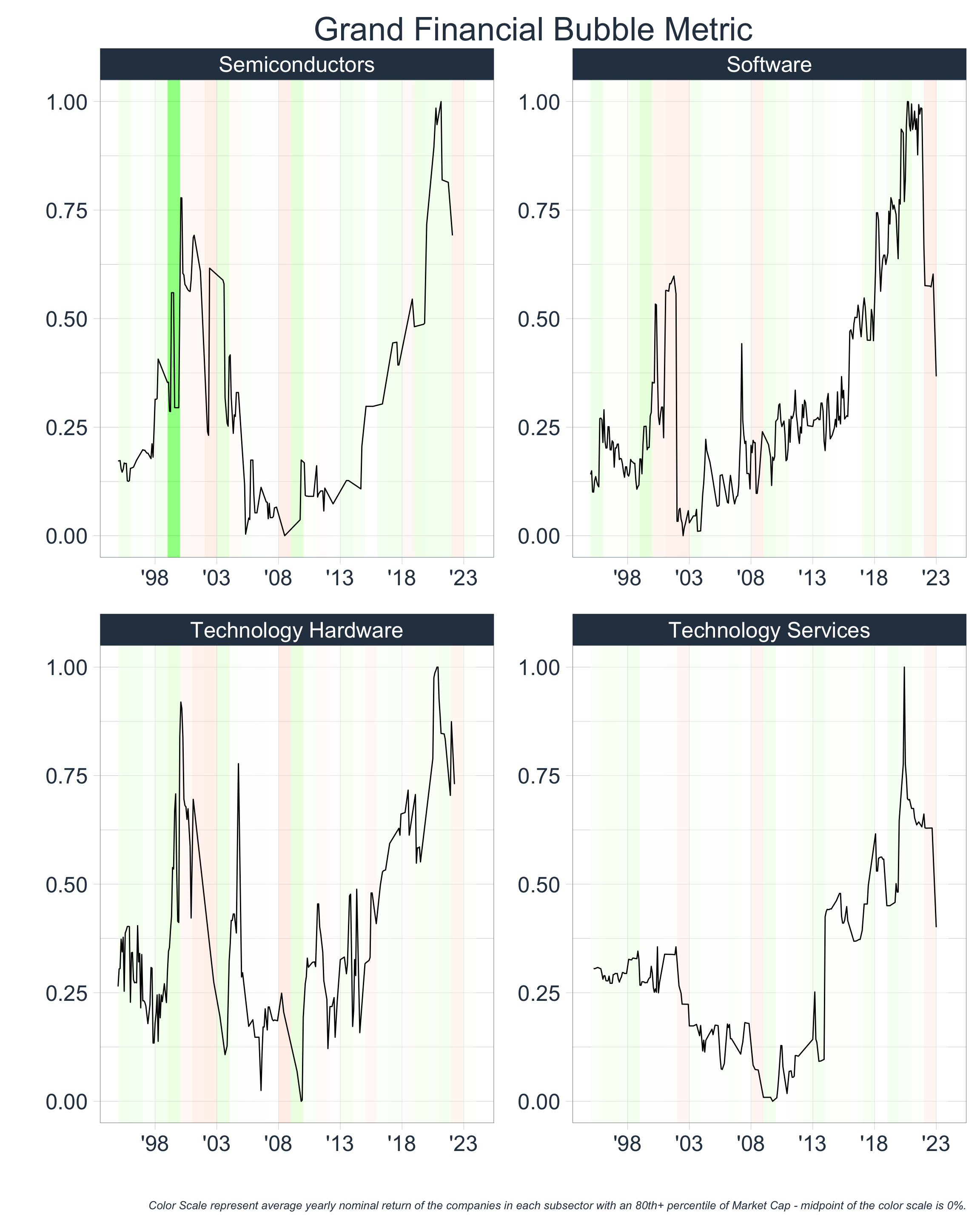
Putting It All Together
Let’s take each of our metrics, scale them to values between 0 and 1, and average them together to create a Grand Financial Bubble Metric. We will then re-scale our resulting metric between 0 and 1.
It is important to note that our IPO metric can take on extreme values at the sector level - Health Care in 2001 and Financials (w/ the SPAC surge) in 2021. Because these extreme points reduce the relative importance of other time periods, we will water them down and keep this in the back of our minds going forward.
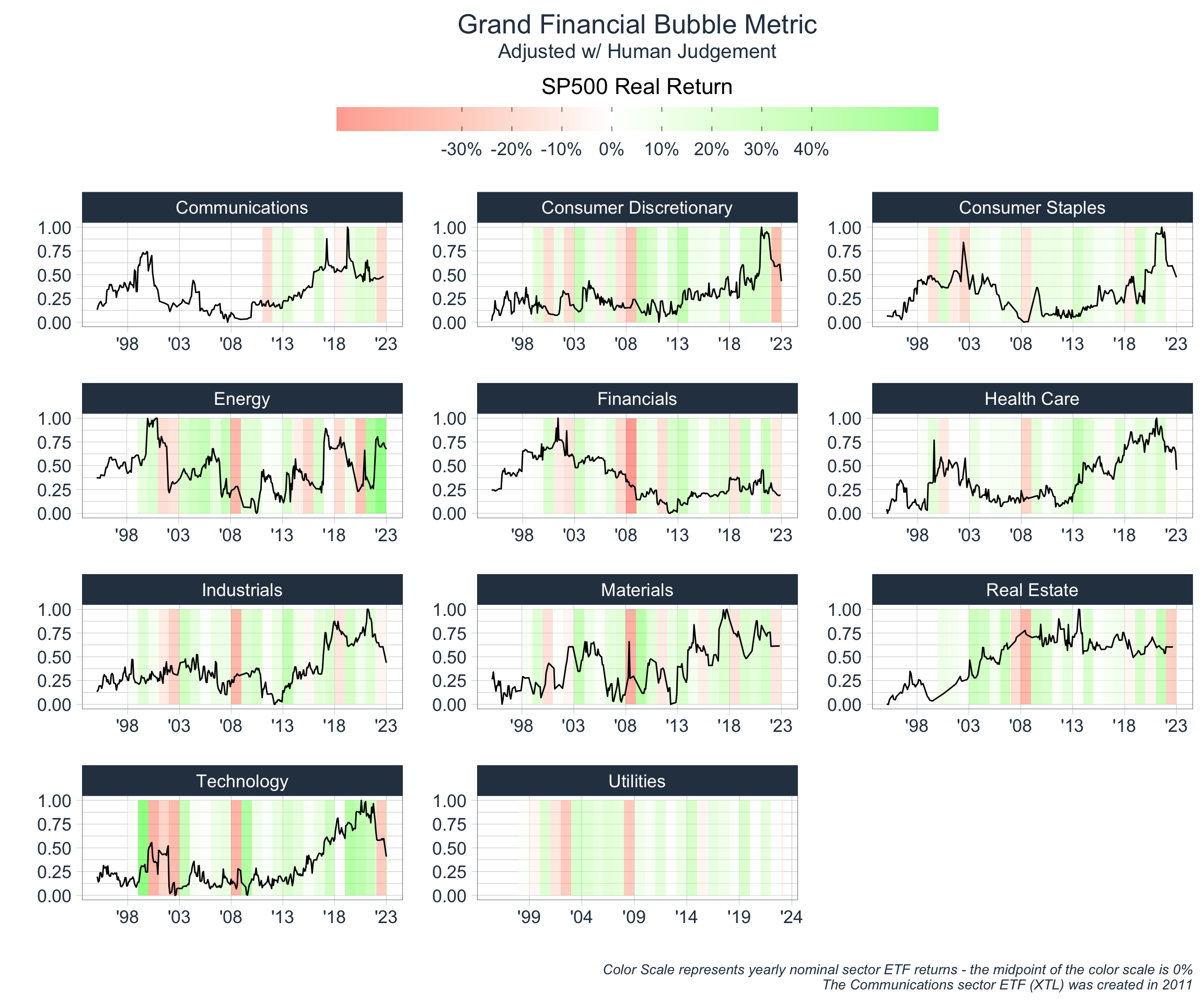
At this point, I will caution the reader that any inferences taken from our Grand Financial Bubble Metric should be held with reservation. The metric allows for a good basic framing of where sectors are relative to history, but understanding the key dynamics at play within each sector, and the current macroeconomic and political environment is equally as important. In addition, when comparing across history, it is important to have a knowledge of context and qualitative factors that may affect inferential ability. For instance, the Covid-19 Pandemic drastically affected the world economy and markets in 2020-2022, so the reader may decide to skew metrics during those years according to their beliefs and theses.
With that said, we can see that our Grand Financial Bubble Metric may be helpful in determining sector performance. In general, we observe positive returns when the metric is relatively low and increasing. As the market frenzies and there are new competitors, higher valuations, and debt-financed growth, market returns are particularly strong. Eventually, our metric peaks, and subsequent returns are generally poor.
There are a few things worth noting from our plot:
- Our confidence in the metric varies for different market segments and understanding why is crucial.
- For instance, our metric is particularly informative for the Energy, Technology, and Consumer segments, but it is difficult to decipher for the Real Estate and Financials segment. This is likely due to the fact that the former segments are cyclical in nature, and therefore distance from a measure of central tendency is informative, but for Real Estate, this is not the case. Financials, however, is certainly cyclical in relative pricing, but due to the nature of the industry, is not cyclical in its leverage; instead banks tend to have uniformly high leverage throughout time.
- Our metric indicated potential bubbles in ’00 and ’22, but completely missed the mark in 2008.
- This is partly a result of the above explanation as well as the fact that our model does not capture any proxy for the quality of a company’s assets (this is mainly applicable to banks only). In reality, the 2008 GFC was not the result of over leverage relative to historical averages (although the fact that banks are inherently extremely levered was certainly crucial), but instead was the result of poor investment decisions made by these financial institutions, which could only have been deciphered with logic and analysis from the balance sheet of banking institutions. It is likely that this will be the case for all traditional banking crises, due to the nature of the industry, and therefore it would be a good idea to try and built a robust, sector-specific
Banking Crisis Metric.
- This is partly a result of the above explanation as well as the fact that our model does not capture any proxy for the quality of a company’s assets (this is mainly applicable to banks only). In reality, the 2008 GFC was not the result of over leverage relative to historical averages (although the fact that banks are inherently extremely levered was certainly crucial), but instead was the result of poor investment decisions made by these financial institutions, which could only have been deciphered with logic and analysis from the balance sheet of banking institutions. It is likely that this will be the case for all traditional banking crises, due to the nature of the industry, and therefore it would be a good idea to try and built a robust, sector-specific
- Our metric provides a framework for historical comparison, but it does not provide a time-based trading signal (and it should not be looked at in isolation when making investment decisions). For instance, if we were to look at our plot in 2018, it would have been very reasonable to conjecture that Technology was in a bubble and poised for poor investment returns in the coming years. Yet, ’19 - ’21 were extremely strong years for that industry, and the bubble did not pop until 2022. Why is that & what are the main catalysts that cause the bubble to pop?
- We will discuss this shortly…
- The effects of bubbles in a particular segment tend to affect other segments as well, even if they appear unrelated, with varying degrees of magnitude.
- In particular, we note that the Financials sector is often affected by bubbles in other segments. This is fairly intuitive, as the Financials sector implicitly interacts with all other sectors, and is inherently levered.
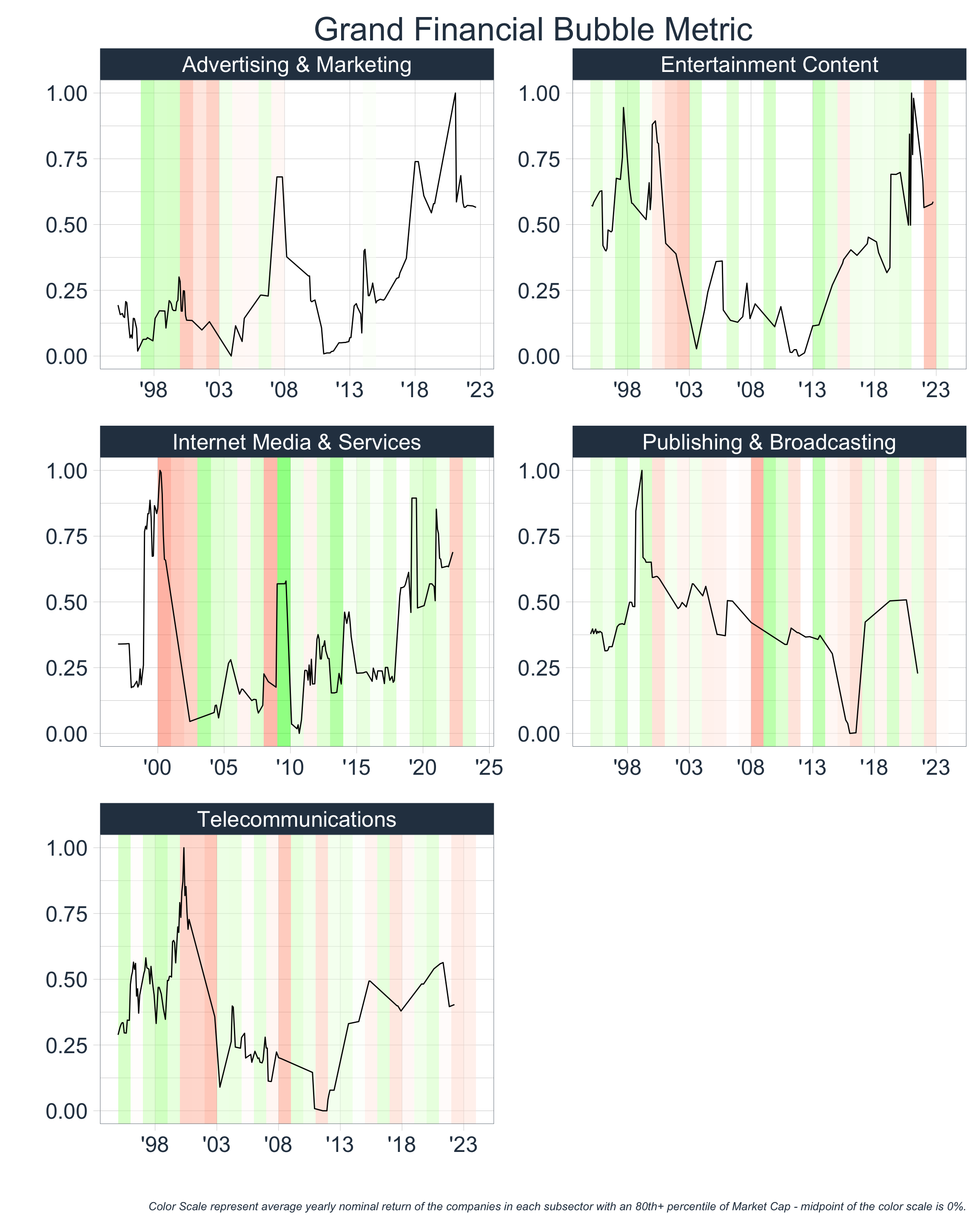
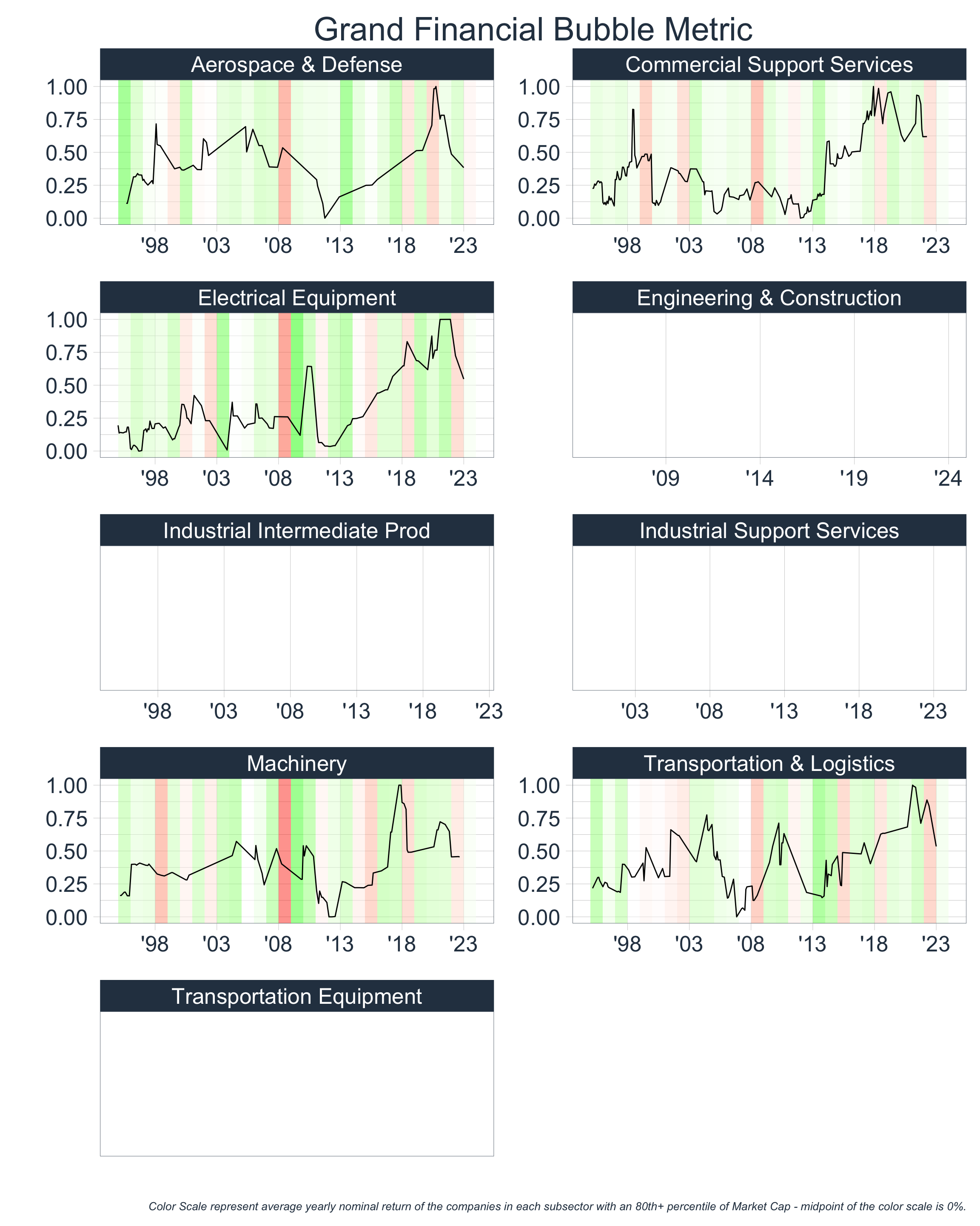
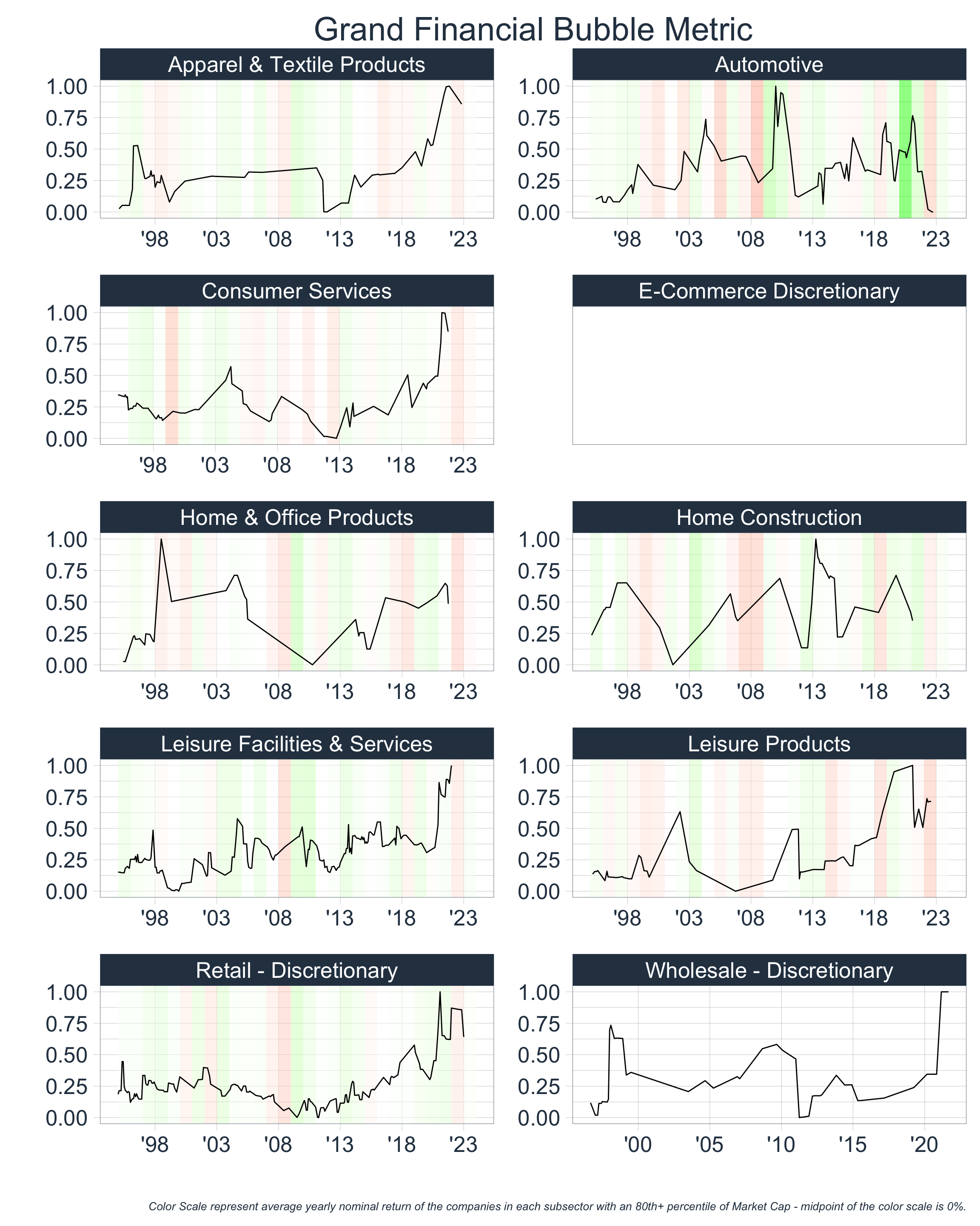
Let’s create our Grand Financial Bubble Metric at a more granular level. We are only going to include the sectors that have sufficient data. For those with sufficient Price & Debt data, but insufficient IPO data, we will calculate our Grand Financial Bubble Metric as the average of Price Metric and Debt Metric and exclude the IPO Metric.
‘Timing’ the Bubble
The ability to time market bubbles is nearly impossible, but the main indicators that many people pay attention to are interest rates/measures of borrowing cost. Since a large part of bubbles are caused by debt, it is logical that the cost of borrowing money is highly relevant.
One of the most observed interest rate metrics in the industry is the “10-2” Yield Spread which measures the difference in the yield of a 10-year Treasury Bond and that of a 2-year Treasury bond. Before we plot this measure below, I think it is important to understand the significance of this metric and its implications. Let’s consider two scenarios:
- A 10-year TBond is yielding 7% per year, and a 2-year TBond is yielding 3% per year, thus netting out to a 4% spread.
This scenario implies that the average person demands 4% more of a return on their investment to loan out their money for 10 years, rather than 2 years. At the most basic level, this is logical. The overarching rationale for this can be boiled down to General Uncertainty about the Future: the longer that maturity of the bond, the more time there is for unexpected events to occur that may affect the bond’s value, or the buyer’s perceived value of the bond, and therefore lenders demand higher rates of return for this increased uncertainty. Economists have outlined key risks attributable to this uncertainty:
Future Inflation Expectations/Inflation Risk: When investors expect higher inflation in the future, they demand higher yields to compensate for the loss of purchasing power. The longer the maturity of the bond, the more sensitive it is to the inflation expectations, which results in higher yields.
Credit Risk: Generally, longer-term bonds have a higher credit risk than shorter-term bonds. This is because the longer the maturity of the bond, the more time there is for the borrower’s creditworthiness to change. If investors perceive that there is a higher risk that the issuer may default on the bond, they will demand a higher yield on longer-term bonds to compensate for this credit risk.
Liquidity Risk: Bonds with varying maturities may have various degrees of ease in which they can be bought or sold without affecting its price. This can be due to a lack of market participants, sudden increases or decreases in supply and demand, etc.
- A 10-year TBond is yielding 3% per year, and a 2-year TBond is yielding 2% per year, thus netting out to a -1% spread. When this spread is negative, it is called a yield curve inversion.
- This scenario implies that the average person is willing to give up a 1% return on their investment to loan out their money for an additional 8 years. In other words, lenders are more uncertain about the near-term than the long-term (for any of the aforementioned reasons)!
If market consensus indicates greater uncertainty regarding the short-term, as it does in the second scenario, this does not bode well for the economy and markets. Therefore, it is likely that the “10-2” Yield Spread is an insightful metric for our purposes.
Many people, rightfully so, will push back and repeat the famous adage “yield-curve inversions predict 4 out of every 3 recessions,” and they are right; it is impossible to predict markets with the use of solely one metric, and there are times when the yield-curve has inverted and markets rallied. This is normal, there are absolutely times when the short-term is uncertain, but the underlying foundation of markets are structurally sound, and therefore the future still holds prospect for healthy growth. However, I believe studying yield curve inversions in conjunction with our Grand Financial Bubble Metric allows for powerful insights - if markets are uncertain about the near-term and markets are structurally unsound, or have been growing beyond potential, then it is likely that future growth prospects are weak.
With that said, let’s inspect interest rates and the “10-2” Yield spread:
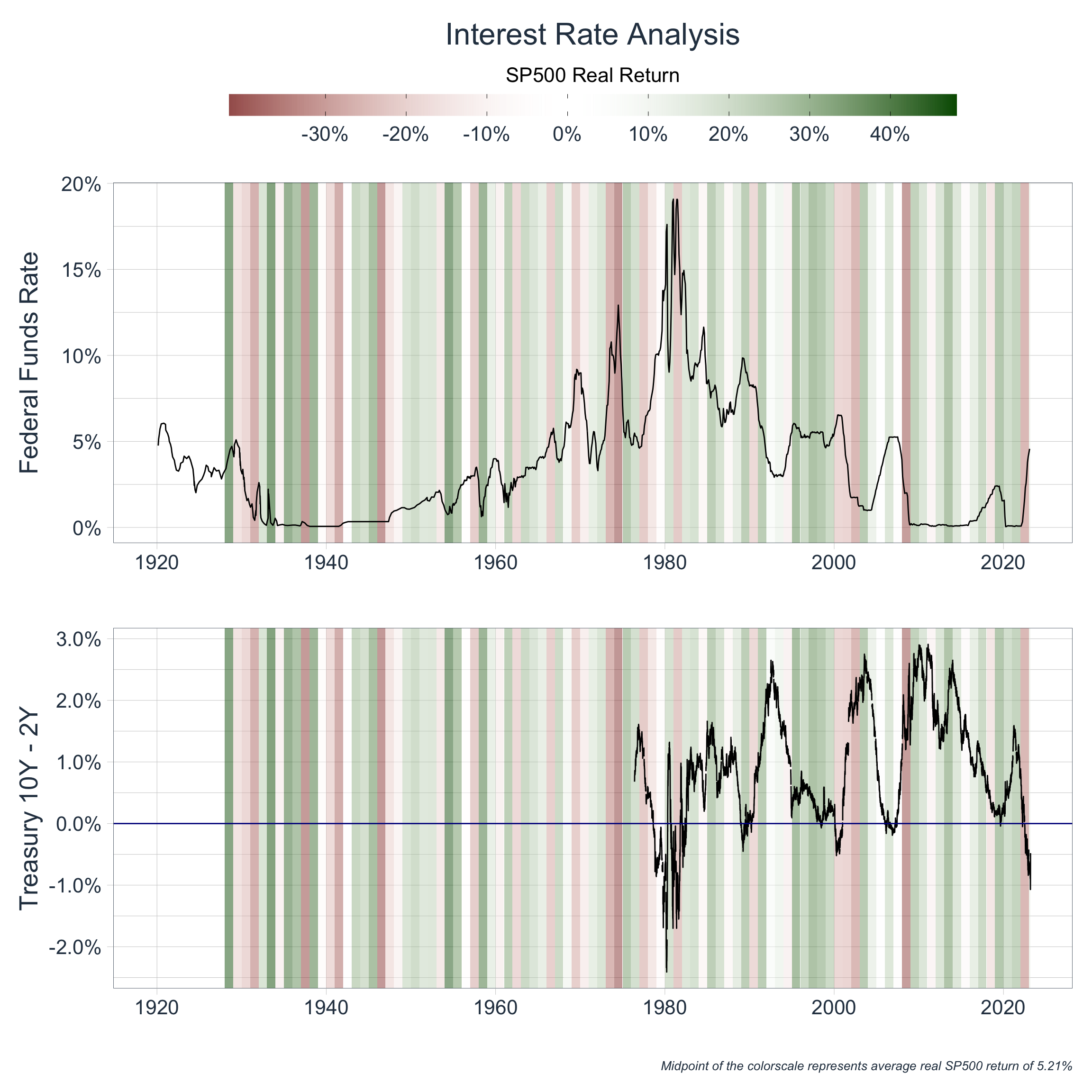
As we can see from our plots, real equity returns tend to be negative following yield curve inversions. We can also see that the Fed, when possible, drops interest rates to stimulate the economy. However, we notice that it cannot afford to do so when a) inflation is out of control and/or b) when rates are already at 0%. These scenarios are structurally different and are therefore worth investigating in depth, but we will not discuss that here.
Let’s overlay the time periods when the yield curve was inverted to our Grand Financial Bubble Metric:

As we can see, looking at yield curve inversions in conjunction with our Grand Financial Bubble Metric is somewhat helpful in informing the user on the formation of financial bubbles, sector equity performance, and possible asset allocation decisions. I would like to highlight that the above is a rough framework (that can be greatly improved) and that much more analysis should be conducted before making a possible investment decision. While our framework may aid in sector allocation decisions, a savvy investor will then pursue company-specific analysis that either supports or opposes their thesis.
Additional Areas of Explanation & Possible Amendments
This article scratches the surface of possible ways to identify financial bubbles and can be drastically improved. A few points worth noting include:
Calculating our
Price Metric&Debt Metricwith rolling averages (or medians) rather than using distance from the population median (similar to ourIPO Metric)The above is an examination of history, not an attempt at building a predictive model. Because of this, I used all available data to calculate the
Price Metric&Debt Metric, which involved calculating distance from the median of all years. In the long-run, this method is acceptable for predictability purposes if we assume that these metrics are stationary and cyclical in nature (which implies the assumption that market dynamics are the same through time), and that we have enough data. However, this would not have been the case in 2000, where we would only have had 6 years of data to assess, and metrics cannot yet be considered cyclical.The investigation of the rolling average (or median) growth rate of these metrics, rather than absolute level, is also worthwhile.
Increasing the frequency of the data is likely to be extremely worthwhile
- In the above, our
Price Metric&Debt Metricwere calculated at yearly intervals (unlike ourIPO Metricwhich could be calculated monthly) because I gathered yearly figures from the financial statements of the constituents of the Russell 3000 Index. However, much can change in the span of a year, and repeating the above at a quarterly frequency is likely to paint a clearer picture in our illustrations.
- In the above, our
The logical, qualitative narrative we built around the formation of bubbles is extremely simplistic and can be improved. As such, there are many additional quantitative ‘metrics’ that could be created to measure and explain this narrative.
For simplicity (and lack of data), we inspected the “10-2” Yield Spread on TBonds as a catalyst for the ‘popping’ of a financial bubble, but it is likely beneficial to inspect corporate yield spreads at the sector level.
- Again, it is also important to understand the first, second, and third order effects that monetary tightening may have on the key entities within each sector, which was not done here.
Improving sector knowledge and building sector-specific models would be tremendously worthwhile, especially when used in conjunction with our broader
Grand Financial Bubble Metric.
An Overarching Takeaway
I think the above examination of history hints at an over-arching principle that applies to every facet of life - everything has an optimal growth rate. Whether it’s a single company, the global economy, or even an individual’s ability to learn a topic - there is an optimal, healthy rate of progress that is predicated upon the underlying nature and quality of the system.
In the case of a single company, that rate of progress is a function of the quality of the workers, their abilities, location, tools, team chemistry, and so on. In the short-run, it is possible to grow beyond optimal; perhaps a company mandates overtime work, which will boost growth in the near-term, but if continued, this will adversely affect long-term growth, as employees will find suitable work elsewhere. In the case of an individual’s learning ability, optimal growth is a function of sleep quality, nutritional intake, time spent studying, and numerous other factors. Again, in the short-run, progress can be artificially inflated; perhaps the individual sacrifices sleep to study, which will boost learning-ability in the short-run, but this rate of learning is obviously unsustainable.
With that said, an entity’s optimal growth rate can obviously change with time, as the nature and the quality of the underlying system change - and it is an analyst’s job to identify when and why this occurs.
Again, it is my perspective that this idea of an ‘optimal growth rate’ is applicable to any subject, including investing. If we can understand an investment’s optimal growth rate, its current deviation from this growth rate, and the reasons for this deviation - then we have the ability to capitalize on these deviations and inefficiencies with the correct strategies and tactics.
Final Remarks
The above is intended as an exploration of historical data, and all statements and opinions are expressly my own; neither should be construed as investment advice.